Wondering how your logo performs? 🧐
Get professional logo reviews in seconds and catch design issues in time.
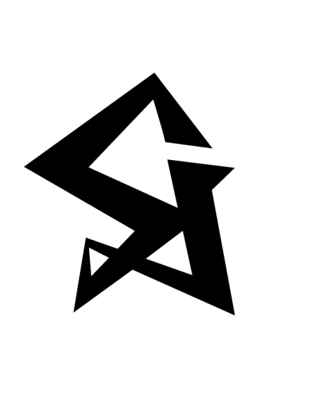
Try it Now!Logo review of S, A
 Logo analysis by AI
Logo type:
Style:
Detected symbol:
Detected text:
Business industry:
Review requested by Sumeyyenur
**If AI can recognize or misinterpret it, so can people.
Structured logo review
Legibility
![]() Letter 'A' is slightly discernible due to triangular and angular stylization.
Letter 'A' is slightly discernible due to triangular and angular stylization.![]() Bold and high-contrast color palette.
Bold and high-contrast color palette.
![]() 'S' and 'A' are not immediately obvious; requires effort to decipher.
'S' and 'A' are not immediately obvious; requires effort to decipher.![]() Poor legibility at first glance—may confuse viewers or inhibit quick recognition.
Poor legibility at first glance—may confuse viewers or inhibit quick recognition.
Scalability versatility
![]() Simple, bold shapes maintain integrity at various sizes.
Simple, bold shapes maintain integrity at various sizes.![]() Works well for large-scale applications such as signage or digital banners.
Works well for large-scale applications such as signage or digital banners.![]() Single color ensures strong reproduction in black-and-white or single-color outputs.
Single color ensures strong reproduction in black-and-white or single-color outputs.
![]() Fine internal angles may lose clarity at very small sizes such as on favicons or small thumbnails.
Fine internal angles may lose clarity at very small sizes such as on favicons or small thumbnails.![]() Highly abstract design becomes harder to interpret as size decreases—reduced impact on merchandise like apparel tags.
Highly abstract design becomes harder to interpret as size decreases—reduced impact on merchandise like apparel tags.
200x250 px
100×125 px
50×62 px
Balance alignment
![]() Centralized form creates a visually striking focal point.
Centralized form creates a visually striking focal point.![]() Geometric weights are consistent throughout the mark.
Geometric weights are consistent throughout the mark.
![]() Visual weight is significantly skewed towards the top left, creating imbalance.
Visual weight is significantly skewed towards the top left, creating imbalance.![]() Alignment between the two letterforms feels forced, making the composition look disjointed.
Alignment between the two letterforms feels forced, making the composition look disjointed.

Originality
![]() Distinctive, aggressive angular treatment is uncommon and memorable.
Distinctive, aggressive angular treatment is uncommon and memorable.![]() Abstract fusion of S and A isn’t generic and demonstrates creative ambition.
Abstract fusion of S and A isn’t generic and demonstrates creative ambition.
![]() The unrecognizable nature can verge on cryptic, which can impact brand recall.
The unrecognizable nature can verge on cryptic, which can impact brand recall.![]() Sharp, harsh angles can appear dated in certain contemporary design contexts.
Sharp, harsh angles can appear dated in certain contemporary design contexts.
Aesthetic look
![]() Bold and impactful at first glance.
Bold and impactful at first glance.![]() Minimalistic use of color provides a clean aesthetic.
Minimalistic use of color provides a clean aesthetic.
![]() Feels overly aggressive, almost chaotic due to excessively sharp fragments.
Feels overly aggressive, almost chaotic due to excessively sharp fragments.![]() Negative space usage is underdeveloped, resulting in a somewhat unfinished feel.
Negative space usage is underdeveloped, resulting in a somewhat unfinished feel.![]() Composition lacks refinement and grace; it's more jarring than harmonious.
Composition lacks refinement and grace; it's more jarring than harmonious.
Dual meaning and misinterpretations
![]() No inappropriate or accidental symbols detected.
No inappropriate or accidental symbols detected.![]() No visual resemblance to sensitive imagery or unintended connotations.
No visual resemblance to sensitive imagery or unintended connotations.
Color harmony
![]() Monochrome palette guarantees consistency across media and maintains brand recognizability.
Monochrome palette guarantees consistency across media and maintains brand recognizability.![]() Excellent contrast between black and white ensures strong visual impact.
Excellent contrast between black and white ensures strong visual impact.
Black
#000000
White
#FFFFFF


