Wondering how your logo performs? 🧐
Get professional logo reviews in seconds and catch design issues in time.
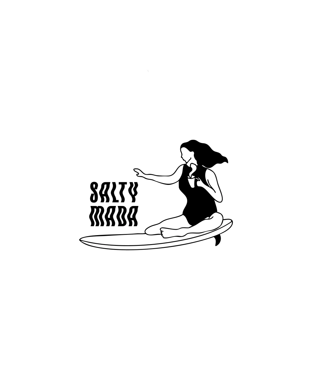
Try it Now!Logo review of SALTY MADA
 Logo analysis by AI
Logo type:
Style:
Detected symbol:
Detected text:
Business industry:
Review requested by Studiohaivah
**If AI can recognize or misinterpret it, so can people.
Structured logo review
Legibility
![]() Text is stylized to fit theme
Text is stylized to fit theme![]() Readable from a short distance
Readable from a short distance
![]() Text style may challenge legibility at a glance
Text style may challenge legibility at a glance![]() Intricate letterforms could be confusing
Intricate letterforms could be confusing
Scalability versatility
![]() Simple shapes help scaling
Simple shapes help scaling![]() Black and white format allows for easy reproduction
Black and white format allows for easy reproduction
![]() Detailed human figure may lose clarity in small sizes
Detailed human figure may lose clarity in small sizes![]() Text styling could blur in small applications
Text styling could blur in small applications
200x250 px
100×125 px
50×62 px
Balance alignment
![]() Well-distributed composition
Well-distributed composition![]() Balanced between text and imagery
Balanced between text and imagery
![]() Slight imbalance with large figure and smaller text
Slight imbalance with large figure and smaller text

Originality
![]() Unique vintage style
Unique vintage style![]() Distinctive combination of elements
Distinctive combination of elements
![]() Surfer imagery somewhat common within industry
Surfer imagery somewhat common within industry
Aesthetic look
![]() Visually appealing with a cohesive theme
Visually appealing with a cohesive theme![]() Clean and minimalistic appearance
Clean and minimalistic appearance
![]() Potentially busy due to intricate surfer depiction
Potentially busy due to intricate surfer depiction
Dual meaning and misinterpretations
![]() Clear and appropriate imagery
Clear and appropriate imagery
Color harmony
![]() Effective use of monochrome palette
Effective use of monochrome palette


