 View review
Logo score
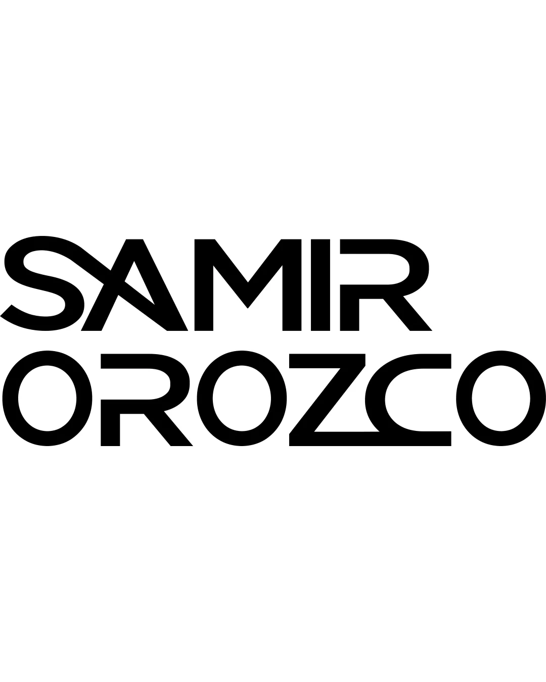
Logo review ofSamir Orozco
Review the detailed scores below to see what is working and what should be refined first.
Legibility
Originality
Misread
Balance
Scale
Detailed review
Logo performance breakdown
Legibility
![]() Clear sans-serif typeface
Clear sans-serif typeface![]() Distinct letter forms
Distinct letter forms
![]() Overall bold style may reduce legibility at smaller sizes
Overall bold style may reduce legibility at smaller sizes
Originality
![]() Stylized letters add uniqueness
Stylized letters add uniqueness
![]() Lacks a distinctive symbol or icon
Lacks a distinctive symbol or icon
Color harmony
![]() Single color enhances simplicity
Single color enhances simplicity
Balance alignment
![]() Well-balanced text alignment
Well-balanced text alignment![]() Visually cohesive
Visually cohesive

Scalability
![]() Simple design, suitable for various applications
Simple design, suitable for various applications
![]() May lose detail in very small sizes due to bold letters
May lose detail in very small sizes due to bold letters
200x250 px
100×125 px
50×62 px
Misinterpretations
![]() No inappropriate symbols
No inappropriate symbols
Try your own review
Review my logo
Wondering how your logo performs?
Get a clear logo score, key risks, and priority fix ideas before your client or audience sees it.
Keep exploring


