Wondering how your logo performs? 🧐
Get professional logo reviews in seconds and catch design issues in time.
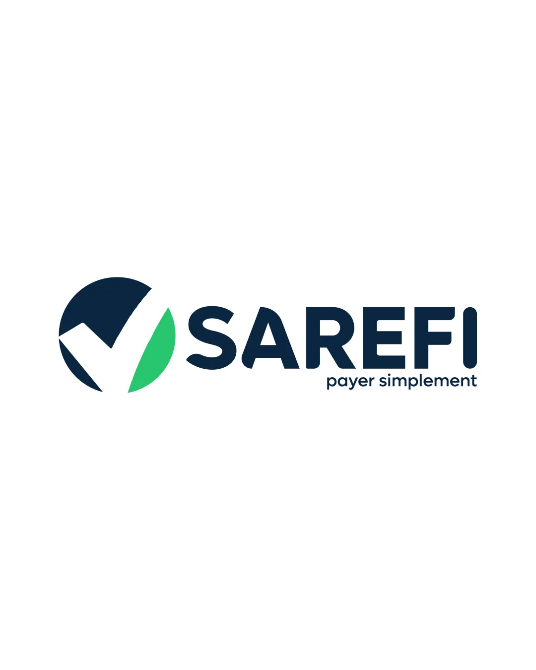
Try it Now!Logo review of SAREFI, payer simplement
 Logo analysis by AI
Logo type:
Style:
Detected symbol:
Negative space:
Detected text:
Business industry:
Review requested by Mlmc
**If AI can recognize or misinterpret it, so can people.
Structured logo review
Legibility
![]() Bold, geometric sans-serif font ensures excellent readability.
Bold, geometric sans-serif font ensures excellent readability.![]() Slogan text is clear despite smaller size.
Slogan text is clear despite smaller size.
Scalability versatility
![]() Simple, bold symbol scales well to small sizes like favicons or app icons.
Simple, bold symbol scales well to small sizes like favicons or app icons.![]() Typeface maintains legibility at a variety of scales.
Typeface maintains legibility at a variety of scales.![]() Logo would reproduce well on business cards, websites, and large banners.
Logo would reproduce well on business cards, websites, and large banners.
![]() Slogan text ('payer simplement') may become illegible at extremely small sizes, such as on pen printing or very small apparel tags.
Slogan text ('payer simplement') may become illegible at extremely small sizes, such as on pen printing or very small apparel tags.
200x250 px
100×125 px
50×62 px
Balance alignment
![]() Excellent visual balance between symbol and wordmark.
Excellent visual balance between symbol and wordmark.![]() Alignment is correctly adjusted, creating a cohesive unit.
Alignment is correctly adjusted, creating a cohesive unit.

Originality
![]() Integrated check mark within a circle is executed cleanly.
Integrated check mark within a circle is executed cleanly.
![]() Check mark inside a circle is a widely used motif in fintech and payments, leading to a generic feel.
Check mark inside a circle is a widely used motif in fintech and payments, leading to a generic feel.![]() Lacks a unique conceptual twist or brand-driven detail.
Lacks a unique conceptual twist or brand-driven detail.
Logomark wordmark fit
![]() Symbol thickness and wordmark weight are well matched.
Symbol thickness and wordmark weight are well matched.![]() Both components feel stylistically harmonious.
Both components feel stylistically harmonious.
Aesthetic look
![]() Visually appealing, modern, and uses minimal color efficiently.
Visually appealing, modern, and uses minimal color efficiently.![]() Clean lines contribute to professional appearance.
Clean lines contribute to professional appearance.
![]() Slightly generic due to the very common symbol choice.
Slightly generic due to the very common symbol choice.
Dual meaning and misinterpretations
![]() No visible risk of inappropriate dual meanings or misinterpretations.
No visible risk of inappropriate dual meanings or misinterpretations.
Color harmony
![]() Just two main colors plus white, providing great contrast and clean appearance.
Just two main colors plus white, providing great contrast and clean appearance.![]() Palette is harmonious, conveying trust and freshness.
Palette is harmonious, conveying trust and freshness.
Prussian Blue
#0B223B
Malachite
#35D07F
White
#FFFFFF


