 View review
Logo score
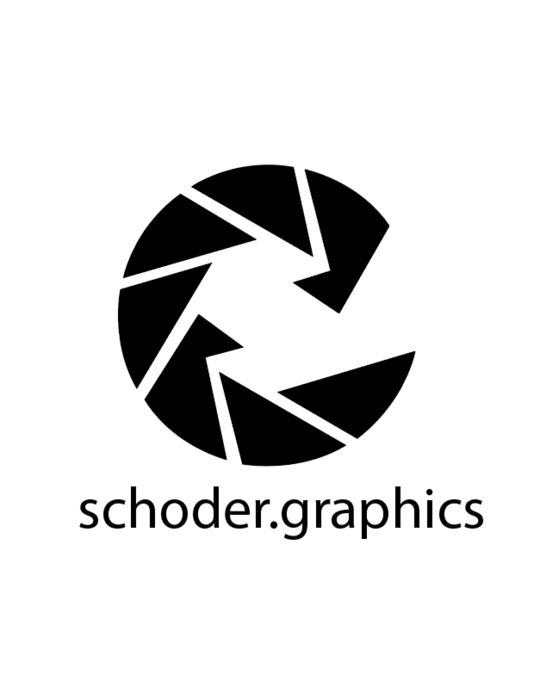
Logo review ofSchoder.graphics
Review the detailed scores below to see what is working and what should be refined first.
Legibility
Originality
Misread
Balance
Scale
Detailed review
Logo performance breakdown
Legibility
![]() Typography is clear and easily readable at a range of sizes.
Typography is clear and easily readable at a range of sizes.![]() Single color ensures high contrast with background.
Single color ensures high contrast with background.
Originality
![]() Clean and geometric representation gives a contemporary identity.
Clean and geometric representation gives a contemporary identity.
![]() The aperture/shutter symbol is a very common motif in the creative/design sector, especially among photography and graphics professionals.
The aperture/shutter symbol is a very common motif in the creative/design sector, especially among photography and graphics professionals.![]() No distinctive customization or creative twist makes it stand out from similar competitors.
No distinctive customization or creative twist makes it stand out from similar competitors.
Color harmony
![]() Excellent use of monochrome ensures consistent legibility and broad application.
Excellent use of monochrome ensures consistent legibility and broad application.
Black
#000000
White
#FFFFFF
Balance alignment
![]() Logo feels visually centered with good proportion between symbol and wordmark.
Logo feels visually centered with good proportion between symbol and wordmark.![]() Consistent visual weight between mark and type.
Consistent visual weight between mark and type.
![]() A small amount of negative space makes the aperture appear off-balance due to partial closure; a more symmetrical aperture might create stronger equilibrium.
A small amount of negative space makes the aperture appear off-balance due to partial closure; a more symmetrical aperture might create stronger equilibrium.

Scalability
![]() Minimalist mark retains visual clarity at small sizes such as favicons and business cards.
Minimalist mark retains visual clarity at small sizes such as favicons and business cards.![]() Logo will reproduce well in black and white without any loss of detail.
Logo will reproduce well in black and white without any loss of detail.![]() Simple geometric shapes are embroidery-friendly and easily applied to signage, digital banners, and stationery.
Simple geometric shapes are embroidery-friendly and easily applied to signage, digital banners, and stationery.
200x250 px
100×125 px
50×62 px
Misinterpretations
![]() No inappropriate or accidental shapes or connotations in either the symbol or wordmark.
No inappropriate or accidental shapes or connotations in either the symbol or wordmark.
Symbol & text fit
![]() The geometric style of the symbol fits well with the modern, sans-serif wordmark.
The geometric style of the symbol fits well with the modern, sans-serif wordmark.
![]() Consistent monochrome palette ties both elements together cohesively.
Consistent monochrome palette ties both elements together cohesively.
Try your own review
Review my logo
Wondering how your logo performs?
Get a clear logo score, key risks, and priority fix ideas before your client or audience sees it.
Keep exploring


