Wondering how your logo performs? 🧐
Get professional logo reviews in seconds and catch design issues in time.
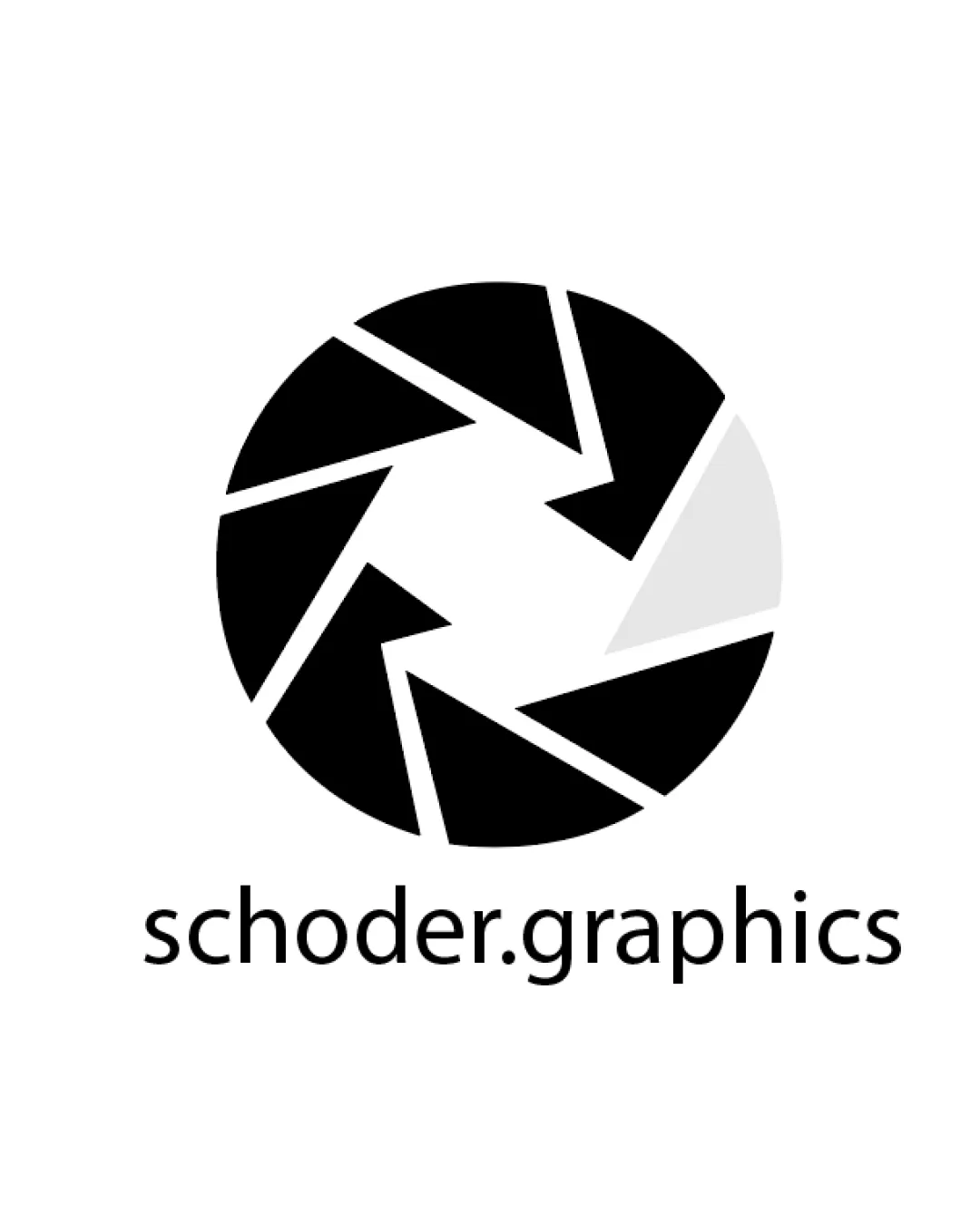
Try it Now!Logo review of schoder.graphics
 Logo analysis by AI
Logo type:
Style:
Detected symbol:
Negative space:
Detected text:
Business industry:
Review requested by Sma
**If AI can recognize or misinterpret it, so can people.
Structured logo review
Legibility
![]() Text is clear, sans-serif, and easy to read at various sizes.
Text is clear, sans-serif, and easy to read at various sizes.![]() Good color contrast between text and background for maximum readability.
Good color contrast between text and background for maximum readability.
Scalability versatility
![]() Simple geometric shape ensures the logo remains distinct when scaled to small sizes.
Simple geometric shape ensures the logo remains distinct when scaled to small sizes.![]() Would work well on digital platforms, business cards, and large format printing.
Would work well on digital platforms, business cards, and large format printing.
![]() Thin white lines between the black blades may lose definition at very small sizes, especially in embroidery or favicon applications.
Thin white lines between the black blades may lose definition at very small sizes, especially in embroidery or favicon applications.![]() Subtle light gray segment may become indistinguishable on some backgrounds or tiny formats.
Subtle light gray segment may become indistinguishable on some backgrounds or tiny formats.
200x250 px
100×125 px
50×62 px
Balance alignment
![]() Logo mark and wordmark are well-centered.
Logo mark and wordmark are well-centered.![]() Aperture symbol sits evenly above the business name, establishing a strong visual anchor.
Aperture symbol sits evenly above the business name, establishing a strong visual anchor.

Originality
![]() Geometric aperture icon is visually connected to photography and graphics, matching the industry.
Geometric aperture icon is visually connected to photography and graphics, matching the industry.
![]() Aperture shutter motifs are widely used and considered generic for creative and photography industries.
Aperture shutter motifs are widely used and considered generic for creative and photography industries.![]() Lacks a unique or unexpected graphical twist to distinguish it from similar competitors.
Lacks a unique or unexpected graphical twist to distinguish it from similar competitors.
Logomark wordmark fit
![]() Styles of symbol and wordmark are cohesive.
Styles of symbol and wordmark are cohesive.![]() Sizing between logomark and wordmark feels harmonious and intentional.
Sizing between logomark and wordmark feels harmonious and intentional.
Aesthetic look
![]() Minimalist look feels clean and professional.
Minimalist look feels clean and professional.![]() High-contrast and contemporary appearance is visually appealing.
High-contrast and contemporary appearance is visually appealing.
![]() Aperture icons are somewhat overused within this space, offering little surprise or memorable distinction.
Aperture icons are somewhat overused within this space, offering little surprise or memorable distinction.
Dual meaning and misinterpretations
![]() No inappropriate shapes or misreadings observed.
No inappropriate shapes or misreadings observed.
Color harmony
![]() Monochromatic palette is harmonious and modern.
Monochromatic palette is harmonious and modern.![]() Limited palette ensures strong contrast and clarity.
Limited palette ensures strong contrast and clarity.
Black
#000000
Light Gray
#E6E6E6
White
#FFFFFF


