Wondering how your logo performs? 🧐
Get professional logo reviews in seconds and catch design issues in time.
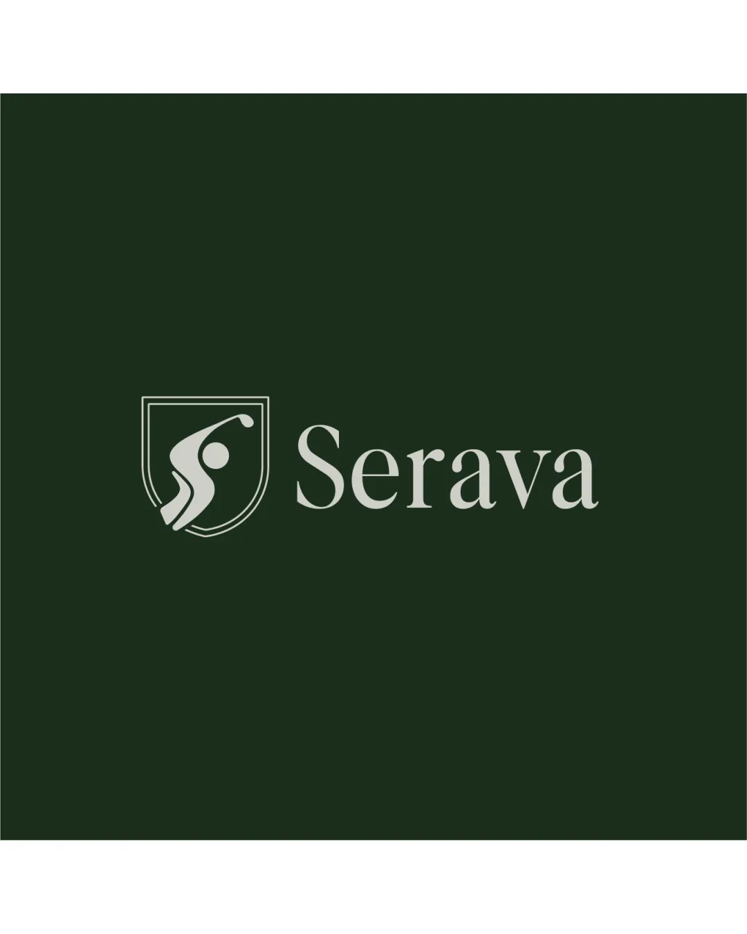
Try it Now!Logo review of Serava
 Logo analysis by AI
Logo type:
Style:
Detected symbol:
Negative space:
Detected text:
Business industry:
Review requested by Vinnify.id
**If AI can recognize or misinterpret it, so can people.
Structured logo review
Legibility
![]() The 'Serava' wordmark is clear with excellent contrast against the dark green background.
The 'Serava' wordmark is clear with excellent contrast against the dark green background.![]() Font choice is elegant and highly readable even at smaller sizes.
Font choice is elegant and highly readable even at smaller sizes.
Scalability versatility
![]() Minimal detail ensures clarity at various sizes.
Minimal detail ensures clarity at various sizes.![]() Works well on signage, sport apparel, and digital media.
Works well on signage, sport apparel, and digital media.
![]() At extremely small sizes, the finer lines in the shield could lose sharpness, especially in embroidery or favicons.
At extremely small sizes, the finer lines in the shield could lose sharpness, especially in embroidery or favicons.
200x250 px
100×125 px
50×62 px
Balance alignment
![]() Logo mark and wordmark are proportionally aligned and well-balanced.
Logo mark and wordmark are proportionally aligned and well-balanced.![]() Good visual hierarchy between symbol and text.
Good visual hierarchy between symbol and text.

Originality
![]() The abstract representation of a golfer in a shield is a creative and distinctive approach.
The abstract representation of a golfer in a shield is a creative and distinctive approach.![]() Use of negative space for motion adds sophistication.
Use of negative space for motion adds sophistication.
![]() Shields are a commonly used motif in sports, reducing some uniqueness.
Shields are a commonly used motif in sports, reducing some uniqueness.![]() Abstract figure could risk blending with other sports logos if not carefully branded.
Abstract figure could risk blending with other sports logos if not carefully branded.
Logomark wordmark fit
![]() The strength and professionalism of the serif font match the shield’s gravitas.
The strength and professionalism of the serif font match the shield’s gravitas.![]() Both elements feel cohesive and harmonious.
Both elements feel cohesive and harmonious.
Aesthetic look
![]() Clean, modern aesthetic with a sense of motion.
Clean, modern aesthetic with a sense of motion.![]() Refined but bold. Contrasts elegantly.
Refined but bold. Contrasts elegantly.
Dual meaning and misinterpretations
![]() No inappropriate visual misinterpretation detected.
No inappropriate visual misinterpretation detected.![]() The human motion is clear and positive.
The human motion is clear and positive.
Color harmony
![]() Limited, harmonious palette of dark green and light taupe, exuding sophistication.
Limited, harmonious palette of dark green and light taupe, exuding sophistication.![]() Good contrast enhances legibility.
Good contrast enhances legibility.
Dark Green
#232F21
Light Taupe
#D7D4CB


