 View review
Logo score
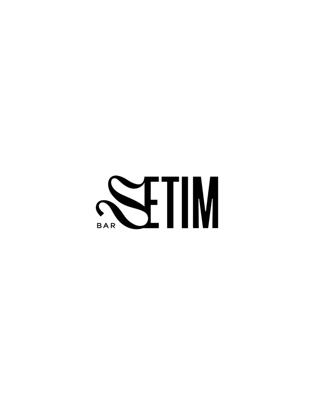
Logo review ofSetim Bar
Review the detailed scores below to see what is working and what should be refined first.
Legibility
Originality
Misread
Balance
Scale
Detailed review
Logo performance breakdown
Legibility
![]() The word 'ETIM' is highly legible due to clean and bold typeface.
The word 'ETIM' is highly legible due to clean and bold typeface.![]() The word 'BAR' is clear and unobtrusive.
The word 'BAR' is clear and unobtrusive.
![]() The stylized 'S' is overly decorative and may be mistaken for another shape or letter, reducing immediate recognition.
The stylized 'S' is overly decorative and may be mistaken for another shape or letter, reducing immediate recognition.![]() The transition between the 'S' and the rest of the word disrupts reading flow for first-time viewers.
The transition between the 'S' and the rest of the word disrupts reading flow for first-time viewers.
Originality
![]() The stylized 'S' as a ribbon/fabric introduces a unique and memorable characteristic.
The stylized 'S' as a ribbon/fabric introduces a unique and memorable characteristic.![]() Custom letterform elevates the identity beyond basic typography.
Custom letterform elevates the identity beyond basic typography.
![]() While the 'S' is creative, such flowing shapes are not uncommon among bar/lounge/fashion branding, slightly reducing uniqueness.
While the 'S' is creative, such flowing shapes are not uncommon among bar/lounge/fashion branding, slightly reducing uniqueness.
Color harmony
![]() Monochrome palette ensures high contrast and universal application.
Monochrome palette ensures high contrast and universal application.![]() Black and white combination is classic and versatile.
Black and white combination is classic and versatile.
Black
#000000
White
#FFFFFF
Balance alignment
![]() Main block of text is visually balanced and aligned horizontally.
Main block of text is visually balanced and aligned horizontally.![]() The 'BAR' subtext is placed cleanly and doesn’t disrupt overall balance.
The 'BAR' subtext is placed cleanly and doesn’t disrupt overall balance.
![]() The exaggerated, flowing 'S' introduces a visual weight imbalance, drawing attention far more than the rest of the wordmark.
The exaggerated, flowing 'S' introduces a visual weight imbalance, drawing attention far more than the rest of the wordmark.![]() The flow of the 'S' exceeds the baseline, disrupting rectangular containment of the typographic block.
The flow of the 'S' exceeds the baseline, disrupting rectangular containment of the typographic block.

Scalability
![]() Simple color scheme ensures readability across many applications.
Simple color scheme ensures readability across many applications.![]() Would work well on large signage, menus, and promotional materials.
Would work well on large signage, menus, and promotional materials.
![]() The intricate curves of the 'S' could get muddled or lose definition in very small sizes such as social media avatars or business cards.
The intricate curves of the 'S' could get muddled or lose definition in very small sizes such as social media avatars or business cards.![]() Thin lines in the 'S' may not translate clearly in embroidery or foil stamping.
Thin lines in the 'S' may not translate clearly in embroidery or foil stamping.
200x250 px
100×125 px
50×62 px
Misinterpretations
![]() The design does not evoke inappropriate, violent, or unfortunate secondary interpretations.
The design does not evoke inappropriate, violent, or unfortunate secondary interpretations.![]() The ribbon-like 'S' remains abstract yet elegant.
The ribbon-like 'S' remains abstract yet elegant.
Try your own review
Review my logo
Wondering how your logo performs?
Get a clear logo score, key risks, and priority fix ideas before your client or audience sees it.
Keep exploring


