 View review
Logo score
Logo review ofShanghai Kungfit Sports Development Co. Ltd., Chin..
Review the detailed scores below to see what is working and what should be refined first.
Legibility
Originality
Misread
Balance
Scale
Detailed review
Logo performance breakdown
Legibility
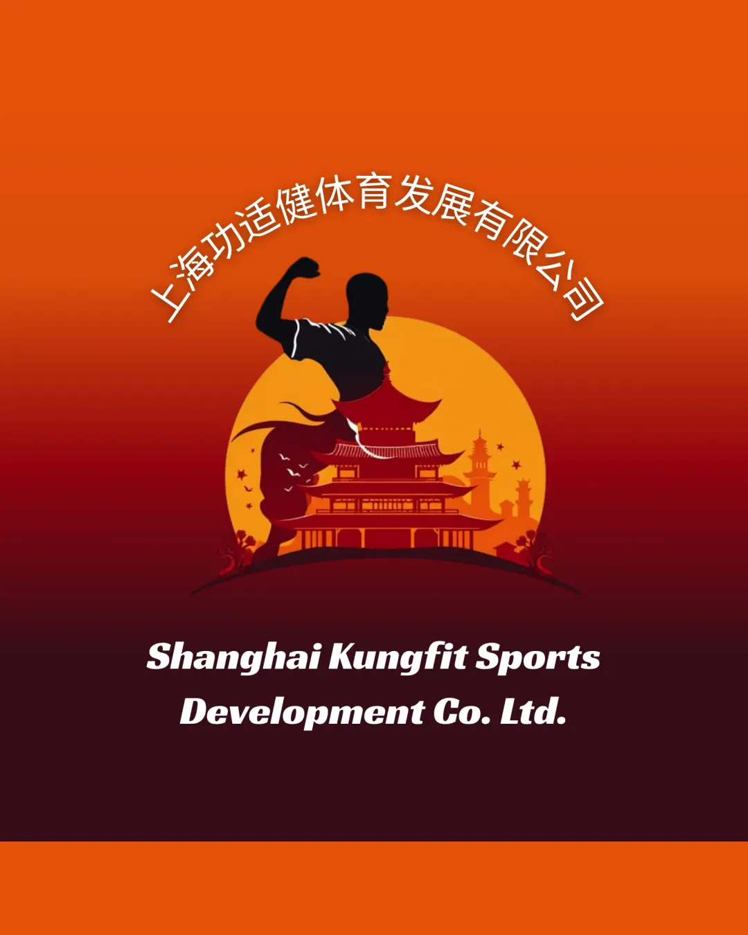
![]() English and Chinese text remain clearly readable.
English and Chinese text remain clearly readable.![]() High contrast between text and background.
High contrast between text and background.
![]() Curved Chinese text may be difficult to read at smaller sizes.
Curved Chinese text may be difficult to read at smaller sizes.![]() Slight distortion of the English company name due to font choice and bolding.
Slight distortion of the English company name due to font choice and bolding.
Originality
![]() Combination of martial artist and traditional architecture ties directly to the brand's industry and culture.
Combination of martial artist and traditional architecture ties directly to the brand's industry and culture.![]() Color palette supports the theme.
Color palette supports the theme.
![]() Martial artist silhouette and pagoda are fairly generic symbols for sports and Chinese-themed brands.
Martial artist silhouette and pagoda are fairly generic symbols for sports and Chinese-themed brands.![]() No creative twist or unique abstraction; literal representation throughout.
No creative twist or unique abstraction; literal representation throughout.
Color harmony
![]() Warm color palette is consistent and thematically strong.
Warm color palette is consistent and thematically strong.![]() Good contrast between elements.
Good contrast between elements.
![]() Multiple gradients risk poor reproduction; can be difficult for print or monochrome uses.
Multiple gradients risk poor reproduction; can be difficult for print or monochrome uses.
Orange
#E44D14
Golden yellow
#FFB644
Dark burgundy
#240B16
Black
#000000
White
#FFFFFF
Your palette is close. Explore sharper color combinations with Colorfly.design before updating the logo.
Explore palettesBalance alignment
![]() Central symmetry between martial artist and pagoda.
Central symmetry between martial artist and pagoda.![]() Text is aligned to frame the illustration.
Text is aligned to frame the illustration.
![]() Curved Chinese text on top creates some visual heaviness and imbalance.
Curved Chinese text on top creates some visual heaviness and imbalance.![]() English text feels detached from the core visual.
English text feels detached from the core visual.

Scalability
![]() Logo is impactful and memorable when used large (e.g., posters, banners, window signage).
Logo is impactful and memorable when used large (e.g., posters, banners, window signage).
![]() Excessive detail in the pagoda and background illustration will not translate well to small use cases like business cards, favicons, or embroidery.
Excessive detail in the pagoda and background illustration will not translate well to small use cases like business cards, favicons, or embroidery.![]() Thin lines and layered elements would be lost at smaller scales.
Thin lines and layered elements would be lost at smaller scales.![]() Complex gradient background limits versatility on different applications.
Complex gradient background limits versatility on different applications.
200x250 px
100×125 px
50×62 px
Misinterpretations
![]() No inappropriate dual meanings or confusing symbols detected.
No inappropriate dual meanings or confusing symbols detected.
Symbol & text fit
![]() Attempt to integrate English and Chinese wordmarks with imagery.
Attempt to integrate English and Chinese wordmarks with imagery.
![]() Styles do not harmonize—font is sporty and bold, while illustration is detailed and traditional.
Styles do not harmonize—font is sporty and bold, while illustration is detailed and traditional.
![]() Wordmark sizing is disproportionate relative to the large illustration; feels out of sync.
Wordmark sizing is disproportionate relative to the large illustration; feels out of sync.
Try your own review
Review my logo
Wondering how your logo performs?
Get a clear logo score, key risks, and priority fix ideas before your client or audience sees it.
Keep exploring


