Wondering how your logo performs? 🧐
Get professional logo reviews in seconds and catch design issues in time.
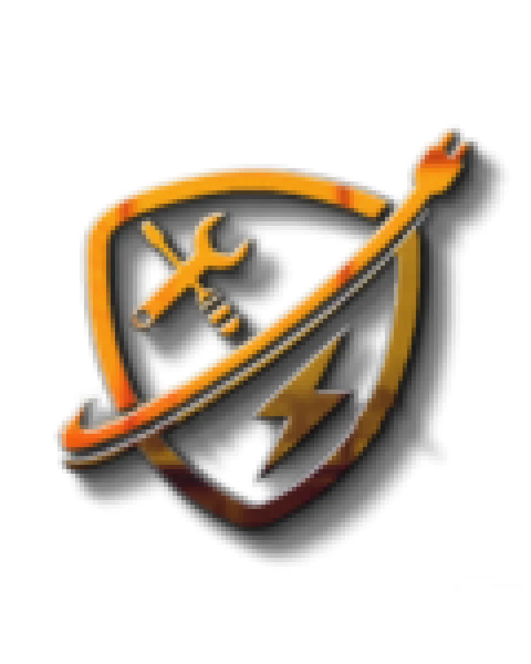
Try it Now!Logo review of shield with wrench, screwdriver, and lightning bol..
 Logo analysis by AI
Logo type:
Style:
Detected symbol:
Business industry:
Review requested by Vaminosproductions
**If AI can recognize or misinterpret it, so can people.
Structured logo review
Scalability versatility
![]() Distinctive icon elements can be recognizable when large, such as on vehicle wraps or building signage.
Distinctive icon elements can be recognizable when large, such as on vehicle wraps or building signage.
![]() 3D effects, gradients, and drop shadows reduce clarity at small sizes such as business cards or mobile app icons.
3D effects, gradients, and drop shadows reduce clarity at small sizes such as business cards or mobile app icons.![]() Complexity and number of elements hinder simple reproduction for embroidery or monochrome printing.
Complexity and number of elements hinder simple reproduction for embroidery or monochrome printing.![]() The badge shape with overlapping objects will not translate well into small favicons or low-resolution formats.
The badge shape with overlapping objects will not translate well into small favicons or low-resolution formats.
200x250 px
100×125 px
50×62 px
Balance alignment
![]() Central placement of main elements keeps design roughly centered.
Central placement of main elements keeps design roughly centered.
![]() Diagonal line (wrench + screwdriver) crossing the shield disrupts visual harmony and feels visually top-heavy.
Diagonal line (wrench + screwdriver) crossing the shield disrupts visual harmony and feels visually top-heavy.![]() Too many individual elements crowded inside the shield create a busy and slightly unbalanced feel.
Too many individual elements crowded inside the shield create a busy and slightly unbalanced feel.

Originality
![]() Combining typical repair and electrical symbols (tools + lightning bolt) does clarify intended industry.
Combining typical repair and electrical symbols (tools + lightning bolt) does clarify intended industry.
![]() All elements are generic and overused in repair/electrician logo design with no unique treatment or creative twist.
All elements are generic and overused in repair/electrician logo design with no unique treatment or creative twist.![]() Shield combined with tools and a lightning bolt is a very common, almost cliché construction.
Shield combined with tools and a lightning bolt is a very common, almost cliché construction.
Aesthetic look
![]() Metallic color and shading attempt to provide visual interest.
Metallic color and shading attempt to provide visual interest.
![]() Dated 3D bevel and shadow styles make the logo feel unprofessional and out of touch with contemporary minimalist aesthetics.
Dated 3D bevel and shadow styles make the logo feel unprofessional and out of touch with contemporary minimalist aesthetics.![]() Overlapping symbols and excessive detail result in a busy, cluttered look.
Overlapping symbols and excessive detail result in a busy, cluttered look.
Dual meaning and misinterpretations
![]() No inappropriate or accidental secondary meanings detected in the iconography.
No inappropriate or accidental secondary meanings detected in the iconography.
Color harmony
![]() Consistent gold/orange color family creates a unified, if somewhat brassy, visual palette.
Consistent gold/orange color family creates a unified, if somewhat brassy, visual palette.
![]() Heavy use of gradients and mixed shadow colors complicates consistent reproduction across materials.
Heavy use of gradients and mixed shadow colors complicates consistent reproduction across materials.![]() 3D metallic effects may not print accurately and lack flexibility for single-color needs.
3D metallic effects may not print accurately and lack flexibility for single-color needs.
Orange
#F4B041
Chestnut Brown
#784212
White
#FFFFFF
Black (shadow)
#000000


