 View review
Logo score
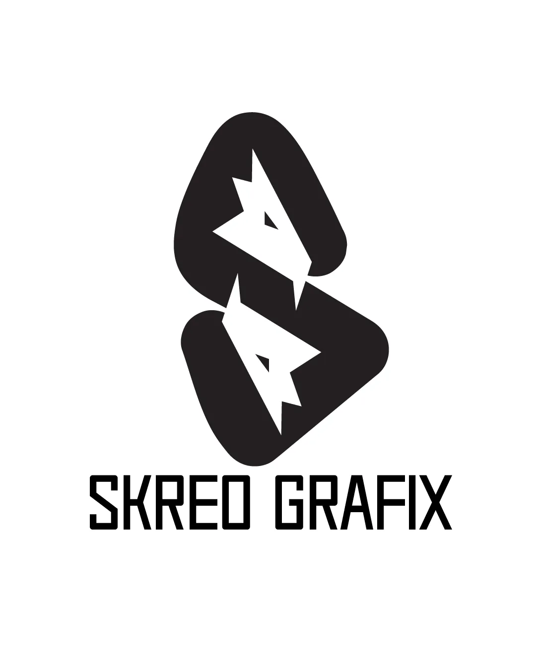
Logo review ofSkreo Grafix
Review the detailed scores below to see what is working and what should be refined first.
Legibility
Originality
Misread
Balance
Scale
Detailed review
Logo performance breakdown
Legibility
![]() Text is high-contrast and highly legible against the white background.
Text is high-contrast and highly legible against the white background.![]() Font is bold, clean, and modern, aiding readability.
Font is bold, clean, and modern, aiding readability.
![]() The custom font has tight kerning, which may reduce clarity at smaller sizes.
The custom font has tight kerning, which may reduce clarity at smaller sizes.![]() Some letter forms (like 'K' and 'R') are stylized, possibly causing quick reading misinterpretation.
Some letter forms (like 'K' and 'R') are stylized, possibly causing quick reading misinterpretation.
Originality
![]() Creative use of negative space to form animal heads within geometric shapes.
Creative use of negative space to form animal heads within geometric shapes.![]() Distinct visual identity with mirrored elements adds a unique touch.
Distinct visual identity with mirrored elements adds a unique touch.
Color harmony
![]() Monochromatic black-and-white color scheme ensures perfect color harmony.
Monochromatic black-and-white color scheme ensures perfect color harmony.![]() Excellent contrast and adaptability.
Excellent contrast and adaptability.
Black
#000000
White
#FFFFFF
Balance alignment
![]() Both the logomark and wordmark are visually centered and aligned.
Both the logomark and wordmark are visually centered and aligned.![]() Overall vertical and horizontal balance is strong.
Overall vertical and horizontal balance is strong.
![]() There is slight visual weight difference between the dense logo symbol and lighter text below.
There is slight visual weight difference between the dense logo symbol and lighter text below.![]() Negative space fox/dog heads draw more attention than the brand name.
Negative space fox/dog heads draw more attention than the brand name.

Scalability
![]() Bold lines and simple shapes make the logo adaptable to various scales.
Bold lines and simple shapes make the logo adaptable to various scales.![]() The symbol works well for large scale uses—posters, signage, packaging.
The symbol works well for large scale uses—posters, signage, packaging.
![]() Fine details of the fox/dog heads might be lost in small applications (favicon, embroidery).
Fine details of the fox/dog heads might be lost in small applications (favicon, embroidery).![]() Logo may need a simplified icon-only or text-only version for maximum versatility.
Logo may need a simplified icon-only or text-only version for maximum versatility.
200x250 px
100×125 px
50×62 px
Misinterpretations
![]() Abstract mark with clear animal imagery prevents accidental inappropriate associations.
Abstract mark with clear animal imagery prevents accidental inappropriate associations.
Symbol & text fit
![]() Logomark and wordmark both share a modern, geometric style.
Logomark and wordmark both share a modern, geometric style.
![]() Both elements are compatible in weight and tone.
Both elements are compatible in weight and tone.
![]() Slight disconnect due to the abstract, playful nature of the symbol versus the rigid, mechanical text.
Slight disconnect due to the abstract, playful nature of the symbol versus the rigid, mechanical text.
Try your own review
Review my logo
Wondering how your logo performs?
Get a clear logo score, key risks, and priority fix ideas before your client or audience sees it.
Keep exploring


