Wondering how your logo performs? 🧐
Get professional logo reviews in seconds and catch design issues in time.
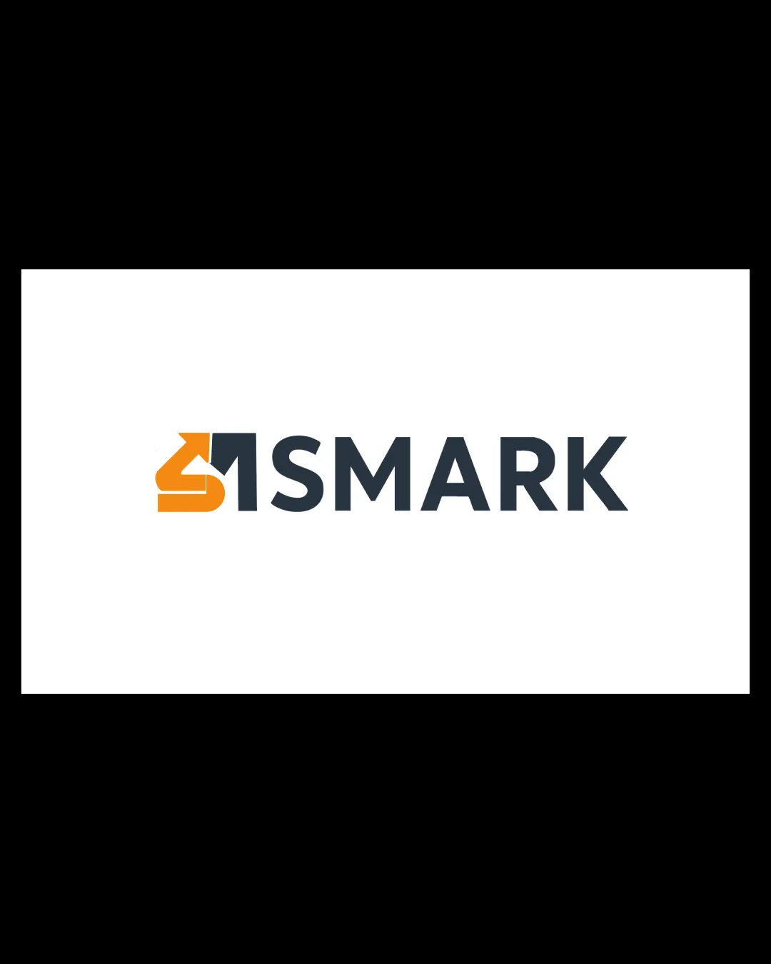
Try it Now!Logo review of SMARK
 Logo analysis by AI
Logo type:
Style:
Detected symbol:
Negative space:
Detected text:
Business industry:
Review requested by Mohabd
**If AI can recognize or misinterpret it, so can people.
Structured logo review
Legibility
![]() The wordmark is highly readable with excellent font choice and spacing.
The wordmark is highly readable with excellent font choice and spacing.![]() Contrast between the dark text and white background supports clear legibility.
Contrast between the dark text and white background supports clear legibility.
Scalability versatility
![]() The mark uses simple geometric shapes, making it fairly scalable across print and digital formats.
The mark uses simple geometric shapes, making it fairly scalable across print and digital formats.![]() Works for signage, business cards, and digital headers.
Works for signage, business cards, and digital headers.
![]() Fine interior details of the symbol (arrow, roof) might blur at very small sizes (e.g., favicon or embroidery on apparel).
Fine interior details of the symbol (arrow, roof) might blur at very small sizes (e.g., favicon or embroidery on apparel).
200x250 px
100×125 px
50×62 px
Balance alignment
![]() Strong alignment between symbol and wordmark, both horizontally and visually.
Strong alignment between symbol and wordmark, both horizontally and visually.![]() Visual weight between the monogram and text is well-managed.
Visual weight between the monogram and text is well-managed.
![]() The boldness of the colored symbol slightly overpowers the wordmark in some contexts.
The boldness of the colored symbol slightly overpowers the wordmark in some contexts.![]() Negative space between the symbol and wordmark is minimal, potentially reducing breathing room.
Negative space between the symbol and wordmark is minimal, potentially reducing breathing room.

Originality
![]() Clever integration of the 'S' and house motif with an arrow in the negative space.
Clever integration of the 'S' and house motif with an arrow in the negative space.![]() Not a fully generic house graphic—attempts some creative blend with the initial.
Not a fully generic house graphic—attempts some creative blend with the initial.
![]() Combining an 'S' with a generic real estate house is a very common trope in the industry.
Combining an 'S' with a generic real estate house is a very common trope in the industry.![]() Overall mark may still feel somewhat derivative among real estate logos.
Overall mark may still feel somewhat derivative among real estate logos.
Logomark wordmark fit
![]() Style and boldness of both logomark and wordmark are largely consistent.
Style and boldness of both logomark and wordmark are largely consistent.![]() Color palette integrates well between mark and text.
Color palette integrates well between mark and text.
![]() Monogram's stylization is visually much stronger than the simple sans-serif font, creating a mild imbalance.
Monogram's stylization is visually much stronger than the simple sans-serif font, creating a mild imbalance.
Aesthetic look
![]() Logo looks clean, modern, and visually appealing.
Logo looks clean, modern, and visually appealing.![]() Color harmony and geometric simplicity contribute to a professional appearance.
Color harmony and geometric simplicity contribute to a professional appearance.
![]() Aesthetic feels safe and slightly generic due to industry conventions.
Aesthetic feels safe and slightly generic due to industry conventions.
Dual meaning and misinterpretations
![]() No unintentional inappropriate imagery detected.
No unintentional inappropriate imagery detected.![]() Dual-meaning (S and house/arrow) supports intended message.
Dual-meaning (S and house/arrow) supports intended message.
Color harmony
![]() Effective, limited palette of orange and dark gray ensures strong contrast and maintains professionalism.
Effective, limited palette of orange and dark gray ensures strong contrast and maintains professionalism.![]() Colors work well for digital and print materials.
Colors work well for digital and print materials.
Orange
#F59C1D
Gunmetal
#2E353D
White
#FFFFFF


