 View review
Logo score
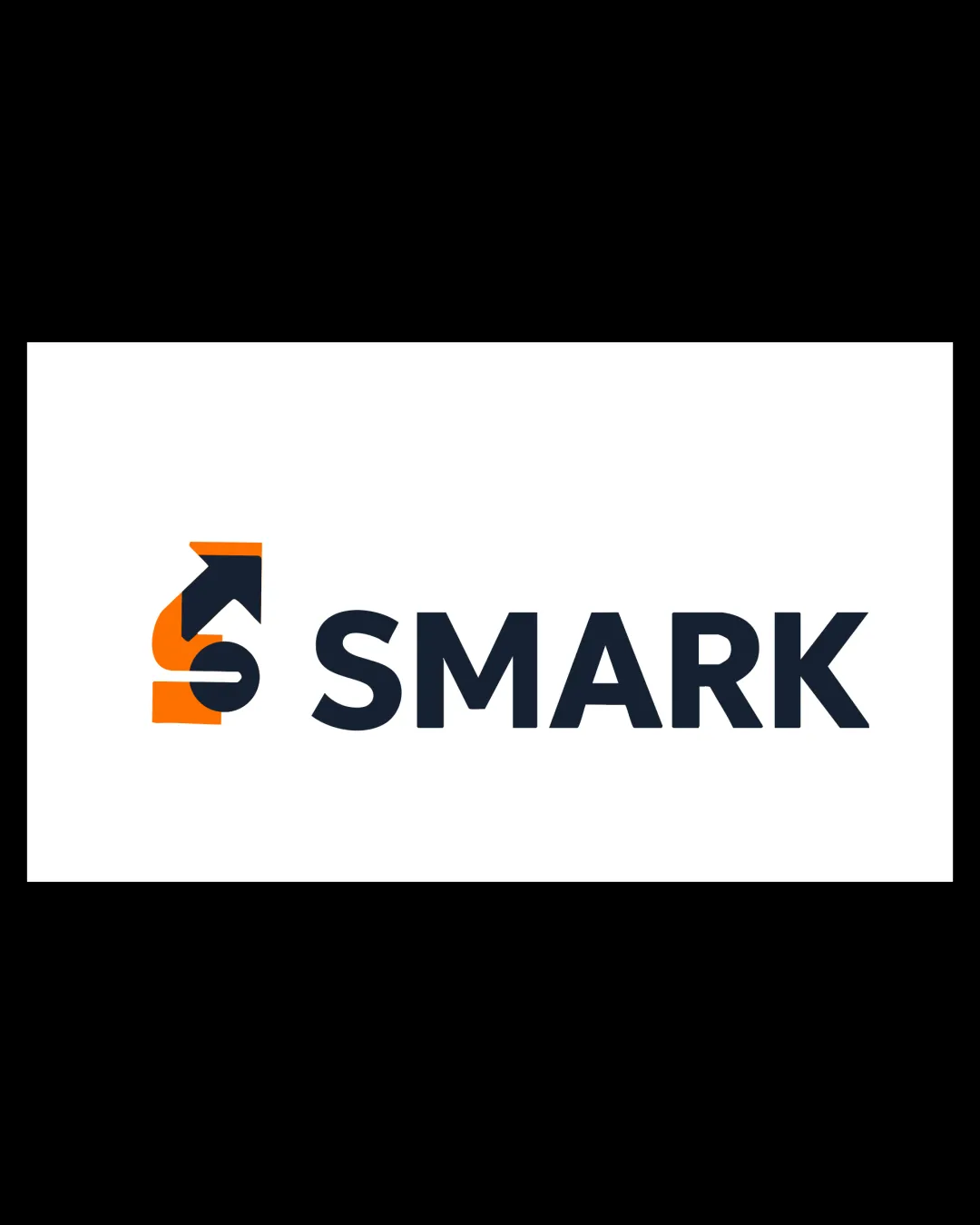
Logo review ofSmark
Review the detailed scores below to see what is working and what should be refined first.
Legibility
Originality
Misread
Balance
Scale
Detailed review
Logo performance breakdown
Legibility
![]() Text is highly readable due to bold, sans-serif font and strong contrast.
Text is highly readable due to bold, sans-serif font and strong contrast.![]() No unnecessary decoration or flourishes on the wordmark.
No unnecessary decoration or flourishes on the wordmark.
Originality
![]() Smart integration of an upward arrow within the S demonstrates thematic relevance.
Smart integration of an upward arrow within the S demonstrates thematic relevance.![]() Custom approach to the S rather than using a standard typeface.
Custom approach to the S rather than using a standard typeface.
![]() Arrow-in-letter concepts are somewhat common in the finance and technology sectors, which makes complete originality elusive.
Arrow-in-letter concepts are somewhat common in the finance and technology sectors, which makes complete originality elusive.
Color harmony
![]() Well-balanced two-color scheme increases impact and maintains professional feel.
Well-balanced two-color scheme increases impact and maintains professional feel.![]() Sufficient contrast between both logo and background.
Sufficient contrast between both logo and background.
Orange
#FF8500
Dark Blue
#222C36
White
#FFFFFF
Balance alignment
![]() Good alignment between symbol and wordmark; spacing is consistent.
Good alignment between symbol and wordmark; spacing is consistent.![]() Strong horizontal balance with centralized emphasis.
Strong horizontal balance with centralized emphasis.
![]() The boldness disparity between the thick 'S' symbol and the wordmark makes the symbol feel heavier than the text.
The boldness disparity between the thick 'S' symbol and the wordmark makes the symbol feel heavier than the text.

Scalability
![]() Logo maintains clarity at small sizes; simple shapes allow for effective scaling.
Logo maintains clarity at small sizes; simple shapes allow for effective scaling.![]() Effective for use on business cards, mobile app icons, and digital interfaces.
Effective for use on business cards, mobile app icons, and digital interfaces.
![]() Arrow within the S could lose definition at extremely small sizes, particularly in embroidery or favicon use.
Arrow within the S could lose definition at extremely small sizes, particularly in embroidery or favicon use.
200x250 px
100×125 px
50×62 px
Misinterpretations
![]() No accidental inappropriate themes or visual confusion detected.
No accidental inappropriate themes or visual confusion detected.
Symbol & text fit
![]() Both elements share similar line weights and geometric styling, creating visual harmony.
Both elements share similar line weights and geometric styling, creating visual harmony.
![]() The symbol may slightly overpower the wordmark in terms of color and weight, leading to minor imbalance.
The symbol may slightly overpower the wordmark in terms of color and weight, leading to minor imbalance.
Try your own review
Review my logo
Wondering how your logo performs?
Get a clear logo score, key risks, and priority fix ideas before your client or audience sees it.
Keep exploring


