Wondering how your logo performs? 🧐
Get professional logo reviews in seconds and catch design issues in time.
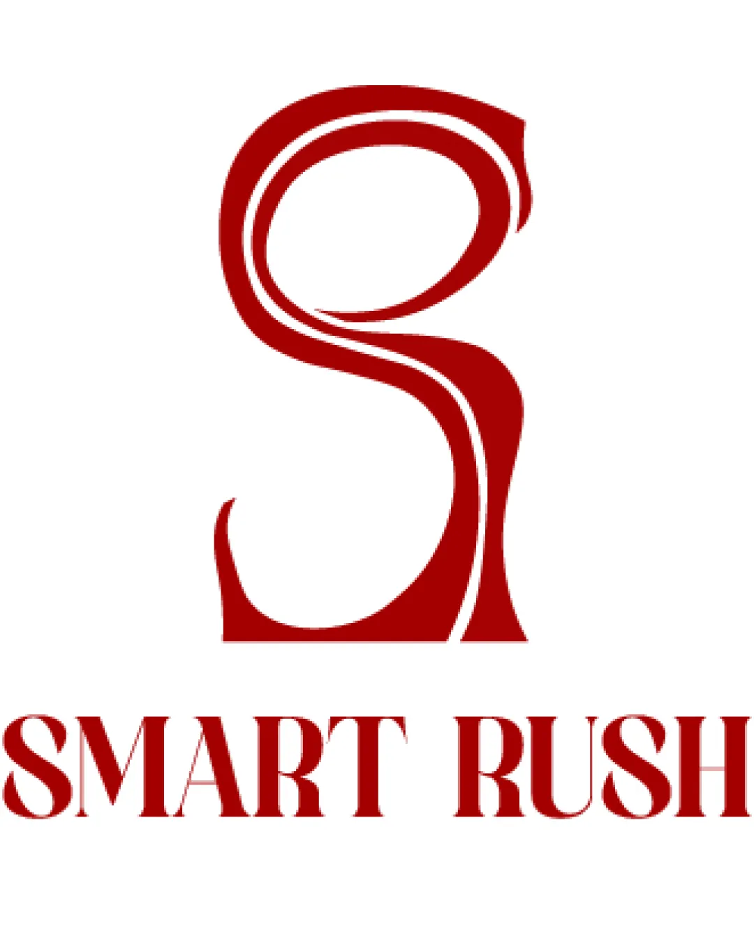
Try it Now!Logo review of SMART RUSH
 Logo analysis by AI
Logo type:
Style:
Detected symbol:
Detected text:
Business industry:
Review requested by Yusrosee
**If AI can recognize or misinterpret it, so can people.
Structured logo review
Legibility
![]() The words 'SMART RUSH' are generally clear, capitalized, and easy to distinguish.
The words 'SMART RUSH' are generally clear, capitalized, and easy to distinguish.![]() Contrast between red text and white background is strong.
Contrast between red text and white background is strong.
![]() Decorative serifs and unusual letter shapes in the wordmark slightly reduce immediate legibility, especially in fast glances or at smaller sizes.
Decorative serifs and unusual letter shapes in the wordmark slightly reduce immediate legibility, especially in fast glances or at smaller sizes.
Scalability versatility
![]() Simple color palette allows for easy reproduction in print and digital applications.
Simple color palette allows for easy reproduction in print and digital applications.![]() Main elements (S symbol and text) are distinct at medium and larger sizes.
Main elements (S symbol and text) are distinct at medium and larger sizes.
![]() Fine internal details/lines within the 'S' symbol may blur or disappear at small sizes (e.g., business cards, app icons).
Fine internal details/lines within the 'S' symbol may blur or disappear at small sizes (e.g., business cards, app icons).![]() Extremely thin serifs in wordmark could cause print issues on some surfaces like embroidery or at very small scales.
Extremely thin serifs in wordmark could cause print issues on some surfaces like embroidery or at very small scales.
200x250 px
100×125 px
50×62 px
Balance alignment
![]() Overall vertical structure is centered and symmetrical.
Overall vertical structure is centered and symmetrical.![]() The visual weight of the S monogram is roughly aligned to the wordmark below.
The visual weight of the S monogram is roughly aligned to the wordmark below.
![]() 'S' monogram feels top-heavy and much larger than the wordmark, creating mild disproportion.
'S' monogram feels top-heavy and much larger than the wordmark, creating mild disproportion.![]() Spacing between logomark and wordmark is awkward; adjustment could lead to better harmony.
Spacing between logomark and wordmark is awkward; adjustment could lead to better harmony.

Originality
![]() Stylized treatment of the S monogram offers a slightly unique twist with flowing inner lines.
Stylized treatment of the S monogram offers a slightly unique twist with flowing inner lines.![]() Wordmark uses less common decorative serif font.
Wordmark uses less common decorative serif font.
![]() S monogram is a widely used motif and does not strongly differentiate the brand.
S monogram is a widely used motif and does not strongly differentiate the brand.![]() No clear symbolism other than representing an S; solution feels safe and not highly inventive.
No clear symbolism other than representing an S; solution feels safe and not highly inventive.
Logomark wordmark fit
![]() Both mark and text share the same red hue, achieving some cohesiveness.
Both mark and text share the same red hue, achieving some cohesiveness.![]() Decorative nature of the 'S' is somewhat echoed in the stylized wordmark serif.
Decorative nature of the 'S' is somewhat echoed in the stylized wordmark serif.
![]() The fluid, organic curves of the logomark clash with the rigid, geometric serifs of the wordmark.
The fluid, organic curves of the logomark clash with the rigid, geometric serifs of the wordmark.![]() Visual proportion and contrast between the mark and text are off-balance, with the S dominating the overall composition.
Visual proportion and contrast between the mark and text are off-balance, with the S dominating the overall composition.
Aesthetic look
![]() The logo has a striking presence and draws the eye, mainly due to the large S monogram.
The logo has a striking presence and draws the eye, mainly due to the large S monogram.![]() Red on white is bold and professional.
Red on white is bold and professional.
![]() Overall, the logo feels outdated due to heavy serif use and decorative excess.
Overall, the logo feels outdated due to heavy serif use and decorative excess.![]() The flowy lines in the logomark, mixed with geometric serifs, create stylistic inconsistency.
The flowy lines in the logomark, mixed with geometric serifs, create stylistic inconsistency.
Dual meaning and misinterpretations
![]() No immediate inappropriate or confusing imagery present.
No immediate inappropriate or confusing imagery present.
![]() Curved internal lines within the S may appear as an abstract swirl or unrelated shape, which might dilute intended brand messaging.
Curved internal lines within the S may appear as an abstract swirl or unrelated shape, which might dilute intended brand messaging.
Color harmony
![]() Limited to two main colors, ensuring visual harmony and easy brand consistency.
Limited to two main colors, ensuring visual harmony and easy brand consistency.![]() Red on white provides strong contrast and clarity.
Red on white provides strong contrast and clarity.
Red
#A80000
White
#FFFFFF


