 View review
Logo score
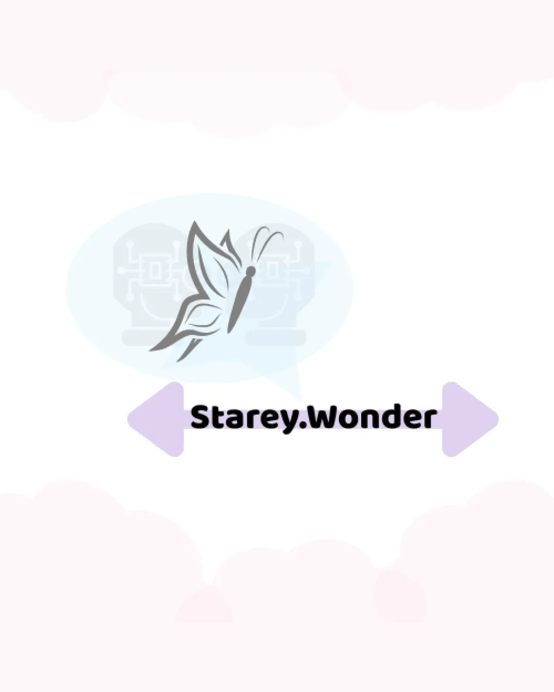
Logo review ofStarey.wonder
Review the detailed scores below to see what is working and what should be refined first.
Legibility
Originality
Misread
Balance
Scale
Detailed review
Logo performance breakdown
Legibility
![]() Text is bold, clear, and easy to read.
Text is bold, clear, and easy to read.![]() Sufficient contrast between text and background.
Sufficient contrast between text and background.
![]() Period in the business name could cause confusion or be misread as a separator.
Period in the business name could cause confusion or be misread as a separator.
Originality
![]() Unique combination of butterfly with microphone circuitry.
Unique combination of butterfly with microphone circuitry.![]() Subtle negative space usage with tech-inspired microphones within speech bubble.
Subtle negative space usage with tech-inspired microphones within speech bubble.
![]() Butterfly and microphone elements are common industry metaphors and could appear generic.
Butterfly and microphone elements are common industry metaphors and could appear generic.![]() Combination relies too much on literal representation.
Combination relies too much on literal representation.
Color harmony
![]() Colors are light and pleasant, not overwhelming.
Colors are light and pleasant, not overwhelming.![]() Consistent pastel palette for a cohesive look.
Consistent pastel palette for a cohesive look.
![]() Slight loss of boldness and impact due to low-contrast pastel shades.
Slight loss of boldness and impact due to low-contrast pastel shades.![]() Multiple shades used with gradients and backgrounds reduce versatility.
Multiple shades used with gradients and backgrounds reduce versatility.
DoveGray
#464646
PaleSkyBlue
#B8E8F6
Lavender
#C4B2F6
WhiteSmoke
#FDF6F7
Your palette is close. Explore sharper color combinations with Colorfly.design before updating the logo.
Explore palettesBalance alignment
![]() Main elements are horizontally aligned with clear central focus.
Main elements are horizontally aligned with clear central focus.
![]() Butterfly symbol and text feel disconnected due to large space and speech bubble placement.
Butterfly symbol and text feel disconnected due to large space and speech bubble placement.![]() Directional arrows left and right disrupt overall centering and cause slight imbalance.
Directional arrows left and right disrupt overall centering and cause slight imbalance.

Scalability
![]() Bold text should reproduce well at various sizes.
Bold text should reproduce well at various sizes.
![]() Butterfly symbol and background circuit microphones contain fine lines and overlapping elements that will lose clarity at small sizes (e.g., business cards, favicons, embroidery).
Butterfly symbol and background circuit microphones contain fine lines and overlapping elements that will lose clarity at small sizes (e.g., business cards, favicons, embroidery).![]() Gradient effects in the background contribute to reproduction issues.
Gradient effects in the background contribute to reproduction issues.
200x250 px
100×125 px
50×62 px
Misinterpretations
![]() No unintended inappropriate shapes detected.
No unintended inappropriate shapes detected.![]() Imagery clearly relates to creativity, communication, or media.
Imagery clearly relates to creativity, communication, or media.
Symbol & text fit
![]() Symbol and wordmark style are somewhat compatible in modernity.
Symbol and wordmark style are somewhat compatible in modernity.
![]() No strong integration between symbol and wordmark.
No strong integration between symbol and wordmark.
![]() Visual gap and styling don't fully unify both components—the logomark has intricate detail while the wordmark is much simpler.
Visual gap and styling don't fully unify both components—the logomark has intricate detail while the wordmark is much simpler.
Try your own review
Review my logo
Wondering how your logo performs?
Get a clear logo score, key risks, and priority fix ideas before your client or audience sees it.
Keep exploring


