 View review
Logo score
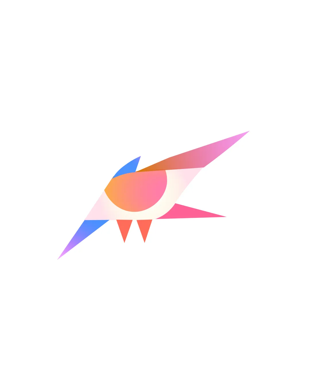
Logo review ofStylized Geometric Bird Shape
Review the detailed scores below to see what is working and what should be refined first.
Originality
Misread
Balance
Scale
Detailed review
Logo performance breakdown
Originality
![]() Unique stylization of a bird with abstract geometric planes.
Unique stylization of a bird with abstract geometric planes.![]() Effective use of color blending and overlapping forms for visual interest.
Effective use of color blending and overlapping forms for visual interest.
![]() Bird symbols are widely used in branding; while well executed, it's not a radically new concept.
Bird symbols are widely used in branding; while well executed, it's not a radically new concept.
Color harmony
![]() Gradient transitions are smooth and colors complement each other.
Gradient transitions are smooth and colors complement each other.![]() Balanced use of cool (blue, purple) and warm (orange, pink) hues.
Balanced use of cool (blue, purple) and warm (orange, pink) hues.
![]() Four-color gradient may limit monochrome adaptability.
Four-color gradient may limit monochrome adaptability.
Light Red
#EC6F66
Light Orange
#FDB99B
Light Purple
#9272FF
Light Blue
#43C6AC
Your palette is close. Explore sharper color combinations with Colorfly.design before updating the logo.
Explore palettesBalance alignment
![]() Overall form achieves good visual balance with dynamic angles and negative space.
Overall form achieves good visual balance with dynamic angles and negative space.![]() Weight is evenly distributed between the tail, wing, and beak.
Weight is evenly distributed between the tail, wing, and beak.
![]() The rightward extension feels slightly heavier, creating mild tension in asymmetry.
The rightward extension feels slightly heavier, creating mild tension in asymmetry.

Scalability
![]() Simple geometric shapes retain clarity at medium sizes.
Simple geometric shapes retain clarity at medium sizes.![]() Distinct, memorable silhouette.
Distinct, memorable silhouette.
![]() Thin, sharp points may disappear or blend when reduced to favicon or embroidery scale.
Thin, sharp points may disappear or blend when reduced to favicon or embroidery scale.![]() Gradient effect may not reproduce well in monochrome or single-color applications.
Gradient effect may not reproduce well in monochrome or single-color applications.
200x250 px
100×125 px
50×62 px
Misinterpretations
![]() Clear representation of a stylized bird without inappropriate or confusing secondary imagery.
Clear representation of a stylized bird without inappropriate or confusing secondary imagery.
Try your own review
Review my logo
Wondering how your logo performs?
Get a clear logo score, key risks, and priority fix ideas before your client or audience sees it.
Keep exploring


