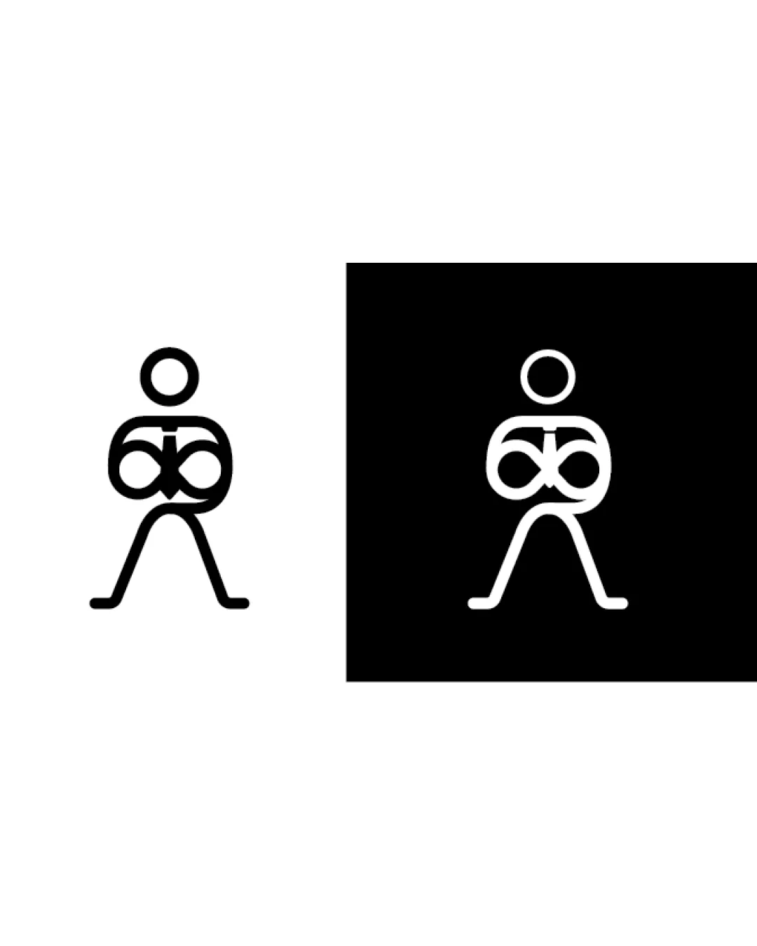
Wondering how your logo performs? 🧐
Get professional logo reviews in seconds and catch design issues in time.
Try it Now!Logo review of stylized seashell with water droplet

 Logo analysis by AI
Logo type:
Style:
Detected symbol:
Business industry:
Review requested by Tiew049605
**If AI can recognize or misinterpret it, so can people.
Structured logo review
Scalability versatility
Simple shapes and solid color make it highly scalable for small to large formats.
Would reproduce well on business cards, websites, app icons, and large banners.

200x250 px

100×125 px

50×62 px
Balance alignment
Overall composition feels balanced with vertical alignment of seashell and water droplet.
The slight asymmetry in the upper shape may visually offset balance when placed next to horizontal or rectangular objects.


Originality
Combination of seashell and droplet is an uncommon pairing, offering thematic distinction.
Minimalist approach avoids overused water-only or shell-only icons.
Symbolic simplicity may border on generic for broad aquatic contexts.
Aesthetic look
Clean, modern aesthetic with appealing curves and proportional placements.
Minimal decoration maintains a professional and elegant look.
Dual meaning and misinterpretations
Symbol is clear and does not unintentionally resemble inappropriate or unrelated imagery.
Color harmony
Excellent use of a single, harmonious blue background with a contrasting white symbol.
Color palette emphasizes purity and clarity, appropriate for water-related industries.
Havelock Blue
#2684C6
White
#FFFFFF


