 View review
Logo score
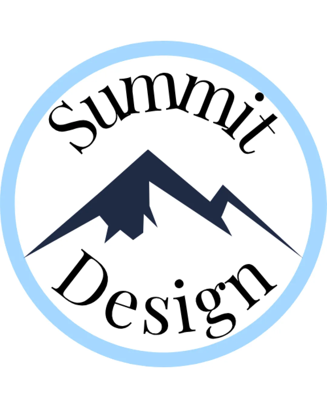
Logo review ofSummit Design
Review the detailed scores below to see what is working and what should be refined first.
Legibility
Originality
Misread
Balance
Scale
Detailed review
Logo performance breakdown
Legibility
![]() Text is large and clearly visible against a white background.
Text is large and clearly visible against a white background.![]() Font is distinct and not overly stylized.
Font is distinct and not overly stylized.
![]() The arched placement and inconsistent spacing of the text disrupts natural reading flow.
The arched placement and inconsistent spacing of the text disrupts natural reading flow.![]() The curved arrangement and varying font sizing may make quick reading less intuitive.
The curved arrangement and varying font sizing may make quick reading less intuitive.![]() Word placement (top and bottom) creates a break that interrupts legibility in some uses.
Word placement (top and bottom) creates a break that interrupts legibility in some uses.
Originality
![]() Uses a mountain as a direct reference to 'Summit', which offers some relevance.
Uses a mountain as a direct reference to 'Summit', which offers some relevance.
![]() Mountain silhouette is generic and very commonly used in similar industries.
Mountain silhouette is generic and very commonly used in similar industries.![]() Overall design doesn’t introduce unique elements or creative integration of text/symbol.
Overall design doesn’t introduce unique elements or creative integration of text/symbol.![]() Lack of creative negative space use or any distinctive style treatment.
Lack of creative negative space use or any distinctive style treatment.
Color harmony
![]() Minimal color usage keeps things clean.
Minimal color usage keeps things clean.![]() Good contrast between background, text, and symbol.
Good contrast between background, text, and symbol.
![]() Inner circle's pale blue feels disconnected from the harshness of the dark blue mountain and black type.
Inner circle's pale blue feels disconnected from the harshness of the dark blue mountain and black type.![]() Color choice doesn't particularly reinforce brand personality.
Color choice doesn't particularly reinforce brand personality.
Cetacean Blue
#22293D
Pale Blue
#B8E1FF
White
#FFFFFF
Black
#000000
Your palette is close. Explore sharper color combinations with Colorfly.design before updating the logo.
Explore palettesBalance alignment
![]() Logo is contained by a circular boundary suggesting unity.
Logo is contained by a circular boundary suggesting unity.
![]() Text feels forced around the circle; uneven letter spacing and inconsistent distance from the border.
Text feels forced around the circle; uneven letter spacing and inconsistent distance from the border.![]() Mountain symbol dominates the center but may not be vertically centered relative to both words, creating awkward negative space.
Mountain symbol dominates the center but may not be vertically centered relative to both words, creating awkward negative space.![]() Visual hierarchy feels split—mountain and text both compete for focal point rather than working in harmony.
Visual hierarchy feels split—mountain and text both compete for focal point rather than working in harmony.

Scalability
![]() Simple mountain form is clean and could reduce well.
Simple mountain form is clean and could reduce well.![]() Limited color palette aids reproduction in many mediums.
Limited color palette aids reproduction in many mediums.
![]() Thin blue circular outline may disappear or blur at small sizes.
Thin blue circular outline may disappear or blur at small sizes.![]() Arched text becomes very hard to read at favicon or embroidery scales.
Arched text becomes very hard to read at favicon or embroidery scales.![]() Proportions and detail loss would be an issue on small merchandise or pens.
Proportions and detail loss would be an issue on small merchandise or pens.
200x250 px
100×125 px
50×62 px
Misinterpretations
![]() No inappropriate or confusing symbolism detected. The mountain is clear and unambiguous.
No inappropriate or confusing symbolism detected. The mountain is clear and unambiguous.
Symbol & text fit
![]() Logomark and wordmark are grouped within the same circular container.
Logomark and wordmark are grouped within the same circular container.
![]() Clashing styles: geometric/abstract mountain versus serif typeface.
Clashing styles: geometric/abstract mountain versus serif typeface.
![]() Proportions between logomark and wordmark are not harmonious; the symbol dominates and the words feel “pushed” to the border.
Proportions between logomark and wordmark are not harmonious; the symbol dominates and the words feel “pushed” to the border.
Try your own review
Review my logo
Wondering how your logo performs?
Get a clear logo score, key risks, and priority fix ideas before your client or audience sees it.
Keep exploring


