Wondering how your logo performs? 🧐
Get professional logo reviews in seconds and catch design issues in time.
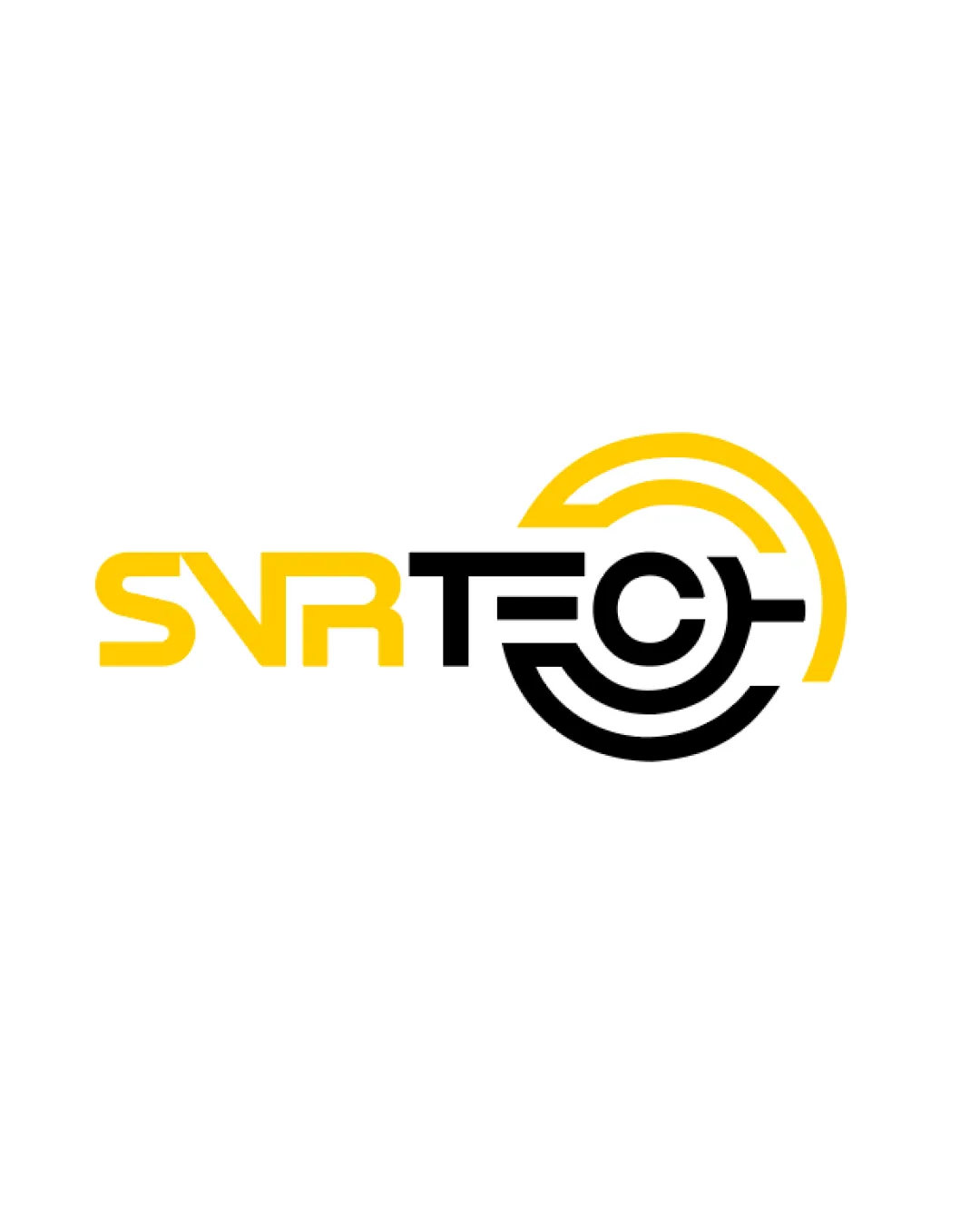
Try it Now!Logo review of SVR TECH
 Logo analysis by AI
Logo type:
Style:
Detected symbol:
Negative space:
Detected text:
Business industry:
Review requested by Melih
**If AI can recognize or misinterpret it, so can people.
Structured logo review
Legibility
![]() The primary text 'SVR TECH' is mostly clear and easy to read.
The primary text 'SVR TECH' is mostly clear and easy to read.![]() Contrasting colors increase readability.
Contrasting colors increase readability.
![]() The stylized geometric 'C' in 'TECH' may take an extra moment to recognize as a letter, especially at smaller scales.
The stylized geometric 'C' in 'TECH' may take an extra moment to recognize as a letter, especially at smaller scales.![]() Unusual spacing between the 'S', 'V', 'R' might cause a minor break in visual flow.
Unusual spacing between the 'S', 'V', 'R' might cause a minor break in visual flow.
Scalability versatility
![]() Simplicity of the mark lends itself to use on large digital/banner applications.
Simplicity of the mark lends itself to use on large digital/banner applications.![]() Bold lines ensure decent visibility at moderate sizes.
Bold lines ensure decent visibility at moderate sizes.
![]() Fine concentric and intersecting lines within the 'C' could blur or lose detail on very small merchandise (like favicons, business cards, or embroidery).
Fine concentric and intersecting lines within the 'C' could blur or lose detail on very small merchandise (like favicons, business cards, or embroidery).![]() Logo may become busy or illegible at very small scales.
Logo may become busy or illegible at very small scales.
200x250 px
100×125 px
50×62 px
Balance alignment
![]() Horizontal alignment and distribution feel intentional.
Horizontal alignment and distribution feel intentional.![]() Geometric elements create visual balance across the design.
Geometric elements create visual balance across the design.
![]() Visual weight of the circular 'C' is much heavier than the rest of the text, causing a slight imbalance.
Visual weight of the circular 'C' is much heavier than the rest of the text, causing a slight imbalance.![]() The yellow 'SVR' and black 'TECH' creates a split that might feel discontinuous.
The yellow 'SVR' and black 'TECH' creates a split that might feel discontinuous.

Originality
![]() Strong integration of geometric/radar symbolism with a tech wordmark.
Strong integration of geometric/radar symbolism with a tech wordmark.![]() Custom treatment of the 'C' makes the logo distinctive.
Custom treatment of the 'C' makes the logo distinctive.
![]() Using concentric lines and circular motifs is common in technology logos, so while the execution is strong, the concept itself isn’t entirely unique.
Using concentric lines and circular motifs is common in technology logos, so while the execution is strong, the concept itself isn’t entirely unique.![]() Letter-based integration is clever but not unprecedented.
Letter-based integration is clever but not unprecedented.
Logomark wordmark fit
![]() Circular geometric mark is directly integrated into the wordmark, providing cohesiveness.
Circular geometric mark is directly integrated into the wordmark, providing cohesiveness.![]() Styles and line-weights are visually compatible.
Styles and line-weights are visually compatible.
![]() Heavier circular 'C' may overpower the lighter left-side text.
Heavier circular 'C' may overpower the lighter left-side text.![]() Transition between the linear font and the circular symbol could be smoother.
Transition between the linear font and the circular symbol could be smoother.
Aesthetic look
![]() Bold, high-contrast palette and clean geometric construction feel modern and professional.
Bold, high-contrast palette and clean geometric construction feel modern and professional.![]() Sleek and minimal visual style suitable for a tech brand.
Sleek and minimal visual style suitable for a tech brand.
![]() Slight overcrowding where the geometric elements overlap causes minor visual busyness.
Slight overcrowding where the geometric elements overlap causes minor visual busyness.![]() Sharp deviation in font weights/line widths between 'SVR' and the rest of the logo introduces some aesthetic discord.
Sharp deviation in font weights/line widths between 'SVR' and the rest of the logo introduces some aesthetic discord.
Dual meaning and misinterpretations
![]() No inappropriate or accidental imagery detected.
No inappropriate or accidental imagery detected.![]() Symbolic meaning aligns well with the concept of technology and radar/electronics.
Symbolic meaning aligns well with the concept of technology and radar/electronics.
Color harmony
![]() Two-tone color palette is clear, direct, and industry-appropriate.
Two-tone color palette is clear, direct, and industry-appropriate.![]() Strong color contrast supports both legibility and aesthetics.
Strong color contrast supports both legibility and aesthetics.
Yellow
#FFD100
Black
#000000
White
#FFFFFF


