Wondering how your logo performs? 🧐
Get professional logo reviews in seconds and catch design issues in time.
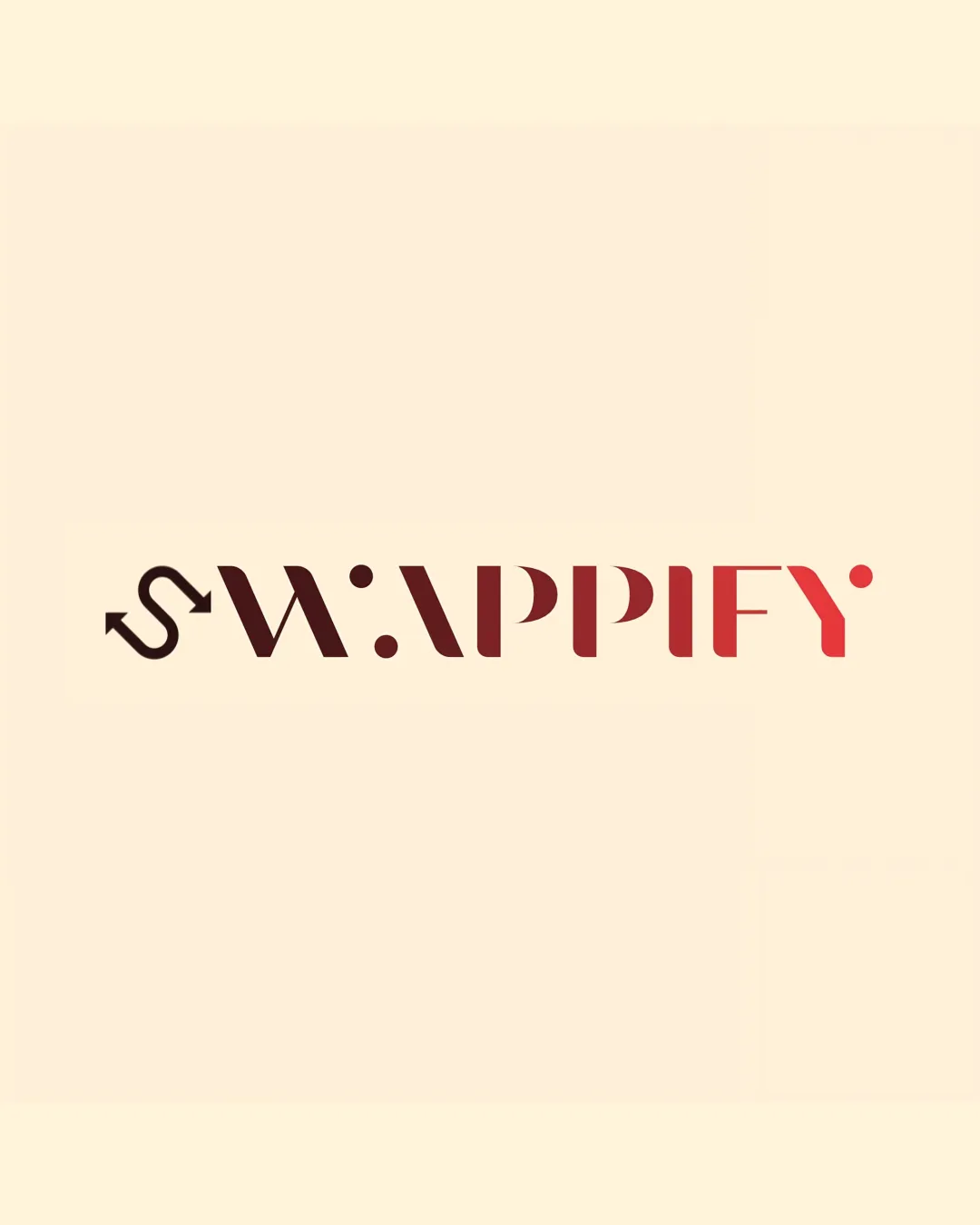
Try it Now!Logo review of SWAPPIFY
 Logo analysis by AI
Recognized style:
Logo type:
Detected symbol:
Detected text:
Business industry:
Review requested by MichaelJack
**If AI can recognize or misinterpret it, so can people.
Structured logo review
Legibility
![]() The business name is clearly readable.
The business name is clearly readable.
![]() The stylized letters may cause minor legibility issues.
The stylized letters may cause minor legibility issues.
Scalability versatility
![]() Simple design allows for versatility across different media.
Simple design allows for versatility across different media.
![]() The thin lines in the 'S' may become less visible at smaller sizes.
The thin lines in the 'S' may become less visible at smaller sizes.
200x250 px
100×125 px
50×62 px
Balance alignment
![]() The logo is generally well-balanced.
The logo is generally well-balanced.
![]() The dot and arrow may slightly disrupt visual balance.
The dot and arrow may slightly disrupt visual balance.

Originality
![]() The integration of the arrow in the 'S' is creative.
The integration of the arrow in the 'S' is creative.
![]() The overall style is somewhat common in modern tech brands.
The overall style is somewhat common in modern tech brands.
Aesthetic look
![]() The logo has a sleek, modern look.
The logo has a sleek, modern look.
![]() Some elements might seem over-stylized to certain audiences.
Some elements might seem over-stylized to certain audiences.
Cultural sensitivity dual meaning
![]() No cultural sensitivity issues detected.
No cultural sensitivity issues detected.
Color harmony
![]() The gradient works well with the modern design.
The gradient works well with the modern design.
![]() The two-tone color scheme might feel limited.
The two-tone color scheme might feel limited.


