 View review
Logo score
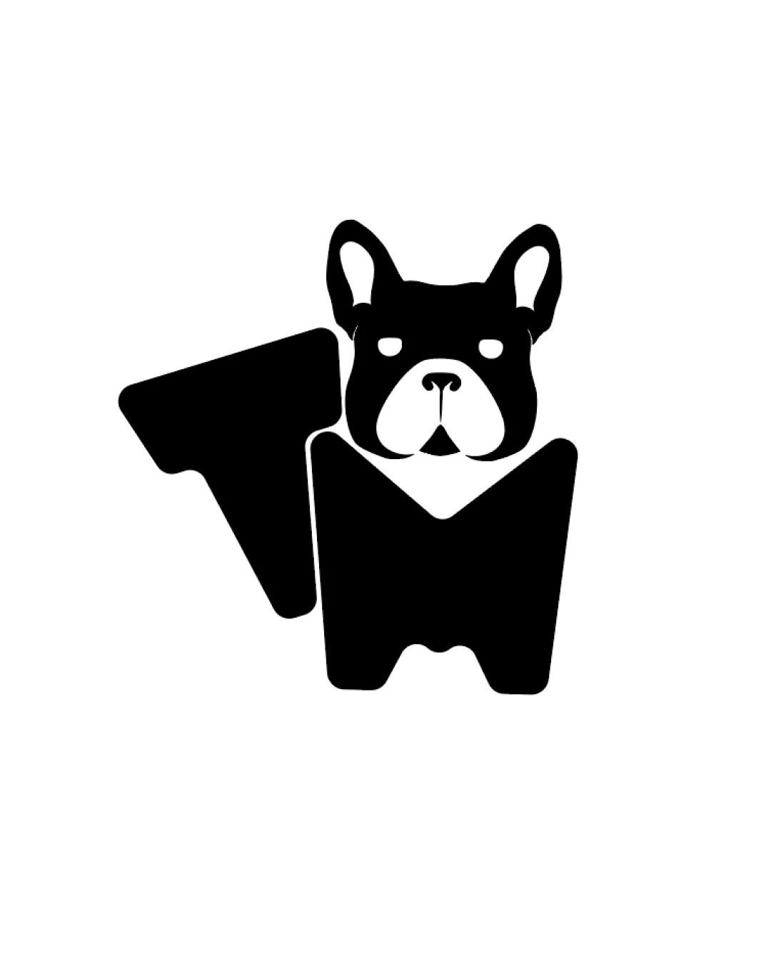
Logo review ofT, M
Review the detailed scores below to see what is working and what should be refined first.
Legibility
Originality
Misread
Balance
Scale
Detailed review
Logo performance breakdown
Legibility
![]() Stylized letters 'T' and 'M' are distinguishable when viewed closely.
Stylized letters 'T' and 'M' are distinguishable when viewed closely.![]() Dog features are clear and recognizable.
Dog features are clear and recognizable.
![]() The 'T' and 'M' integration may not be instantly readable to new viewers, especially at small sizes.
The 'T' and 'M' integration may not be instantly readable to new viewers, especially at small sizes.![]() Letter shapes could be mistaken for abstract shapes before realizing their intent.
Letter shapes could be mistaken for abstract shapes before realizing their intent.
Originality
![]() Clever fusion of pet imagery with custom geometric letterforms.
Clever fusion of pet imagery with custom geometric letterforms.![]() Distinctive execution not often seen in pet-industry logos.
Distinctive execution not often seen in pet-industry logos.
Color harmony
![]() Monochrome palette is timeless and adaptable to any brand color scheme.
Monochrome palette is timeless and adaptable to any brand color scheme.![]() Strong contrast enhances clarity and sophistication.
Strong contrast enhances clarity and sophistication.
Black
#000000
White
#FFFFFF
Balance alignment
![]() Composition maintains central symmetry vertically.
Composition maintains central symmetry vertically.![]() Weight distribution of black and white areas is fairly even.
Weight distribution of black and white areas is fairly even.
![]() The 'T' on the left visually feels less integrated and slightly drags the composition leftward.
The 'T' on the left visually feels less integrated and slightly drags the composition leftward.![]() Dog’s head and body merge with the ‘M’, creating minor imbalance and crowding at the union.
Dog’s head and body merge with the ‘M’, creating minor imbalance and crowding at the union.

Scalability
![]() Minimal use of detail allows for solid scalability across different media.
Minimal use of detail allows for solid scalability across different media.![]() Will work well for embroidery, stamps, website favicons, and packaging.
Will work well for embroidery, stamps, website favicons, and packaging.
![]() Finer facial elements might lose clarity at extremely small sizes.
Finer facial elements might lose clarity at extremely small sizes.![]() Could lack impact on very large outdoor signage where the compactness lessens visual spread.
Could lack impact on very large outdoor signage where the compactness lessens visual spread.
200x250 px
100×125 px
50×62 px
Misinterpretations
![]() No obvious inappropriate connotations or accidental negative symbolism.
No obvious inappropriate connotations or accidental negative symbolism.
Try your own review
Review my logo
Wondering how your logo performs?
Get a clear logo score, key risks, and priority fix ideas before your client or audience sees it.
Keep exploring


