Wondering how your logo performs? 🧐
Get professional logo reviews in seconds and catch design issues in time.
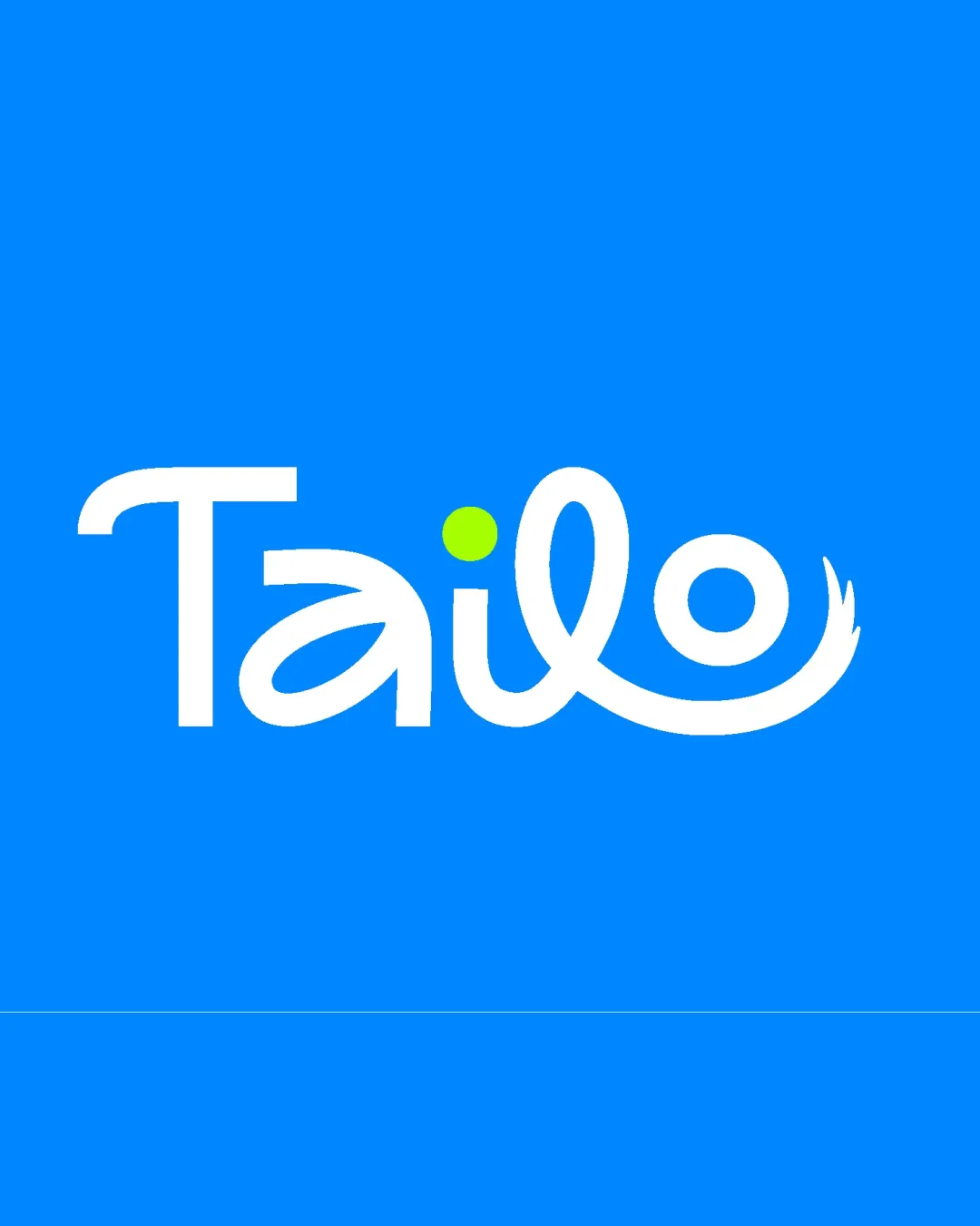
Try it Now!Logo review of Tailo
 Logo analysis by AI
Logo type:
Style:
Detected symbol:
Detected text:
Business industry:
Review requested by Yarden.arad
**If AI can recognize or misinterpret it, so can people.
Structured logo review
Legibility
![]() Most letters are distinct and readable.
Most letters are distinct and readable.![]() The playful form attracts attention and creates a memorable identity.
The playful form attracts attention and creates a memorable identity.
![]() The swash integration in the 'l' and 'o' may cause momentary confusion when reading at a glance.
The swash integration in the 'l' and 'o' may cause momentary confusion when reading at a glance.![]() The rounded, script-like connection between 'l' and 'o' slightly impacts quick readability, especially at small sizes.
The rounded, script-like connection between 'l' and 'o' slightly impacts quick readability, especially at small sizes.
Scalability versatility
![]() Simplified design should scale well on most signage and digital applications.
Simplified design should scale well on most signage and digital applications.![]() Limited color palette aids in versatility.
Limited color palette aids in versatility.
![]() Thin curve details, particularly in the 'o' tail, could be lost at very small sizes such as business cards or app icons.
Thin curve details, particularly in the 'o' tail, could be lost at very small sizes such as business cards or app icons.![]() The green dot might become unclear or shrink excessively at tiny sizes.
The green dot might become unclear or shrink excessively at tiny sizes.
200x250 px
100×125 px
50×62 px
Balance alignment
![]() Visually balanced overall, with playful yet controlled movement across the word.
Visually balanced overall, with playful yet controlled movement across the word.![]() Symmetrical weight in the larger starting 'T' and the ending swash tail.
Symmetrical weight in the larger starting 'T' and the ending swash tail.
![]() The 'o' tail element gives some visual heaviness to the right, slightly throwing off perfect lateral balance.
The 'o' tail element gives some visual heaviness to the right, slightly throwing off perfect lateral balance.

Originality
![]() The integration of a tail into the 'o' is clever and relevant, contributing to brand personality.
The integration of a tail into the 'o' is clever and relevant, contributing to brand personality.![]() The stylized script adds a distinctive, whimsical touch.
The stylized script adds a distinctive, whimsical touch.
![]() Wordmarks with script connections are somewhat common in playful or tech brands—could push the form further for bold originality.
Wordmarks with script connections are somewhat common in playful or tech brands—could push the form further for bold originality.
Aesthetic look
![]() Clean execution with smooth curves and a fresh appearance.
Clean execution with smooth curves and a fresh appearance.![]() Attractive color selection communicates a modern, friendly vibe.
Attractive color selection communicates a modern, friendly vibe.
![]() The excessive curling could feel overly ornamental for some audiences.
The excessive curling could feel overly ornamental for some audiences.![]() Minor crowding occurs with the connection between 'l' and 'o'.
Minor crowding occurs with the connection between 'l' and 'o'.
Dual meaning and misinterpretations
![]() No apparent inappropriate or misleading shapes.
No apparent inappropriate or misleading shapes.![]() Playful tail reference is clear and positive.
Playful tail reference is clear and positive.
Color harmony
![]() Limited, harmonious palette that is visually appealing and contemporary.
Limited, harmonious palette that is visually appealing and contemporary.![]() Strong contrast with background ensures text is clear.
Strong contrast with background ensures text is clear.
Blue
#0795FF
White
#FFFFFF
Lime Green
#95D600


