 View review
Logo score
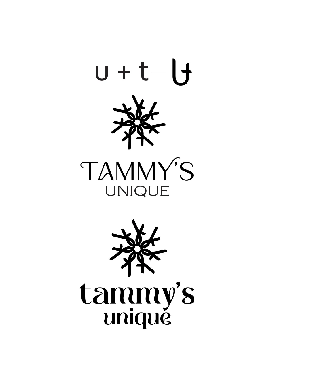
Logo review ofTammy's Unique, Tammy's Unique
Review the detailed scores below to see what is working and what should be refined first.
Legibility
Originality
Misread
Balance
Scale
Detailed review
Logo performance breakdown
Legibility
![]() Both uppercase and lowercase versions maintain clear and readable letterforms.
Both uppercase and lowercase versions maintain clear and readable letterforms.![]() Text doesn't blend with the intricate symbol above it, maintaining separation.
Text doesn't blend with the intricate symbol above it, maintaining separation.
![]() The stylized font in the second version, especially the lowercase 'm', might reduce instant readability for some viewers.
The stylized font in the second version, especially the lowercase 'm', might reduce instant readability for some viewers.
Originality
![]() Creative integration of letters 'u', 't', and 'U' into a unique snowflake/star symbol.
Creative integration of letters 'u', 't', and 'U' into a unique snowflake/star symbol.![]() Memorable and non-generic concept, showing thoughtful design execution.
Memorable and non-generic concept, showing thoughtful design execution.![]() Smart use of negative space in the symbol.
Smart use of negative space in the symbol.
Color harmony
![]() Single color use ensures harmony and avoids clutter.
Single color use ensures harmony and avoids clutter.![]() Logo is adaptable for color reversals and overlays.
Logo is adaptable for color reversals and overlays.
Black
#000000
White
#FFFFFF
Balance alignment
![]() Both vertical and horizontal alignments are consistent between wordmark and logomark.
Both vertical and horizontal alignments are consistent between wordmark and logomark.![]() Top symbol and text stack are reasonably well-proportioned.
Top symbol and text stack are reasonably well-proportioned.
![]() In the first version, the thinness of the font does not entirely align visually with the thicker icon; slight cohesiveness is missing.
In the first version, the thinness of the font does not entirely align visually with the thicker icon; slight cohesiveness is missing.

Scalability
![]() Monochrome color palette ensures clarity in most applications.
Monochrome color palette ensures clarity in most applications.![]() Symbol and wordmark are distinct, working in tandem for horizontal and stacked layouts.
Symbol and wordmark are distinct, working in tandem for horizontal and stacked layouts.
![]() The intricate snowflake icon may become muddy or lose detail when scaled down significantly (e.g., favicons, embroidery).
The intricate snowflake icon may become muddy or lose detail when scaled down significantly (e.g., favicons, embroidery).![]() Thin lines and built-in detail reduce effectiveness at very small sizes.
Thin lines and built-in detail reduce effectiveness at very small sizes.
200x250 px
100×125 px
50×62 px
Misinterpretations
![]() No inappropriate or confusing visual double-meanings detected.
No inappropriate or confusing visual double-meanings detected.![]() Symbol is abstract but clear in intent.
Symbol is abstract but clear in intent.
Symbol & text fit
![]() Both fonts (serif and sans-serif) are compatible with the geometric style of the symbol.
Both fonts (serif and sans-serif) are compatible with the geometric style of the symbol.
![]() Symbol is distinctive and connects back to the wordmark through subtle geometry.
Symbol is distinctive and connects back to the wordmark through subtle geometry.
![]() The font style and weights could be better matched to the icon's thickness for increased unity.
The font style and weights could be better matched to the icon's thickness for increased unity.
Try your own review
Review my logo
Wondering how your logo performs?
Get a clear logo score, key risks, and priority fix ideas before your client or audience sees it.
Keep exploring


