Wondering how your logo performs? 🧐
Get professional logo reviews in seconds and catch design issues in time.
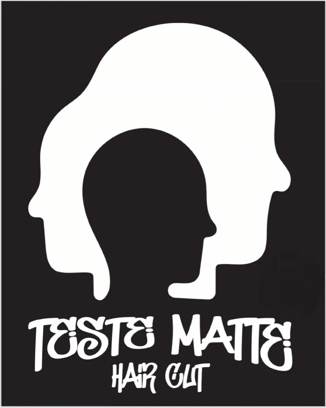
Try it Now!Logo review of TESTE MATTE HAIR CUT
 Logo analysis by AI
Logo type:
Style:
Detected symbol:
Negative space:
Detected text:
Business industry:
Review requested by Leonard
**If AI can recognize or misinterpret it, so can people.
Structured logo review
Legibility
![]() Distinctive letterforms in brand name
Distinctive letterforms in brand name![]() Large size and high contrast
Large size and high contrast
![]() Decorative, graffiti-style font is difficult to read especially at small sizes
Decorative, graffiti-style font is difficult to read especially at small sizes![]() Spacing and flourishes on letters reduce clarity; 'T', 'S', and 'A' are hard to recognize
Spacing and flourishes on letters reduce clarity; 'T', 'S', and 'A' are hard to recognize![]() 'HAIR CUT' is less legible due to thinner strokes
'HAIR CUT' is less legible due to thinner strokes
Scalability versatility
![]() Simple black/white color scheme is reproducible
Simple black/white color scheme is reproducible![]() Icon is recognizable at moderate scale
Icon is recognizable at moderate scale
![]() Thin details and overlapping heads lose clarity when reduced to favicon size or product labels
Thin details and overlapping heads lose clarity when reduced to favicon size or product labels![]() Graffiti text loses legibility on small print (e.g., business cards, embroidery)
Graffiti text loses legibility on small print (e.g., business cards, embroidery)![]() May not work well as an embroidered patch or engraved signage
May not work well as an embroidered patch or engraved signage
200x250 px
100×125 px
50×62 px
Balance alignment
![]() Visual mass is centered; overlapping heads create a sense of focus
Visual mass is centered; overlapping heads create a sense of focus![]() Text appears nearly centered under the logomark
Text appears nearly centered under the logomark
![]() Visual weight of upper graphic is heavy compared to smaller, lighter HAIR CUT text below
Visual weight of upper graphic is heavy compared to smaller, lighter HAIR CUT text below![]() Letter baseline is uneven, causing slightly chaotic feel
Letter baseline is uneven, causing slightly chaotic feel

Originality
![]() Creative, clever use of overlapping head silhouettes
Creative, clever use of overlapping head silhouettes![]() Memorable visual metaphor for diversity/style in haircuts
Memorable visual metaphor for diversity/style in haircuts![]() Distinctive urban/graffiti typeface adds personality
Distinctive urban/graffiti typeface adds personality
![]() Silhouette profile is not a highly unique concept in barbershop/haircut logos
Silhouette profile is not a highly unique concept in barbershop/haircut logos
Logomark wordmark fit
![]() Graffiti font matches urban, streetwise mood of layered heads
Graffiti font matches urban, streetwise mood of layered heads![]() Logo and text share bold, casual theme
Logo and text share bold, casual theme
![]() Disparity between playful font and more formal/geometric logo shape
Disparity between playful font and more formal/geometric logo shape![]() Text decorativeness distracts from clean mark above
Text decorativeness distracts from clean mark above
Aesthetic look
![]() Strong black/white contrast is visually striking
Strong black/white contrast is visually striking![]() Overall composition is attention-grabbing
Overall composition is attention-grabbing
![]() Busy details and decorative text create visual clutter
Busy details and decorative text create visual clutter![]() Mixed font weights and inconsistent style lead to aesthetic tension
Mixed font weights and inconsistent style lead to aesthetic tension
Dual meaning and misinterpretations
![]() Heads are clearly depicted; no inappropriate visual suggestiveness
Heads are clearly depicted; no inappropriate visual suggestiveness
Color harmony
![]() Monochrome palette ensures adaptability, simplicity, and universal appeal
Monochrome palette ensures adaptability, simplicity, and universal appeal
White
#FFFFFF
Black
#000000


