Wondering how your logo performs? 🧐
Get professional logo reviews in seconds and catch design issues in time.
Try it Now!Logo review of THE ART DUO
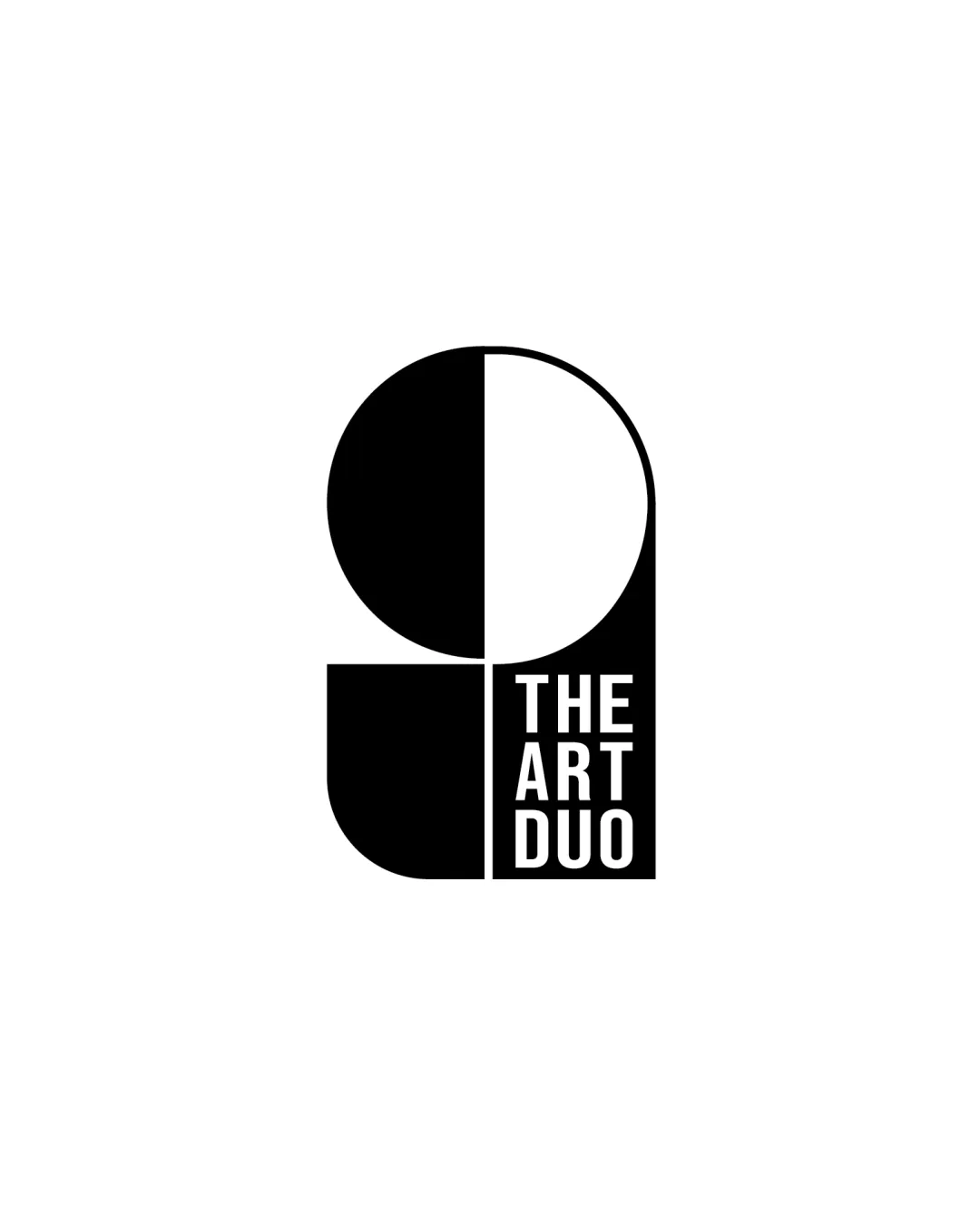
 Logo analysis by AI
Logo type:
Style:
Detected symbol:
Negative space:
Detected text:
Business industry:
Review requested by Studiozain
**If AI can recognize or misinterpret it, so can people.
Structured logo review
Legibility
Clear, sans-serif typeface is highly readable.
High contrast between text and background ensures excellent legibility.
Scalability versatility
Bold, simple geometry allows for great scalability.
Can be used in black and white, on packaging, stationery, or digital platforms.
Minimal details ensure legibility at small sizes.
Text becomes difficult to read at extremely small scales, such as favicons or very small promotional items.

200x250 px

100×125 px

50×62 px
Balance alignment
Symmetry in composition creates a sense of stability and balance.
Clean alignment between geometric elements and text block.
Slight tension between geometric form and centralized text block; text fills only half of the lower right quadrant, which can feel visually heavier on that side.


Originality
Distinctive geometric composition combining text block and simple shapes.
Subtle duality/partnership message reinforced by negative space and symmetry.
Geometric/minimalist style is highly trendy, so risks some similarity to other creative industry designs.
Logomark wordmark fit
Wordmark integrated cleanly into geometric framework, suggesting cohesive identity.
The tight placement of the wordmark restricts expansion for longer brand names, limiting adaptability.
Aesthetic look
Clean, modern aesthetic is visually appealing.
Minimal color use emphasizes form and concept.
Dual meaning and misinterpretations
No inappropriate or unintended visual cues detected.
Color harmony
Monochrome palette is timeless and versatile.
High contrast increases visual impact.
Black
#000000
White
#FFFFFF

