Wondering how your logo performs? 🧐
Get professional logo reviews in seconds and catch design issues in time.
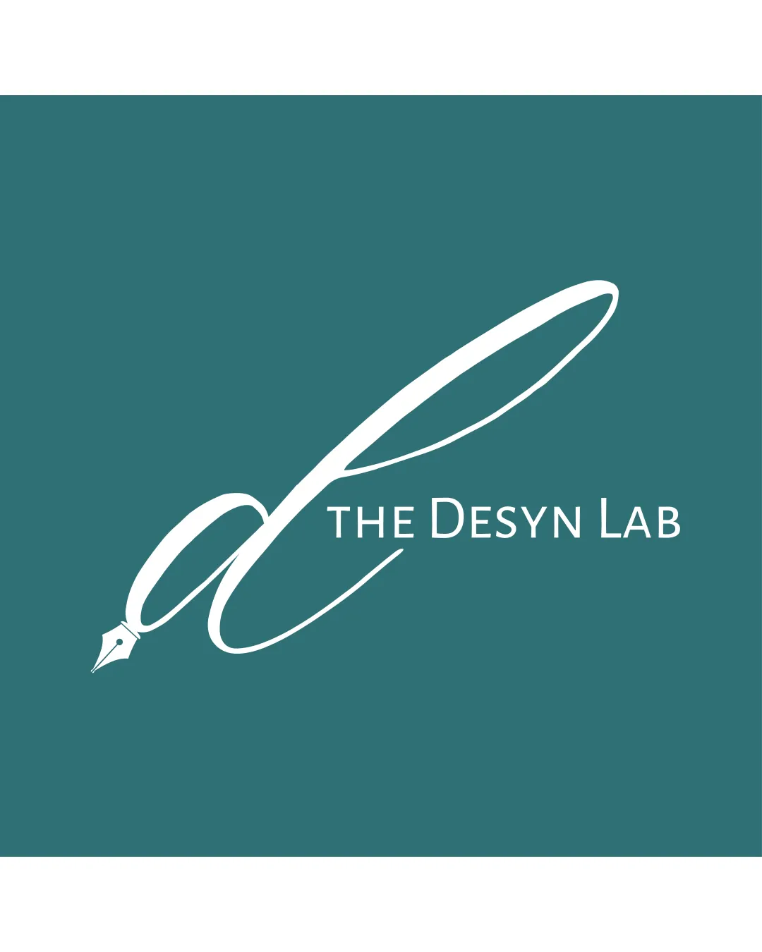
Try it Now!Logo review of THE DESYN LAB
 Logo analysis by AI
Recognized style:
Logo type:
Detected symbol:
Detected text:
Business industry:
Review requested by Moxutang
**If AI can recognize or misinterpret it, so can people.
Structured logo review
Legibility
![]() I assume the business name is The Desyn Lab.
I assume the business name is The Desyn Lab.
![]() The intricate script can be difficult to read at a glance.
The intricate script can be difficult to read at a glance.
Scalability versatility
![]() The logo has a distinct symbol and clear name, enhancing versatility.
The logo has a distinct symbol and clear name, enhancing versatility.
![]() The thin lines in the script may lose detail on smaller applications.
The thin lines in the script may lose detail on smaller applications.
200x250 px
100×125 px
50×62 px
Balance alignment
![]() The elements are well balanced and aligned within the space.
The elements are well balanced and aligned within the space.
![]() The script's flourish could make horizontal alignment tricky in some layouts.
The script's flourish could make horizontal alignment tricky in some layouts.

Originality
![]() The integration of a pen nib into a letter D is unique and creative.
The integration of a pen nib into a letter D is unique and creative.
Aesthetic look
![]() The logo looks elegant and professional.
The logo looks elegant and professional.
Cultural sensitivity dual meaning
![]() No cultural sensitivity issues detected.
No cultural sensitivity issues detected.
Color harmony
![]() The color palette is subtle and complements the design well.
The color palette is subtle and complements the design well.


