Wondering how your logo performs? 🧐
Get professional logo reviews in seconds and catch design issues in time.
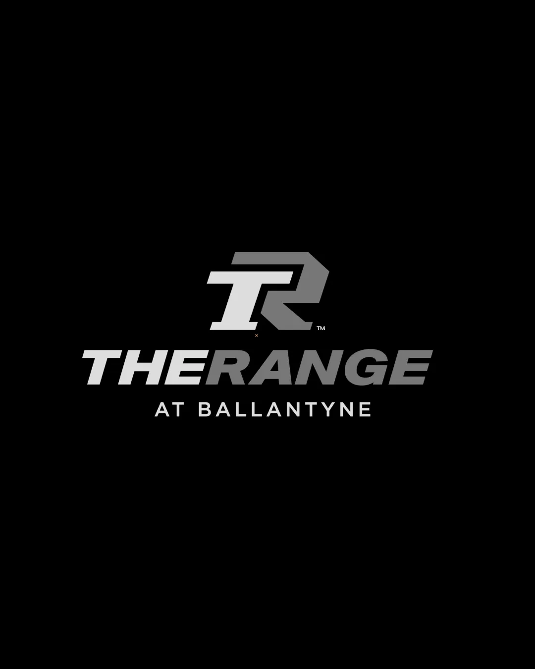
Try it Now!Logo review of THE RANGE AT BALLANTYNE
 Logo analysis by AI
Recognized style:
Logo type:
Detected symbol:
Detected text:
Business industry:
Review requested by Madebyknight
**If AI can recognize or misinterpret it, so can people.
Structured logo review
Legibility
![]() Logomark and wordmark are clear and easy to read.
Logomark and wordmark are clear and easy to read.
![]() The slight overlap in the R may confuse at small sizes.
The slight overlap in the R may confuse at small sizes.
Scalability versatility
![]() The strong and bold design is versatile for various sizes.
The strong and bold design is versatile for various sizes.
![]() Complexity in the monogram might reduce clarity when scaled down.
Complexity in the monogram might reduce clarity when scaled down.
200x250 px
100×125 px
50×62 px
Balance alignment
![]() Good alignment of elements and text.
Good alignment of elements and text.
![]() The monogram could be perceived as slightly overpowering.
The monogram could be perceived as slightly overpowering.

Originality
![]() The T and R merge creatively.
The T and R merge creatively.
![]() Monogram style is somewhat common.
Monogram style is somewhat common.
Logomark wordmark fit
![]() The symbol and wordmark together form a cohesive unit.
The symbol and wordmark together form a cohesive unit.
![]() The monogram could be visually dominant relative to text.
The monogram could be visually dominant relative to text.
Aesthetic look
![]() The logo emanates a professional and modern vibe.
The logo emanates a professional and modern vibe.
![]() Could be simplistic for some tastes.
Could be simplistic for some tastes.
Cultural sensitivity dual meaning
![]() No cultural or dual meaning issues detected.
No cultural or dual meaning issues detected.
Color harmony
![]() Monochrome color scheme maintains impact.
Monochrome color scheme maintains impact.
![]() Limited color palette might appear too neutral.
Limited color palette might appear too neutral.


