Wondering how your logo performs? 🧐
Get professional logo reviews in seconds and catch design issues in time.
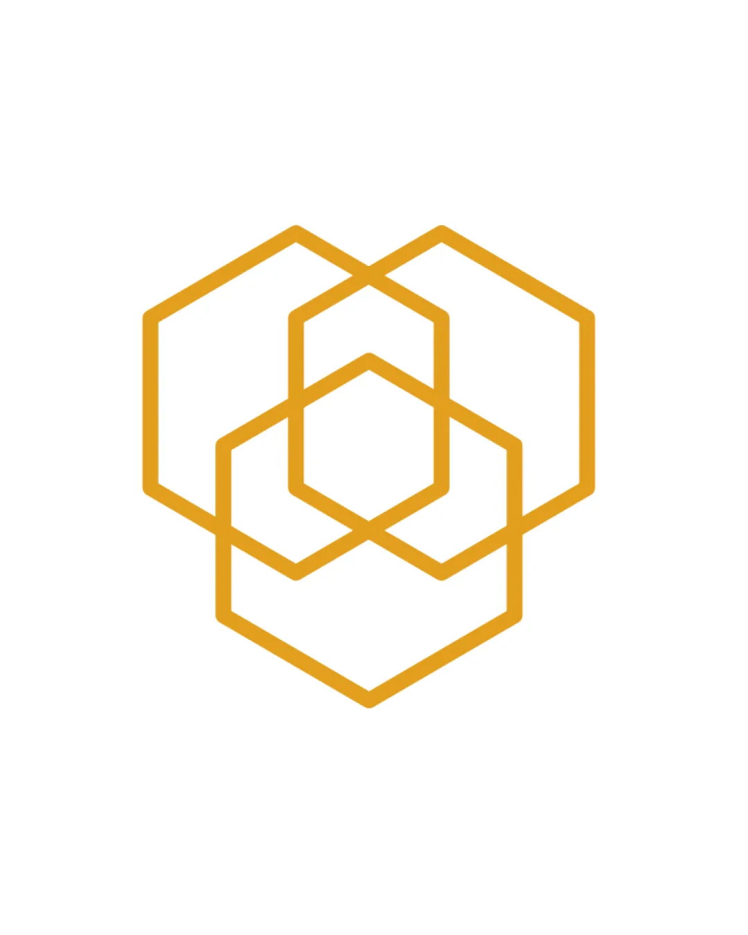
Try it Now!Logo review of three overlapping hexagons
 Logo analysis by AI
Logo type:
Style:
Detected symbol:
Negative space:
Business industry:
Review requested by SabrielleGrey
**If AI can recognize or misinterpret it, so can people.
Structured logo review
Scalability versatility
![]() Simple geometric lines allow for decent scalability.
Simple geometric lines allow for decent scalability.![]() Would work effectively for digital applications and large print like billboards.
Would work effectively for digital applications and large print like billboards.
![]() Thin lines may become hard to distinguish at very small sizes, such as favicons or embroidery.
Thin lines may become hard to distinguish at very small sizes, such as favicons or embroidery.![]() Lack of solid fills could reduce impact on small-scale applications.
Lack of solid fills could reduce impact on small-scale applications.
200x250 px
100×125 px
50×62 px
Balance alignment
![]() Symmetrical and well-centered.
Symmetrical and well-centered.![]() Even line thickness and proportion create a sense of stability.
Even line thickness and proportion create a sense of stability.

Originality
![]() Clean execution and modern geometric style.
Clean execution and modern geometric style.
![]() Hexagon motifs are extremely common, especially in tech and construction industries.
Hexagon motifs are extremely common, especially in tech and construction industries.![]() Overlapping technique offers little innovation or distinctiveness.
Overlapping technique offers little innovation or distinctiveness.
Aesthetic look
![]() Minimal and visually pleasing.
Minimal and visually pleasing.![]() Consistent line thickness and geometric uniformity.
Consistent line thickness and geometric uniformity.
![]() A little sterile and lacks memorable intrigue.
A little sterile and lacks memorable intrigue.![]() Can be perceived as generic because of the overused hexagon motif.
Can be perceived as generic because of the overused hexagon motif.
Dual meaning and misinterpretations
![]() No inappropriate, misleading, or ambiguous imagery detected.
No inappropriate, misleading, or ambiguous imagery detected.
Color harmony
![]() Single bold color creates strong visual presence.
Single bold color creates strong visual presence.![]() Monochrome ensures high adaptability and brand cohesion.
Monochrome ensures high adaptability and brand cohesion.
Gamboge
#E2A721
White
#FFFFFF


