Wondering how your logo performs? 🧐
Get professional logo reviews in seconds and catch design issues in time.
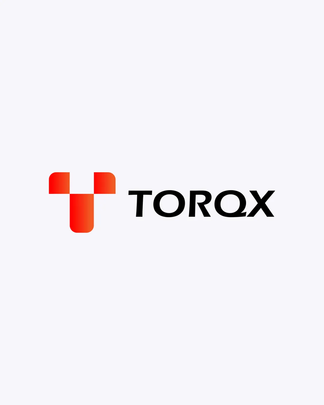
Try it Now!Logo review of TORQX
 Logo analysis by AI
Recognized style:
Logo type:
Detected symbol:
Detected text:
Business industry:
Review requested by Benjie
**If AI can recognize or misinterpret it, so can people.
Structured logo review
Legibility
![]() The text 'TORQX' is clear and easy to read.
The text 'TORQX' is clear and easy to read.
Scalability versatility
![]() The logo is simple and should scale well across different mediums.
The logo is simple and should scale well across different mediums.
![]() The gradient in the symbol might lose detail in smaller sizes.
The gradient in the symbol might lose detail in smaller sizes.
200x250 px
100×125 px
50×62 px
Balance alignment
![]() The symbol and text are well balanced.
The symbol and text are well balanced.

Originality
![]() The abstract shape adds a unique touch to the logo.
The abstract shape adds a unique touch to the logo.
![]() Similar geometric styles are common in tech industries.
Similar geometric styles are common in tech industries.
Logomark wordmark fit
![]() The style of the text complements the geometric symbol nicely.
The style of the text complements the geometric symbol nicely.
Aesthetic look
![]() The logo has a clean, professional aesthetic.
The logo has a clean, professional aesthetic.
Cultural sensitivity dual meaning
![]() No cultural sensitivity issues detected.
No cultural sensitivity issues detected.
Color harmony
![]() The red gradient is appealing and eye-catching.
The red gradient is appealing and eye-catching.
![]() Single color use might limit flexibility for different backgrounds.
Single color use might limit flexibility for different backgrounds.


