Wondering how your logo performs? 🧐
Get professional logo reviews in seconds and catch design issues in time.
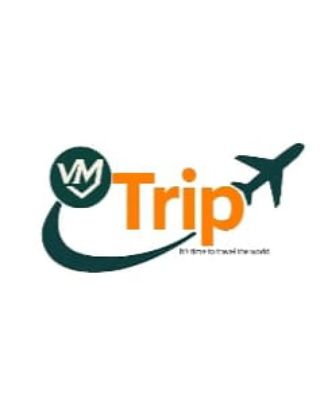
Try it Now!Logo review of Trip
 Logo analysis by AI
Logo type:
Style:
Detected symbol:
Detected text:
Business industry:
Review requested by _vp
**If AI can recognize or misinterpret it, so can people.
Structured logo review
Legibility
![]() The main word 'Trip' is large, prominent, and has high contrast with the background.
The main word 'Trip' is large, prominent, and has high contrast with the background.![]() Color selection for 'Trip' makes it stand out.
Color selection for 'Trip' makes it stand out.
![]() The small subtext is extremely difficult to read due to its size and the color contrast.
The small subtext is extremely difficult to read due to its size and the color contrast.![]() The 'VM' inside the circle is somewhat cramped and may not be immediately clear in smaller formats.
The 'VM' inside the circle is somewhat cramped and may not be immediately clear in smaller formats.
Scalability versatility
![]() Simple shapes (plane and swoosh) read well at moderate sizes.
Simple shapes (plane and swoosh) read well at moderate sizes.![]() Suitable for branding on websites and social media banners.
Suitable for branding on websites and social media banners.
![]() The detail and legibility in the 'VM' circle and tagline will be lost at small sizes such as business cards or app icons.
The detail and legibility in the 'VM' circle and tagline will be lost at small sizes such as business cards or app icons.![]() Thin swoosh and the size relationship between elements may get muddled in embroidery or reduced contexts.
Thin swoosh and the size relationship between elements may get muddled in embroidery or reduced contexts.
200x250 px
100×125 px
50×62 px
Balance alignment
![]() Dynamic movement evoked by the plane and swoosh curving around the logotype.
Dynamic movement evoked by the plane and swoosh curving around the logotype.
![]() The left-heavy 'VM' mark and swoosh contrast harshly with the right-heavy plane and text, creating imbalance.
The left-heavy 'VM' mark and swoosh contrast harshly with the right-heavy plane and text, creating imbalance.![]() The alignment of elements feels awkward; the circular logomark, arched swoosh, and flying plane seem disconnected rather than unified.
The alignment of elements feels awkward; the circular logomark, arched swoosh, and flying plane seem disconnected rather than unified.

Originality
![]() Attempts to differentiate with a monogram inside a circle and a dynamic path.
Attempts to differentiate with a monogram inside a circle and a dynamic path.
![]() Airplane plus swoosh motif is an overused cliché in the travel industry.
Airplane plus swoosh motif is an overused cliché in the travel industry.![]() No unique visual twist or memorable interpretation is present.
No unique visual twist or memorable interpretation is present.
Logomark wordmark fit
![]() Effort to integrate symbol with type through the swoosh.
Effort to integrate symbol with type through the swoosh.
![]() The styles between the bold, geometric 'Trip', the hand-drawn look of the swoosh, and the rigid circle/VM don't mesh harmoniously.
The styles between the bold, geometric 'Trip', the hand-drawn look of the swoosh, and the rigid circle/VM don't mesh harmoniously.![]() Swoosh creates a visual gap between the mark and type, not seamless.
Swoosh creates a visual gap between the mark and type, not seamless.
Aesthetic look
![]() Color palette is lively and appropriate for the industry.
Color palette is lively and appropriate for the industry.
![]() Overall design feels busy and dated due to mix of motifs and disconnected styles.
Overall design feels busy and dated due to mix of motifs and disconnected styles.![]() Overlapping elements reduce visual clarity.
Overlapping elements reduce visual clarity.
Dual meaning and misinterpretations
![]() No inappropriate or confusing visual double-meanings detected.
No inappropriate or confusing visual double-meanings detected.
Color harmony
![]() Two-color palette is energetic yet not overwhelming.
Two-color palette is energetic yet not overwhelming.![]() Good contrast ensures the logo stands out on white.
Good contrast ensures the logo stands out on white.
![]() The orange may feel generic for travel brands, less distinctive.
The orange may feel generic for travel brands, less distinctive.
Evergreen
#1E3932
Orange
#F7931E
White
#FFFFFF


