 View review
Logo score
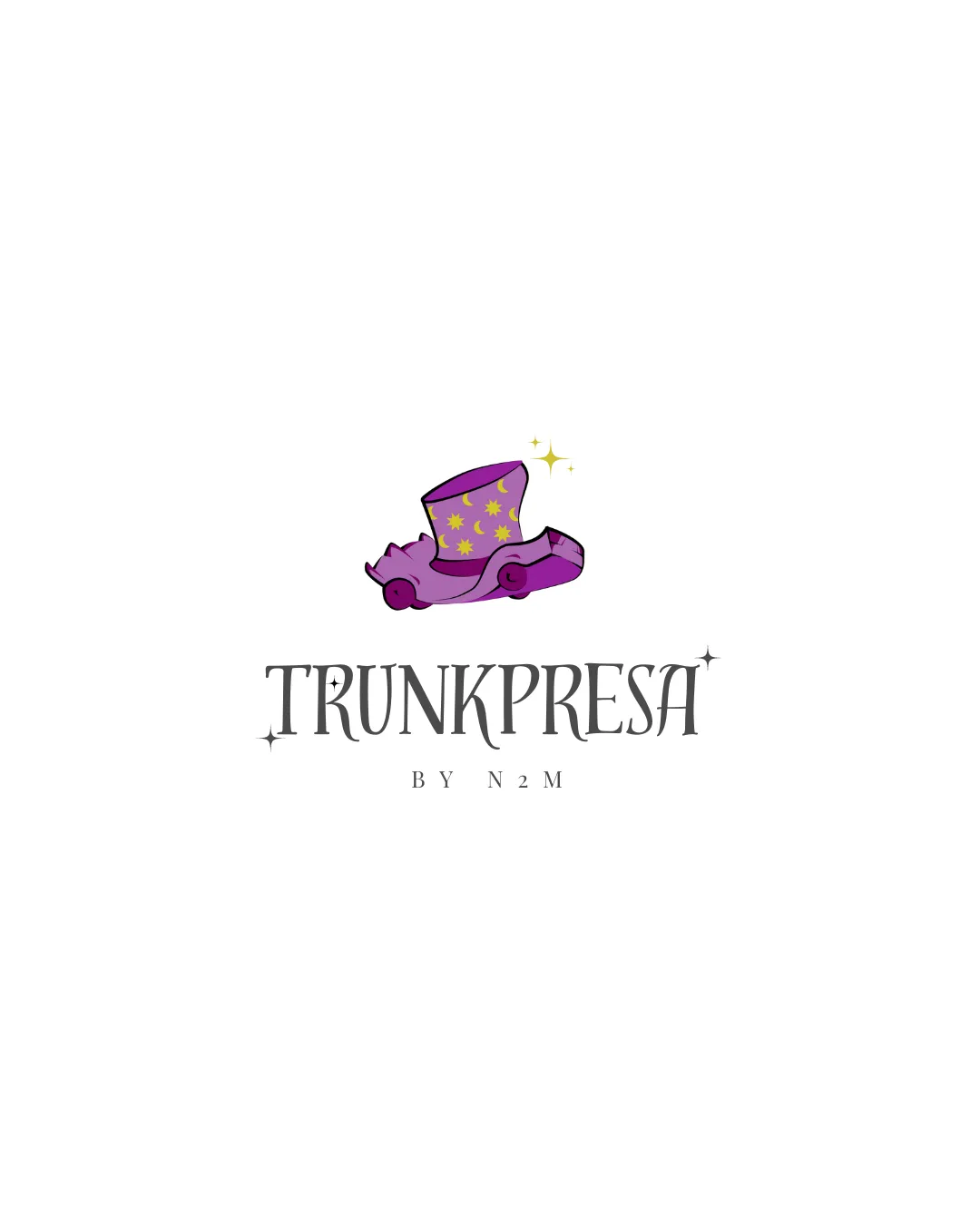
Logo review ofTrunkpresa, By N2m
Review the detailed scores below to see what is working and what should be refined first.
Legibility
Originality
Misread
Balance
Scale
Detailed review
Logo performance breakdown
Legibility
![]() Main name TRUNKPRESA is generally readable with decorative but legible characters.
Main name TRUNKPRESA is generally readable with decorative but legible characters.![]() Sufficient contrast between the dark text and white background.
Sufficient contrast between the dark text and white background.
![]() Decorative serifs and star accents on some letters reduce quick legibility.
Decorative serifs and star accents on some letters reduce quick legibility.![]() BY N2M subtext is small and might not be legible at smaller sizes.
BY N2M subtext is small and might not be legible at smaller sizes.
Originality
![]() Combination of a magical hat and trunk is distinctive and playful.
Combination of a magical hat and trunk is distinctive and playful.![]() Illustrative style adds unique personality.
Illustrative style adds unique personality.
![]() The use of magical props and sparkles is common in whimsical/retail logos, so it's not fully original.
The use of magical props and sparkles is common in whimsical/retail logos, so it's not fully original.![]() No creative integration between the mark and letters.
No creative integration between the mark and letters.
Color harmony
![]() Limited palette focused on purple, yellow, and neutral black, which harmonize well.
Limited palette focused on purple, yellow, and neutral black, which harmonize well.
![]() Slight mismatch between the illustrative color tones and the grayscale wordmark; could be more unified.
Slight mismatch between the illustrative color tones and the grayscale wordmark; could be more unified.
Studio
#8A5CA9
Light Purple
#C178CF
Yellow
#FFE952
Black
#242120
Your palette is close. Explore sharper color combinations with Colorfly.design before updating the logo.
Explore palettesBalance alignment
![]() Logomark is centered above the wordmark, creating a vertical visual hierarchy.
Logomark is centered above the wordmark, creating a vertical visual hierarchy.![]() Elements are generally aligned.
Elements are generally aligned.
![]() Logomark feels visually heavier than the type below, creating a slight imbalance.
Logomark feels visually heavier than the type below, creating a slight imbalance.![]() Text spacing is inconsistent; the star accents disrupt the baseline alignment.
Text spacing is inconsistent; the star accents disrupt the baseline alignment.

Scalability
![]() Works decently well for web banners and printed packaging at medium to large sizes.
Works decently well for web banners and printed packaging at medium to large sizes.
![]() Illustrative logomark has multiple thin lines and color gradients, which may not scale down clearly for favicons or embroidery.
Illustrative logomark has multiple thin lines and color gradients, which may not scale down clearly for favicons or embroidery.![]() Small text (BY N2M) will be unreadable in small applications like business cards or labels.
Small text (BY N2M) will be unreadable in small applications like business cards or labels.![]() Illustrative details may get lost on apparel or product tags.
Illustrative details may get lost on apparel or product tags.
200x250 px
100×125 px
50×62 px
Misinterpretations
![]() No inappropriate or confusing symbols detected.
No inappropriate or confusing symbols detected.
Symbol & text fit
![]() Both logomark and wordmark share a whimsical, magical theme.
Both logomark and wordmark share a whimsical, magical theme.
![]() Illustration style of logomark slightly clashes with the refined, serif typography.
Illustration style of logomark slightly clashes with the refined, serif typography.
![]() Logomark overshadows the wordmark due to size and detail contrast.
Logomark overshadows the wordmark due to size and detail contrast.
Try your own review
Review my logo
Wondering how your logo performs?
Get a clear logo score, key risks, and priority fix ideas before your client or audience sees it.
Keep exploring


