 View review
Logo score
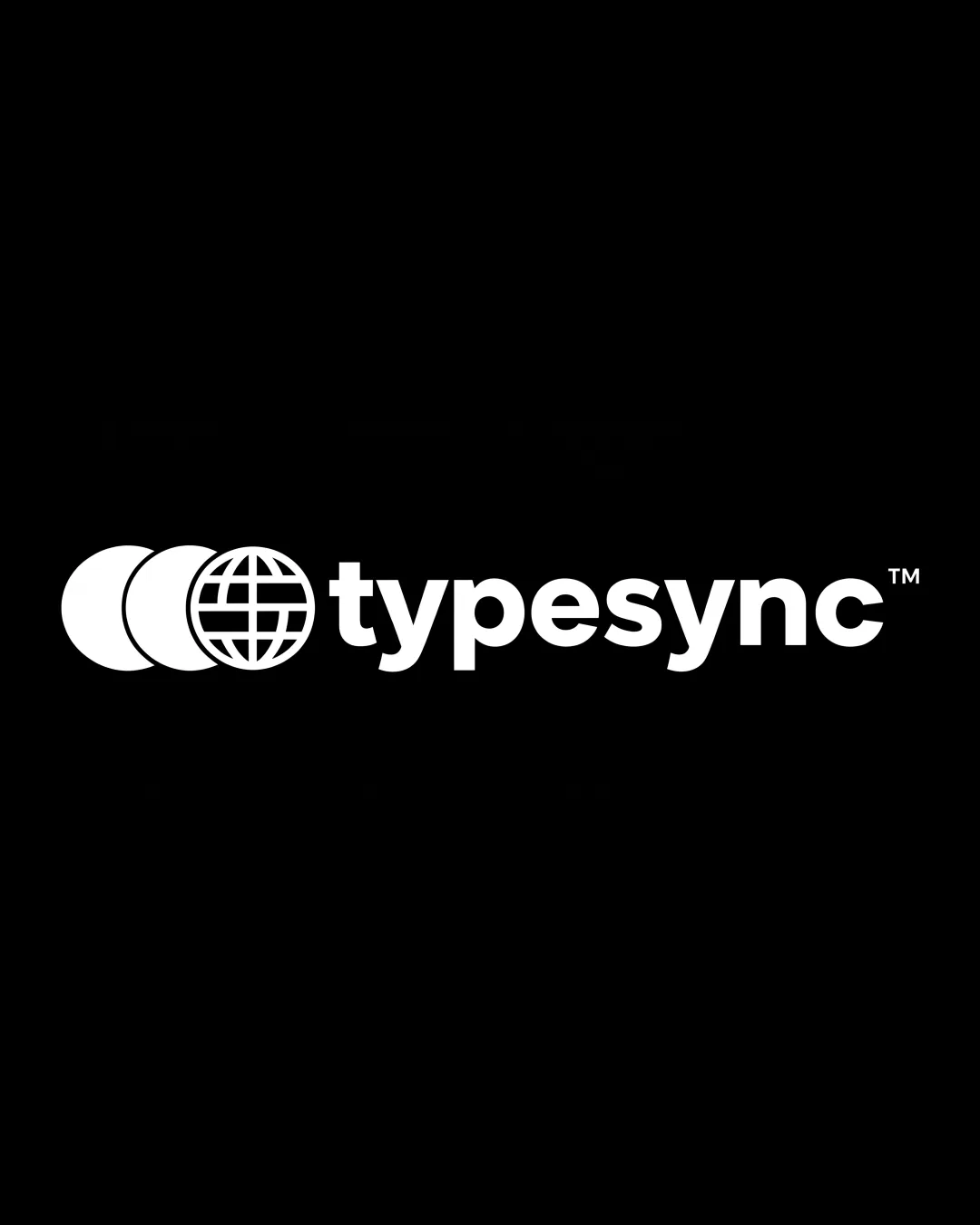
Logo review ofTypesync
Review the detailed scores below to see what is working and what should be refined first.
Legibility
Originality
Misread
Balance
Scale
Detailed review
Logo performance breakdown
Legibility
![]() Text is bold, clear, and easy to read.
Text is bold, clear, and easy to read.![]() Contrast between the white logo and black background maximizes legibility.
Contrast between the white logo and black background maximizes legibility.
Originality
![]() Incorporates a globe with overlapping circles that suggests connectivity and network, relevant to the 'sync' aspect.
Incorporates a globe with overlapping circles that suggests connectivity and network, relevant to the 'sync' aspect.
![]() The globe/circle motif is common in technology and global brandings, making the symbol somewhat generic.
The globe/circle motif is common in technology and global brandings, making the symbol somewhat generic.
Color harmony
![]() Excellent use of black and white, achieving high contrast.
Excellent use of black and white, achieving high contrast.![]() Single color scheme ensures consistency and adaptability.
Single color scheme ensures consistency and adaptability.
White
#FFFFFF
Black
#000000
Balance alignment
![]() Good balance between symbol and wordmark.
Good balance between symbol and wordmark.![]() Consistent alignment of logomark and baseline of typography.
Consistent alignment of logomark and baseline of typography.
![]() The symbol (three circles) is slightly more visually dominant than the wordmark, potentially creating a mild imbalance, especially in vertical applications.
The symbol (three circles) is slightly more visually dominant than the wordmark, potentially creating a mild imbalance, especially in vertical applications.

Scalability
![]() Simple geometric shapes allow for scalability on digital applications.
Simple geometric shapes allow for scalability on digital applications.![]() Logo will reproduce well on monochrome mediums such as business cards or embroidery.
Logo will reproduce well on monochrome mediums such as business cards or embroidery.
![]() The intricate grid lines in the globe motif may lose clarity at very small sizes, such as in favicons or small merchandise icons.
The intricate grid lines in the globe motif may lose clarity at very small sizes, such as in favicons or small merchandise icons.
200x250 px
100×125 px
50×62 px
Misinterpretations
![]() No inappropriate or confusing visual double meanings detected.
No inappropriate or confusing visual double meanings detected.
Symbol & text fit
![]() Stylistically consistent between symbol and wordmark.
Stylistically consistent between symbol and wordmark.
![]() Both elements share a geometric, modern feel.
Both elements share a geometric, modern feel.
Try your own review
Review my logo
Wondering how your logo performs?
Get a clear logo score, key risks, and priority fix ideas before your client or audience sees it.
Keep exploring


