 View review
Logo score
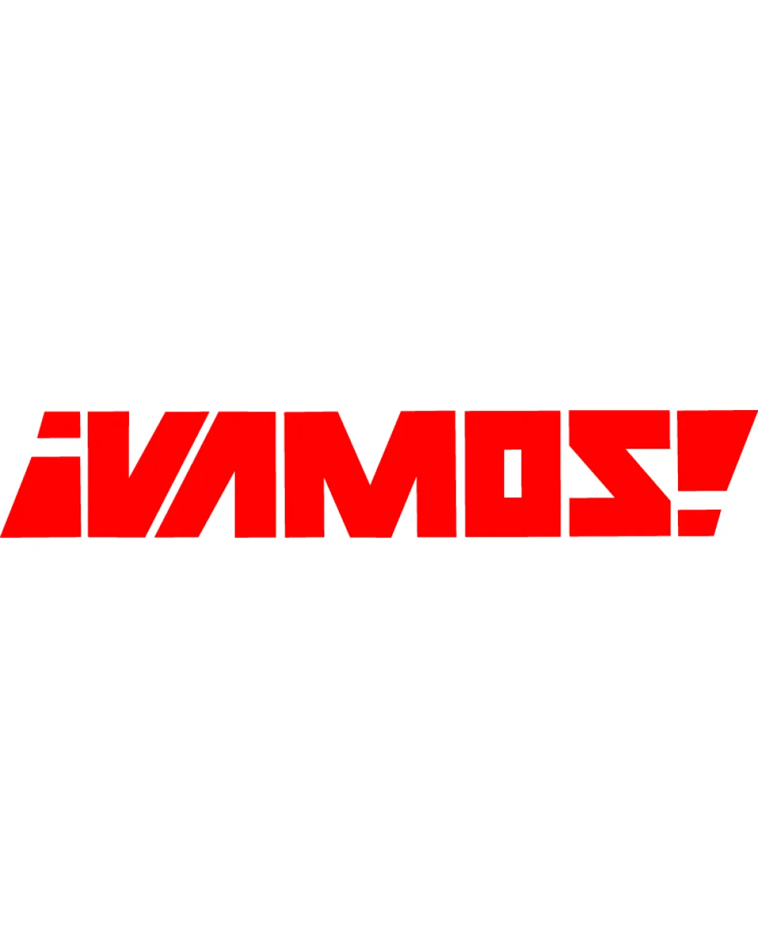
Logo review of¡vamos!
Review the detailed scores below to see what is working and what should be refined first.
Legibility
Originality
Misread
Balance
Scale
Detailed review
Logo performance breakdown
Legibility
![]() Bold and strong letterforms create high visual impact.
Bold and strong letterforms create high visual impact.![]() Spacing between each letter helps to avoid crowding.
Spacing between each letter helps to avoid crowding.
![]() Angular geometrical cuts reduce the instant recognition of some letters, notably 'V', 'A', and 'S'.
Angular geometrical cuts reduce the instant recognition of some letters, notably 'V', 'A', and 'S'.![]() All capital stylization and the exclamation introduce some ambiguity at a glance.
All capital stylization and the exclamation introduce some ambiguity at a glance.
Originality
![]() Unique geometric modifications to the letterforms add custom identity.
Unique geometric modifications to the letterforms add custom identity.![]() Full-caps angular style is uncommon and high-energy.
Full-caps angular style is uncommon and high-energy.
![]() Despite modifications, wordmark-based logos are popular and require extra creativity to stand out further.
Despite modifications, wordmark-based logos are popular and require extra creativity to stand out further.
Color harmony
![]() Monochromatic red on white is bold, striking, and harmonious.
Monochromatic red on white is bold, striking, and harmonious.![]() Choice of one main color ensures consistency and ease of reproduction.
Choice of one main color ensures consistency and ease of reproduction.
Red
#FF0000
White
#FFFFFF
Balance alignment
![]() Text is well-aligned on a flat baseline, with uniform height and spacing.
Text is well-aligned on a flat baseline, with uniform height and spacing.![]() Visual weight is consistent throughout the wordmark.
Visual weight is consistent throughout the wordmark.

Scalability
![]() Simple geometric construction allows effective scaling across large formats such as posters, banners, and billboards.
Simple geometric construction allows effective scaling across large formats such as posters, banners, and billboards.![]() Contrast against white background ensures high visibility.
Contrast against white background ensures high visibility.
![]() Fine triangular details on some letters may become less clear at tiny favicon sizes or on embroidery.
Fine triangular details on some letters may become less clear at tiny favicon sizes or on embroidery.![]() Single colorway may not always work on colored/dark backgrounds without alternates.
Single colorway may not always work on colored/dark backgrounds without alternates.
200x250 px
100×125 px
50×62 px
Misinterpretations
![]() No inappropriate or ambiguous shapes detected.
No inappropriate or ambiguous shapes detected.![]() Message comes across clearly.
Message comes across clearly.
Try your own review
Review my logo
Wondering how your logo performs?
Get a clear logo score, key risks, and priority fix ideas before your client or audience sees it.
Keep exploring


