Wondering how your logo performs? 🧐
Get professional logo reviews in seconds and catch design issues in time.
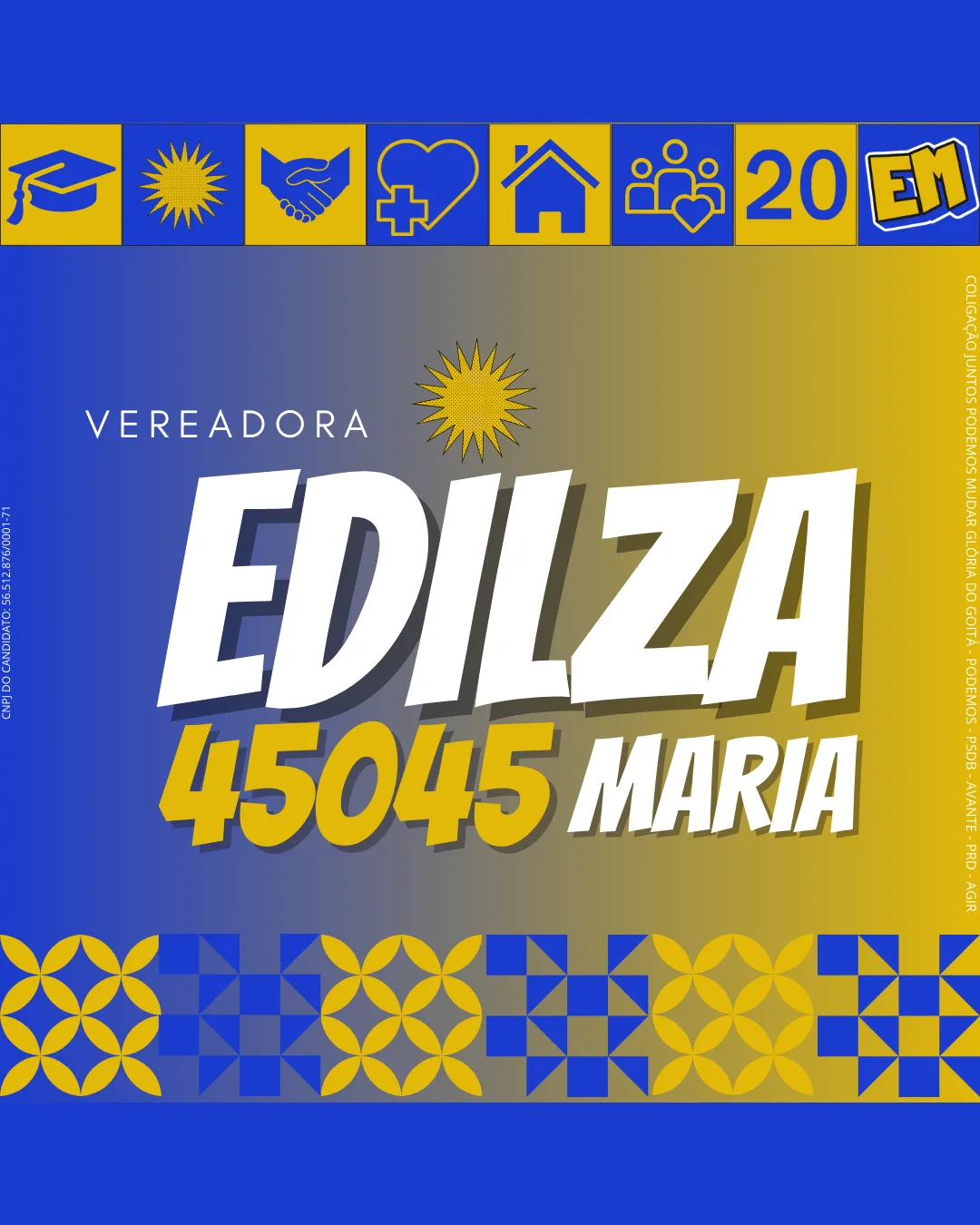
Try it Now!Logo review of VEREADORA EDILZA 45045 MARIA
 Logo analysis by AI
Logo type:
Style:
Detected symbol:
Detected text:
Business industry:
Review requested by Legalzinho
**If AI can recognize or misinterpret it, so can people.
Structured logo review
Legibility
![]() Main text 'EDILZA 45045 MARIA' is large, bold, and contrasts well with background
Main text 'EDILZA 45045 MARIA' is large, bold, and contrasts well with background![]() Auxiliary text 'VEREADORA' is clear and simple
Auxiliary text 'VEREADORA' is clear and simple
![]() Shadow effect under main text adds slight clutter
Shadow effect under main text adds slight clutter![]() Smaller details (such as party coalition) become hard to read in reduced sizes
Smaller details (such as party coalition) become hard to read in reduced sizes
Scalability versatility
![]() High contrast colors support basic visibility
High contrast colors support basic visibility![]() Main logotype could function on billboards or large signage
Main logotype could function on billboards or large signage
![]() Excess number of icons and patterns do not scale well to smaller formats, such as business cards or social media avatars
Excess number of icons and patterns do not scale well to smaller formats, such as business cards or social media avatars![]() Thin text and small elements become illegible at reduced sizes
Thin text and small elements become illegible at reduced sizes![]() Complex background gradients and motifs reduce clarity in print or merch like embroidery
Complex background gradients and motifs reduce clarity in print or merch like embroidery
200x250 px
100×125 px
50×62 px
Balance alignment
![]() Central alignment of main wordmark creates basic anchor
Central alignment of main wordmark creates basic anchor
![]() Heavy use of patterns and icons at the top/bottom creates visual overcrowding
Heavy use of patterns and icons at the top/bottom creates visual overcrowding![]() Sunburst symbol above 'EDILZA' is visually disconnected and competes for focus
Sunburst symbol above 'EDILZA' is visually disconnected and competes for focus![]() Inconsistent margin treatments and spacing between elements
Inconsistent margin treatments and spacing between elements

Originality
![]() Distinctive use of a sunburst and specific set of social icons
Distinctive use of a sunburst and specific set of social icons
![]() Icons (graduation cap, handshake, heart, home, family) are extremely generic for the political and social sector
Icons (graduation cap, handshake, heart, home, family) are extremely generic for the political and social sector![]() Patterned background motifs are common and do not reinforce a unique message for the candidate
Patterned background motifs are common and do not reinforce a unique message for the candidate
Logomark wordmark fit
![]() Attempted integration of sunburst with candidate name
Attempted integration of sunburst with candidate name
![]() Sunburst does not stylistically mesh with angular wordmark
Sunburst does not stylistically mesh with angular wordmark![]() Multiple icons and badges create a fragmented visual hierarchy
Multiple icons and badges create a fragmented visual hierarchy![]() No clear connection between wordmark and surrounding symbols—feels more like collage than integrated brand
No clear connection between wordmark and surrounding symbols—feels more like collage than integrated brand
Aesthetic look
![]() Vibrant color scheme feels energetic
Vibrant color scheme feels energetic
![]() Extremely busy overall layout, visually overwhelming
Extremely busy overall layout, visually overwhelming![]() Overuse of symbols, patterns, gradients, and hues hurts the cohesiveness
Overuse of symbols, patterns, gradients, and hues hurts the cohesiveness![]() Lacks sophistication or restraint
Lacks sophistication or restraint
Dual meaning and misinterpretations
![]() No inappropriate or ambiguous imagery detected
No inappropriate or ambiguous imagery detected
Color harmony
![]() Good contrast between blue and yellow, standard for political materials
Good contrast between blue and yellow, standard for political materials
![]() Introduction of gradient backgrounds and olive tints introduces an unnecessary third color tone
Introduction of gradient backgrounds and olive tints introduces an unnecessary third color tone![]() Patterned icons and color swaps create unnecessary visual complexity; simpler palette would unify the identity
Patterned icons and color swaps create unnecessary visual complexity; simpler palette would unify the identity
Cobalt Blue
#2450C3
Sunglow Yellow
#FFCB05
White
#FFFFFF
Golden Olive
#A6A169


