 View review
Logo score
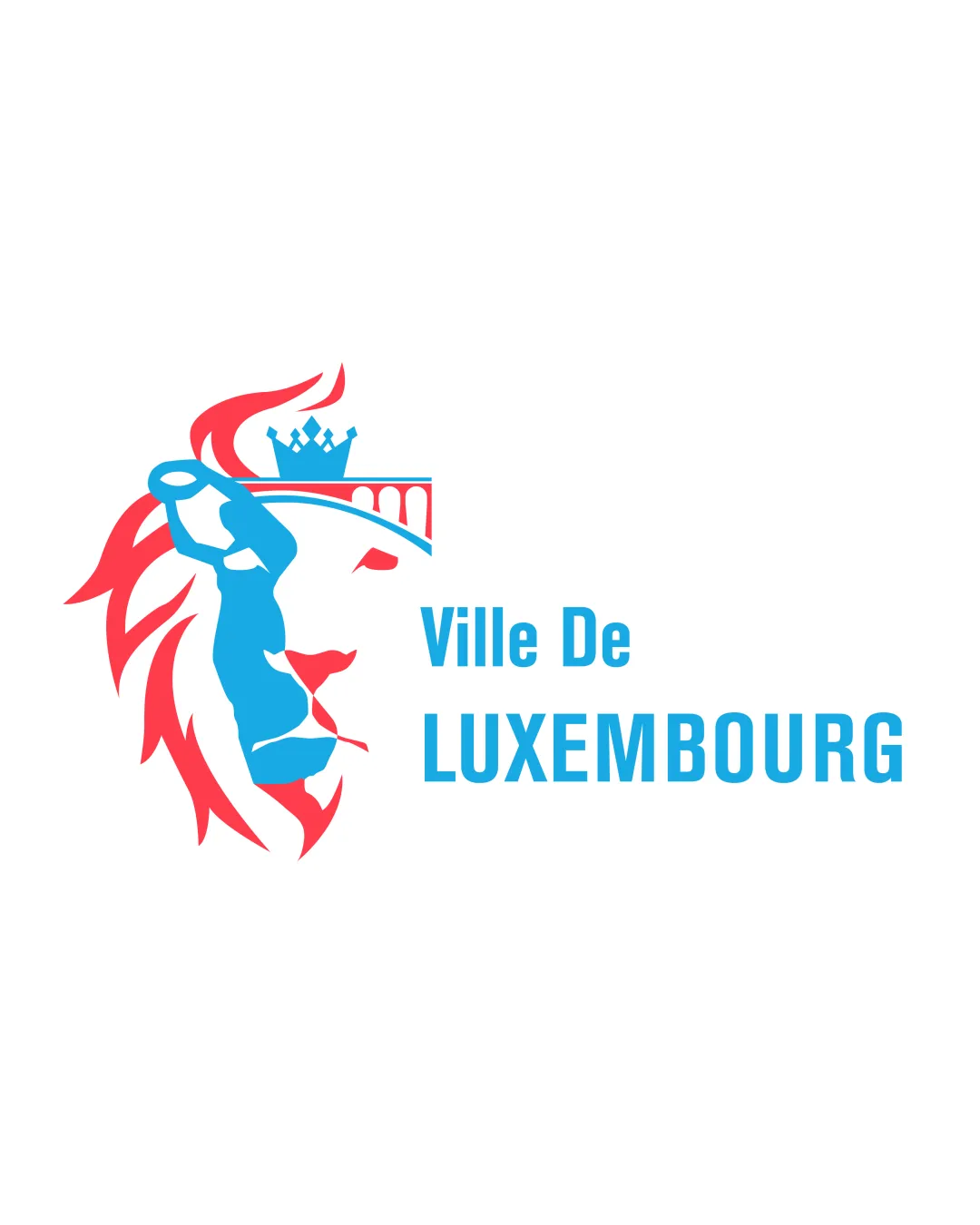
Logo review ofVille De Luxembourg
Review the detailed scores below to see what is working and what should be refined first.
Legibility
Originality
Misread
Balance
Scale
Detailed review
Logo performance breakdown
Legibility
![]() Text is clear and legible
Text is clear and legible![]() Contrasting colors enhance readability
Contrasting colors enhance readability
![]() Font size for 'Ville De' is slightly small compared to 'LUXEMBOURG'
Font size for 'Ville De' is slightly small compared to 'LUXEMBOURG'
Originality
![]() Creative integration of city and national symbols
Creative integration of city and national symbols![]() Unique combination of elements
Unique combination of elements
![]() Lion symbol is fairly common for logos in this context
Lion symbol is fairly common for logos in this context
Color harmony
![]() Complementary color palette
Complementary color palette![]() Good contrast ensuring visibility
Good contrast ensuring visibility
Balance alignment
![]() Elements are well-balanced around the central lion figure
Elements are well-balanced around the central lion figure![]() Text aligns neatly with the symbol
Text aligns neatly with the symbol
![]() Lion's mane creates visual heaviness to the left side
Lion's mane creates visual heaviness to the left side

Scalability
![]() Simple color scheme aids scalability
Simple color scheme aids scalability![]() Basic shapes without excessive detail
Basic shapes without excessive detail
![]() Might lose detail at very small sizes
Might lose detail at very small sizes![]() Fine lines in the bridge and crown may become unclear
Fine lines in the bridge and crown may become unclear
200x250 px
100×125 px
50×62 px
Misinterpretations
![]() No inappropriate imagery detected
No inappropriate imagery detected
Try your own review
Review my logo
Wondering how your logo performs?
Get a clear logo score, key risks, and priority fix ideas before your client or audience sees it.
Keep exploring


