Wondering how your logo performs? 🧐
Get professional logo reviews in seconds and catch design issues in time.
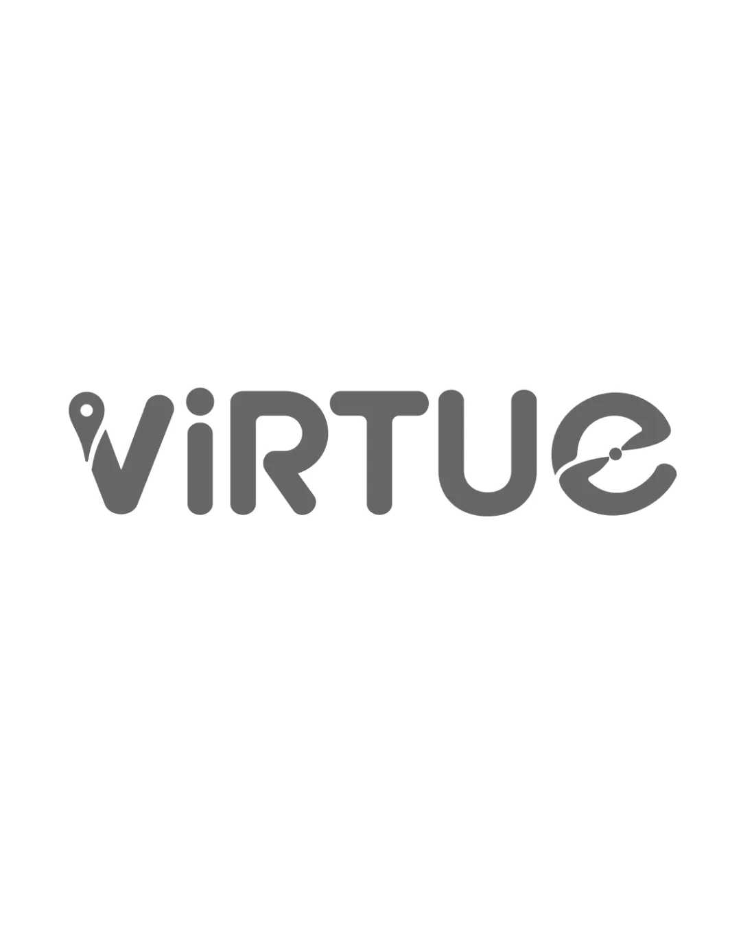
Try it Now!Logo review of Virtue
 Logo analysis by AI
Logo type:
Style:
Detected symbol:
Detected text:
Business industry:
Review requested by GraficaLabIdee
**If AI can recognize or misinterpret it, so can people.
Structured logo review
Legibility
![]() Text is clear and easy to read
Text is clear and easy to read![]() Unique styling does not hinder readability
Unique styling does not hinder readability
![]() Slight complexity in the 'V' and 'E' might distract at smaller sizes
Slight complexity in the 'V' and 'E' might distract at smaller sizes
Scalability versatility
![]() Minimalistic design ensures good scalability
Minimalistic design ensures good scalability![]() Works well on both digital and print mediums
Works well on both digital and print mediums
![]() Details in 'V' and 'E' might lose clarity at very small sizes
Details in 'V' and 'E' might lose clarity at very small sizes
200x250 px
100×125 px
50×62 px
Balance alignment
![]() Logo is well-balanced
Logo is well-balanced![]() Consistent stroke weight across letters
Consistent stroke weight across letters

Originality
![]() Creative use of symbols within letters
Creative use of symbols within letters![]() Pin and speedometer add unique character
Pin and speedometer add unique character
![]() Abstract elements are somewhat common in tech and travel logos
Abstract elements are somewhat common in tech and travel logos
Aesthetic look
![]() Modern and sleek design
Modern and sleek design![]() Good use of minimalism
Good use of minimalism
![]() Might appear slightly generic in tech-oriented markets
Might appear slightly generic in tech-oriented markets
Dual meaning and misinterpretations
![]() Clear and appropriate symbolism
Clear and appropriate symbolism
Color harmony
![]() Monochrome color scheme is versatile
Monochrome color scheme is versatile![]() High contrast ensures visibility
High contrast ensures visibility


