Wondering how your logo performs? 🧐
Get professional logo reviews in seconds and catch design issues in time.
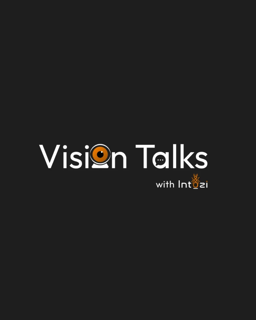
Try it Now!Logo review of Vision Talks with Intozi
 Logo analysis by AI
Logo type:
Style:
Detected symbol:
Negative space:
Detected text:
Business industry:
Review requested by Summiiiiiiidha
**If AI can recognize or misinterpret it, so can people.
Structured logo review
Legibility
![]() Main text 'Vision Talks' is generally clear and easy to read.
Main text 'Vision Talks' is generally clear and easy to read.![]() Typeface choice is geometric and modern, matching the media industry.
Typeface choice is geometric and modern, matching the media industry.
![]() Iconic substitutions for some letters (o in Vision, a in Talks, o in Intozi) reduce instant legibility.
Iconic substitutions for some letters (o in Vision, a in Talks, o in Intozi) reduce instant legibility.![]() The ant on the 'o' in Intozi adds visual clutter and can reduce comprehension at smaller sizes.
The ant on the 'o' in Intozi adds visual clutter and can reduce comprehension at smaller sizes.
Scalability versatility
![]() Simplified shapes are suitable for medium-scale applications (e.g. digital banners, event posters).
Simplified shapes are suitable for medium-scale applications (e.g. digital banners, event posters).
![]() Thin lines in the webcam and ant detail will not reproduce well in small applications (favicon, business card, embroidery).
Thin lines in the webcam and ant detail will not reproduce well in small applications (favicon, business card, embroidery).![]() Letter substitutions may become ambiguous or unrecognizable at reduced sizes.
Letter substitutions may become ambiguous or unrecognizable at reduced sizes.![]() Multiple intricate icons within the text reduce clarity.
Multiple intricate icons within the text reduce clarity.
200x250 px
100×125 px
50×62 px
Balance alignment
![]() Strong horizontal alignment with clear separation between the main title and subheading.
Strong horizontal alignment with clear separation between the main title and subheading.
![]() Symbols embedded within letters disrupt the visual rhythm and make the logo feel slightly unbalanced.
Symbols embedded within letters disrupt the visual rhythm and make the logo feel slightly unbalanced.![]() 'with Intozi' feels disconnected due to scale and color contrast.
'with Intozi' feels disconnected due to scale and color contrast.

Originality
![]() Creative integration of relevant icons (webcam/eye, speech bubble, ant for 'Intozi').
Creative integration of relevant icons (webcam/eye, speech bubble, ant for 'Intozi').![]() Distinctive approach linking each icon to the brand narrative.
Distinctive approach linking each icon to the brand narrative.
![]() Three different icon treatments make the logo a little busy and reduce brand focus.
Three different icon treatments make the logo a little busy and reduce brand focus.![]() Speech bubble and webcam icons are not highly uncommon in the tech/media sector.
Speech bubble and webcam icons are not highly uncommon in the tech/media sector.
Logomark wordmark fit
![]() The icons reflect the brand's communication and vision themes.
The icons reflect the brand's communication and vision themes.
![]() The mixture of 3 different icon styles within the type creates a lack of cohesion.
The mixture of 3 different icon styles within the type creates a lack of cohesion.![]() 'o' treatments are not visually consistent between 'Vision' and 'Intozi'.
'o' treatments are not visually consistent between 'Vision' and 'Intozi'.
Aesthetic look
![]() Clean, modern typography and a strong minimalist color palette.
Clean, modern typography and a strong minimalist color palette.![]() Icons are well-drawn and conceptually relevant.
Icons are well-drawn and conceptually relevant.
![]() Multiple icons create a cluttered look.
Multiple icons create a cluttered look.![]() Visual hierarchy is muddled by competing focal points (multiple orange/accented icons).
Visual hierarchy is muddled by competing focal points (multiple orange/accented icons).
Dual meaning and misinterpretations
![]() No inappropriate or accidental symbolism detected.
No inappropriate or accidental symbolism detected.![]() Iconography is suitable and industry-appropriate.
Iconography is suitable and industry-appropriate.
Color harmony
![]() Limited palette of white, black, and orange provides strong contrast and clarity.
Limited palette of white, black, and orange provides strong contrast and clarity.![]() Accent color draws attention to key brand icons.
Accent color draws attention to key brand icons.
![]() Multiple icons in orange may create competing emphasis.
Multiple icons in orange may create competing emphasis.![]() Minor busyness due to color repetition for iconography.
Minor busyness due to color repetition for iconography.
White
#FFFFFF
Nero
#1A1A1A
Orange
#F28C28


