Wondering how your logo performs? 🧐
Get professional logo reviews in seconds and catch design issues in time.
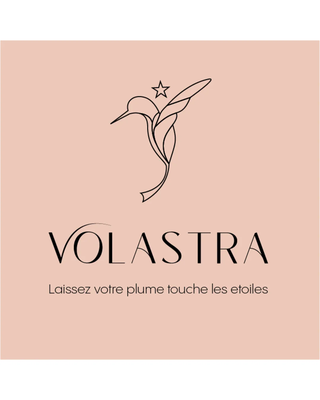
Try it Now!Logo review of VOLASTRA
 Logo analysis by AI
Recognized style:
Logo type:
Detected symbol:
Detected text:
Business industry:
Review requested by Manelboudjema
**If AI can recognize or misinterpret it, so can people.
Structured logo review
Legibility
![]() The business name 'VOLASTRA' is clearly readable.
The business name 'VOLASTRA' is clearly readable.
Scalability versatility
![]() The simple and elegant design is versatile across applications.
The simple and elegant design is versatile across applications.
![]() The thin lines might lose visibility at very small sizes.
The thin lines might lose visibility at very small sizes.
200x250 px
100×125 px
50×62 px
Balance alignment
![]() The logomark and wordmark are balanced and well-aligned.
The logomark and wordmark are balanced and well-aligned.

Originality
![]() The combination of a bird and star with abstract lines is unique.
The combination of a bird and star with abstract lines is unique.
![]() The bird motif is somewhat common, slightly reducing originality.
The bird motif is somewhat common, slightly reducing originality.
Logomark wordmark fit
![]() The text and symbol blend harmoniously, forming a cohesive identity.
The text and symbol blend harmoniously, forming a cohesive identity.
Aesthetic look
![]() The logo has an elegant, professional aesthetic.
The logo has an elegant, professional aesthetic.
Cultural sensitivity dual meaning
![]() No cultural sensitivity issues detected.
No cultural sensitivity issues detected.
Color harmony
![]() The color scheme enhances the sophisticated feel of the logo.
The color scheme enhances the sophisticated feel of the logo.


