Wondering how your logo performs? 🧐
Get professional logo reviews in seconds and catch design issues in time.
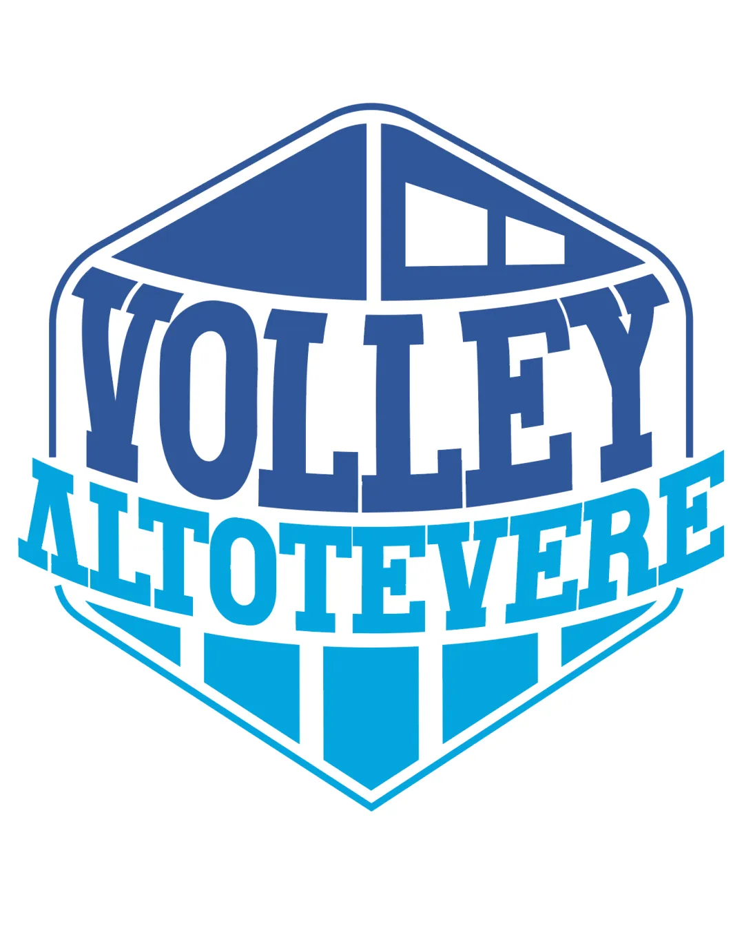
Try it Now!Logo review of VOLLEY ALTOTEVERE
 Logo analysis by AI
Logo type:
Style:
Detected symbol:
Detected text:
Business industry:
Review requested by Rosa
**If AI can recognize or misinterpret it, so can people.
Structured logo review
Legibility
![]() Text is bold and clear.
Text is bold and clear.![]() Good contrast between text and background.
Good contrast between text and background.
![]() Slight curvature of text may affect readability.
Slight curvature of text may affect readability.
Scalability versatility
![]() Bold text ensures clarity at smaller sizes.
Bold text ensures clarity at smaller sizes.
![]() Detailed geometric design may lose clarity in small applications.
Detailed geometric design may lose clarity in small applications.
200x250 px
100×125 px
50×62 px
Balance alignment
![]() Symmetrical design provides good balance.
Symmetrical design provides good balance.![]() Text is well-aligned within the emblem.
Text is well-aligned within the emblem.

Originality
![]() Unique geometric shape related to the sport.
Unique geometric shape related to the sport.
![]() No unique twist in typography.
No unique twist in typography.
Aesthetic look
![]() Sporty and bold aesthetic.
Sporty and bold aesthetic.
![]() Might feel slightly generic for a sports logo.
Might feel slightly generic for a sports logo.
Dual meaning and misinterpretations
![]() No inappropriate imagery detected.
No inappropriate imagery detected.
Color harmony
![]() Consistent use of blue shades provides harmony.
Consistent use of blue shades provides harmony.
![]() Lack of accent color might reduce visual interest.
Lack of accent color might reduce visual interest.


