 View review
Logo score
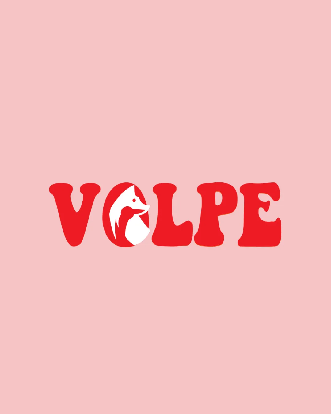
Logo review ofVolpe
Review the detailed scores below to see what is working and what should be refined first.
Legibility
Originality
Balance
Scale
Detailed review
Logo performance breakdown
Legibility
![]() The bold, clear font ensures the text 'VOLPE' is easily readable.
The bold, clear font ensures the text 'VOLPE' is easily readable.
Originality
![]() The combination of a fox symbol within the text adds uniqueness.
The combination of a fox symbol within the text adds uniqueness.
![]() Using animal symbols like a fox is somewhat common.
Using animal symbols like a fox is somewhat common.
Color harmony
![]() The red color is vibrant and eye-catching.
The red color is vibrant and eye-catching.
![]() The single color may limit diversity in application contexts.
The single color may limit diversity in application contexts.
Your palette is close. Explore sharper color combinations with Colorfly.design before updating the logo.
Explore palettesBalance alignment
![]() The integration of the fox symbol within the 'O' is balanced.
The integration of the fox symbol within the 'O' is balanced.

Scalability
![]() The bold lines are versatile for different sizes and applications.
The bold lines are versatile for different sizes and applications.
![]() The detailed fox symbol may lose clarity at smaller sizes.
The detailed fox symbol may lose clarity at smaller sizes.
200x250 px
100×125 px
50×62 px
Symbol & text fit
![]() The fox symbol fits well with the wordmark, creating a cohesive look.
The fox symbol fits well with the wordmark, creating a cohesive look.
Try your own review
Review my logo
Wondering how your logo performs?
Get a clear logo score, key risks, and priority fix ideas before your client or audience sees it.
Keep exploring


