Wondering how your logo performs? 🧐
Get professional logo reviews in seconds and catch design issues in time.
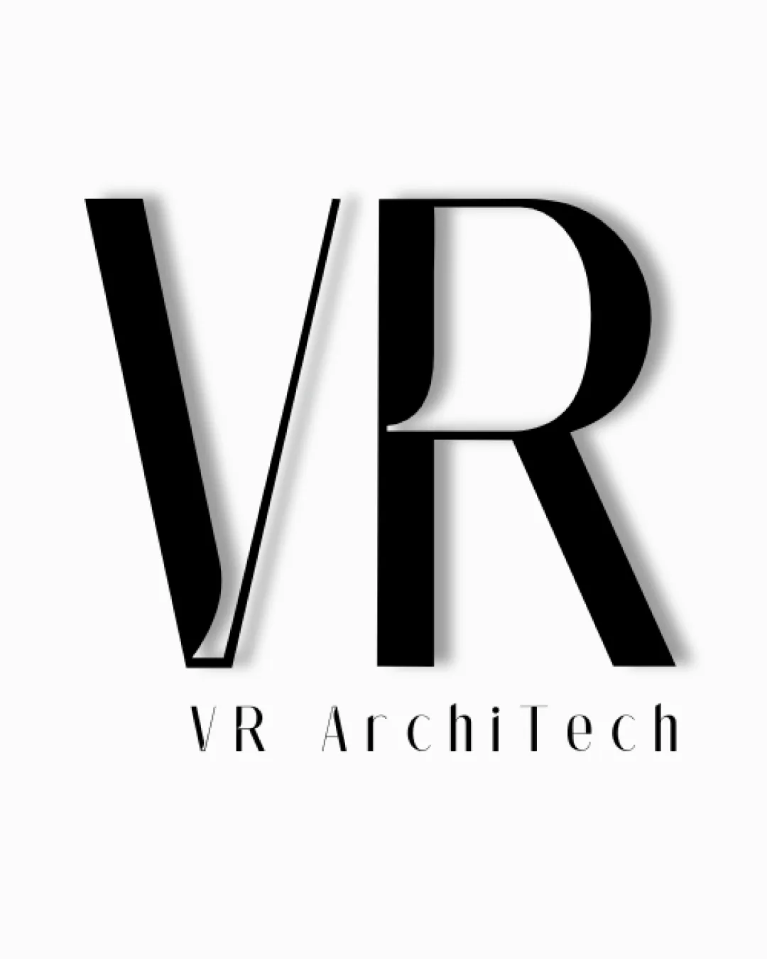
Try it Now!Logo review of VR ArchiTech
 Logo analysis by AI
Recognized style:
Logo type:
Detected symbol:
Detected text:
Business industry:
Review requested by Weci
**If AI can recognize or misinterpret it, so can people.
Structured logo review
Legibility
![]() The VR letters are prominent and easy to read.
The VR letters are prominent and easy to read.
![]() The tagline 'ArchiTech' has thin spacing which could affect readability on smaller scales.
The tagline 'ArchiTech' has thin spacing which could affect readability on smaller scales.
Scalability versatility
![]() The bold letters make it versatile for various applications.
The bold letters make it versatile for various applications.
![]() The fine lines may lose detail when scaled down too much.
The fine lines may lose detail when scaled down too much.
200x250 px
100×125 px
50×62 px
Balance alignment
![]() The composition is well-balanced and visually appealing.
The composition is well-balanced and visually appealing.

Originality
![]() The combination of VR with modern typography is creative.
The combination of VR with modern typography is creative.
![]() The overall concept is somewhat generic for architecture/design firms.
The overall concept is somewhat generic for architecture/design firms.
Aesthetic look
![]() The logo has a professional and sleek aesthetic.
The logo has a professional and sleek aesthetic.
Cultural sensitivity dual meaning
![]() No cultural sensitivity issues detected.
No cultural sensitivity issues detected.
Color harmony
![]() The black and white color scheme is classic and versatile.
The black and white color scheme is classic and versatile.


