Wondering how your logo performs? 🧐
Get professional logo reviews in seconds and catch design issues in time.
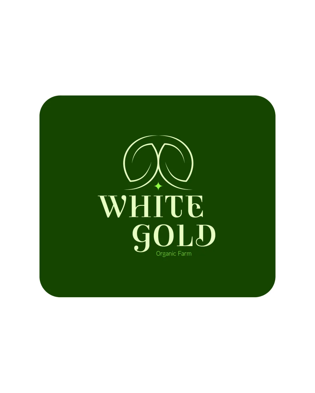
Try it Now!Logo review of WHITE GOLD Organic Farm
 Logo analysis by AI
Logo type:
Style:
Detected symbol:
Detected text:
Business industry:
Review requested by Paras
**If AI can recognize or misinterpret it, so can people.
Structured logo review
Legibility
![]() Text is clear and readable
Text is clear and readable![]() Good contrast with background
Good contrast with background
![]() Slight decorative touches on text could impact readability at small sizes
Slight decorative touches on text could impact readability at small sizes
Scalability versatility
![]() Simple design that scales well
Simple design that scales well![]() Suitable for various sizes like business cards and signage
Suitable for various sizes like business cards and signage
![]() Intricacies in the leaf symbol might lose clarity in very small formats
Intricacies in the leaf symbol might lose clarity in very small formats
200x250 px
100×125 px
50×62 px
Balance alignment
![]() Well-balanced composition
Well-balanced composition![]() Aligned and aesthetically pleasing
Aligned and aesthetically pleasing

Originality
![]() Unique integration of leaf symbol with text
Unique integration of leaf symbol with text
![]() Leaf motifs are commonly used in agriculture
Leaf motifs are commonly used in agriculture
Aesthetic look
![]() Clean and modern aesthetic
Clean and modern aesthetic![]() Color choice is subtle and appealing
Color choice is subtle and appealing
Dual meaning and misinterpretations
![]() No inappropriate symbols detected
No inappropriate symbols detected
Color harmony
![]() Colors are well-coordinated
Colors are well-coordinated![]() Pleasing and consistent
Pleasing and consistent![]() Aligns with organic and agricultural themes
Aligns with organic and agricultural themes
BottleGreen
#122C12
Chiffon
#E1E48B


