 View review
Logo score
Logo review ofYak
Review the detailed scores below to see what is working and what should be refined first.
Legibility
Originality
Misread
Balance
Scale
Detailed review
Logo performance breakdown
Legibility
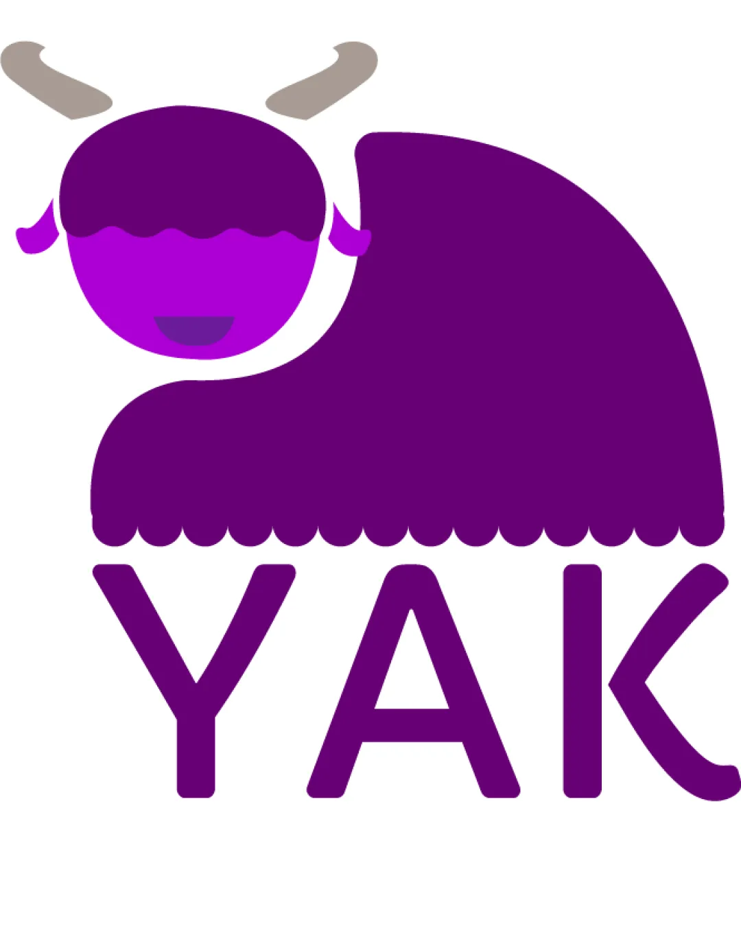
![]() Text is clear, uppercase, and easily readable.
Text is clear, uppercase, and easily readable.![]() Good spacing between characters.
Good spacing between characters.
Originality
![]() Stylized yak illustration is unique and playful.
Stylized yak illustration is unique and playful.![]() Color palette is distinctive for an animal logo.
Color palette is distinctive for an animal logo.
![]() Yak's horns and body are somewhat generic and could be mistaken for similar livestock logos, lowering uniqueness.
Yak's horns and body are somewhat generic and could be mistaken for similar livestock logos, lowering uniqueness.
Color harmony
![]() Color palette is limited and harmonious.
Color palette is limited and harmonious.![]() Good contrast between the logo and background.
Good contrast between the logo and background.
Vivid violet
#6E1A8A
Purple
#BA22DD
Light taupe
#B9B1A6
White
#FFFFFF
Balance alignment
![]() Logo feels visually balanced top to bottom.
Logo feels visually balanced top to bottom.![]() Text is centrally aligned under the logomark.
Text is centrally aligned under the logomark.
![]() Yak’s head and body lean to one side, introducing slight visual weight imbalance.
Yak’s head and body lean to one side, introducing slight visual weight imbalance.

Scalability
![]() Simple shapes and limited details enable good scalability.
Simple shapes and limited details enable good scalability.![]() Works well for digital, print, signage applications.
Works well for digital, print, signage applications.
![]() Scalloped details on the yak’s fur and small facial features may lose clarity at tiny sizes or in embroidery.
Scalloped details on the yak’s fur and small facial features may lose clarity at tiny sizes or in embroidery.
200x250 px
100×125 px
50×62 px
Misinterpretations
![]() No inappropriate or confusing secondary imagery detected.
No inappropriate or confusing secondary imagery detected.
Symbol & text fit
![]() Stylistic match between playful yak illustration and rounded, geometric font.
Stylistic match between playful yak illustration and rounded, geometric font.
Try your own review
Review my logo
Wondering how your logo performs?
Get a clear logo score, key risks, and priority fix ideas before your client or audience sees it.
Keep exploring


