Wondering how your logo performs? 🧐
Get professional logo reviews in seconds and catch design issues in time.
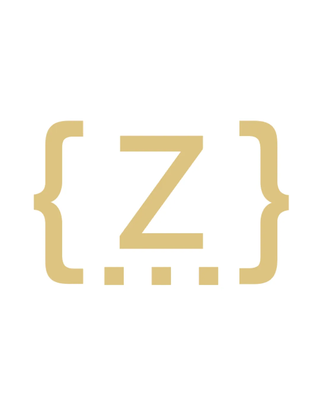
Try it Now!Logo review of Z
 Logo analysis by AI
Logo type:
Style:
Detected symbol:
Detected text:
Business industry:
Review requested by Weasleyau
**If AI can recognize or misinterpret it, so can people.
Structured logo review
Legibility
![]() The 'Z' is clear and highly readable due to its bold, geometric form and color contrast.
The 'Z' is clear and highly readable due to its bold, geometric form and color contrast.![]() Minimalist presentation ensures no distractions from the letterform.
Minimalist presentation ensures no distractions from the letterform.
Scalability versatility
![]() Minimal use of detail allows for good scalability across digital and print sizes.
Minimal use of detail allows for good scalability across digital and print sizes.![]() The distinct shape ensures recognizability at smaller sizes such as favicons.
The distinct shape ensures recognizability at smaller sizes such as favicons.![]() Will translate well to monochrome uses.
Will translate well to monochrome uses.
![]() Thick bracket lines could lose definition at extremely small sizes, particularly in low-resolution embroidery or tiny icons.
Thick bracket lines could lose definition at extremely small sizes, particularly in low-resolution embroidery or tiny icons.
200x250 px
100×125 px
50×62 px
Balance alignment
![]() Elements (brackets, Z, dots) are evenly spaced and visually centered, creating a harmonious composition.
Elements (brackets, Z, dots) are evenly spaced and visually centered, creating a harmonious composition.![]() Symmetry enhances overall balance.
Symmetry enhances overall balance.

Originality
![]() Combining a single letter with recognizable coding brackets and ellipsis conveys programming/tech with a unique approach.
Combining a single letter with recognizable coding brackets and ellipsis conveys programming/tech with a unique approach.![]() Avoids typical cliché symbols (e.g., gears, bulbs) common in tech logos.
Avoids typical cliché symbols (e.g., gears, bulbs) common in tech logos.
![]() Brackets and ellipsis are fairly standard symbols in the coding industry, which slightly reduces originality.
Brackets and ellipsis are fairly standard symbols in the coding industry, which slightly reduces originality.
Aesthetic look
![]() Clean, modern, and minimal aesthetic with effective use of negative space.
Clean, modern, and minimal aesthetic with effective use of negative space.![]() Refined geometric styling and professional color choice.
Refined geometric styling and professional color choice.
Dual meaning and misinterpretations
![]() No accidental or inappropriate symbols detected in the shape or arrangement.
No accidental or inappropriate symbols detected in the shape or arrangement.![]() Direct and straightforward iconography.
Direct and straightforward iconography.
Color harmony
![]() Single, muted gold shade is elegant and balanced with white, providing excellent contrast.
Single, muted gold shade is elegant and balanced with white, providing excellent contrast.![]() Palette is visually pleasant and not overwhelming.
Palette is visually pleasant and not overwhelming.
Teak
#D9C083
White
#FFFFFF


