Wondering how your logo performs? 🧐
Get professional logo reviews in seconds and catch design issues in time.
Try it Now!Logo review of Zedlewska Barbara
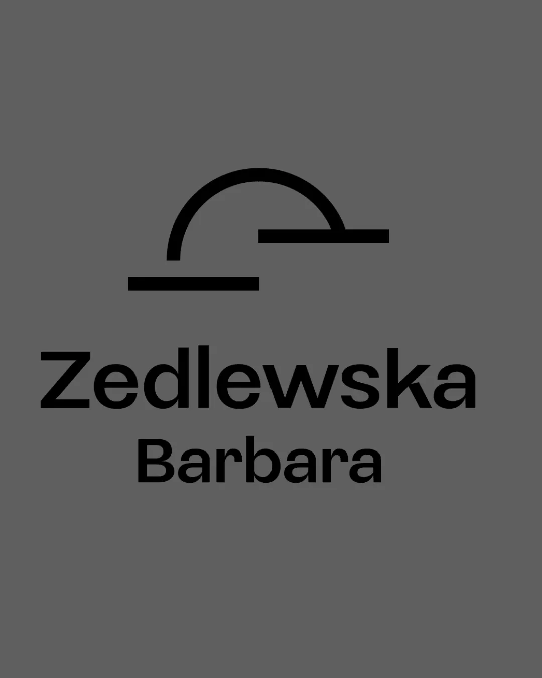
 Logo analysis by AI
Logo type:
Style:
Detected symbol:
Detected text:
Business industry:
Review requested by Smiarowskadesign
**If AI can recognize or misinterpret it, so can people.
Structured logo review
Legibility
Text is highly readable
Strong, clear sans-serif font with excellent spacing
Scalability versatility
Minimal details allow for effective scaling
Logo likely maintains clarity at small and large sizes
Simple shapes work across mediums like letterheads and business cards
Very thin line on symbol could lose presence at micro size applications such as favicon or embroidery

200x250 px

100×125 px

50×62 px
Balance alignment
Text is horizontally centered with the symbol
Consistent spacing between elements
Symbol and wordmark alignment feels slightly top-heavy
Uneven visual weight distribution; symbol's horizontal lines create imbalance above text


Originality
Abstract, non-cliché symbol
Unique geometric approach for a personal brand
Symbol is visually intriguing but lacks clear meaning, which could lower memorability or instant recognition
Logomark wordmark fit
Minimalist style of both wordmark and symbol creates some cohesion
Symbol's curves and horizontals don't reference any letterforms from the wordmark, causing some visual disconnect
Aesthetic look
Clean, modern aesthetic
Minimal use of color creates professional look
Simplicity is appealing and on-trend
Feels somewhat generic/impersonal due to abstract symbol lacking emotional resonance
Dual meaning and misinterpretations
No inappropriate or unintended symbolism detected
Color harmony
Bold black logo contrasts well with muted gray background
Restrained color palette enhances professionalism
Dove Gray
#5E5E5E
Black
#000000

