Wondering how your logo performs? 🧐
Get professional logo reviews in seconds and catch design issues in time.
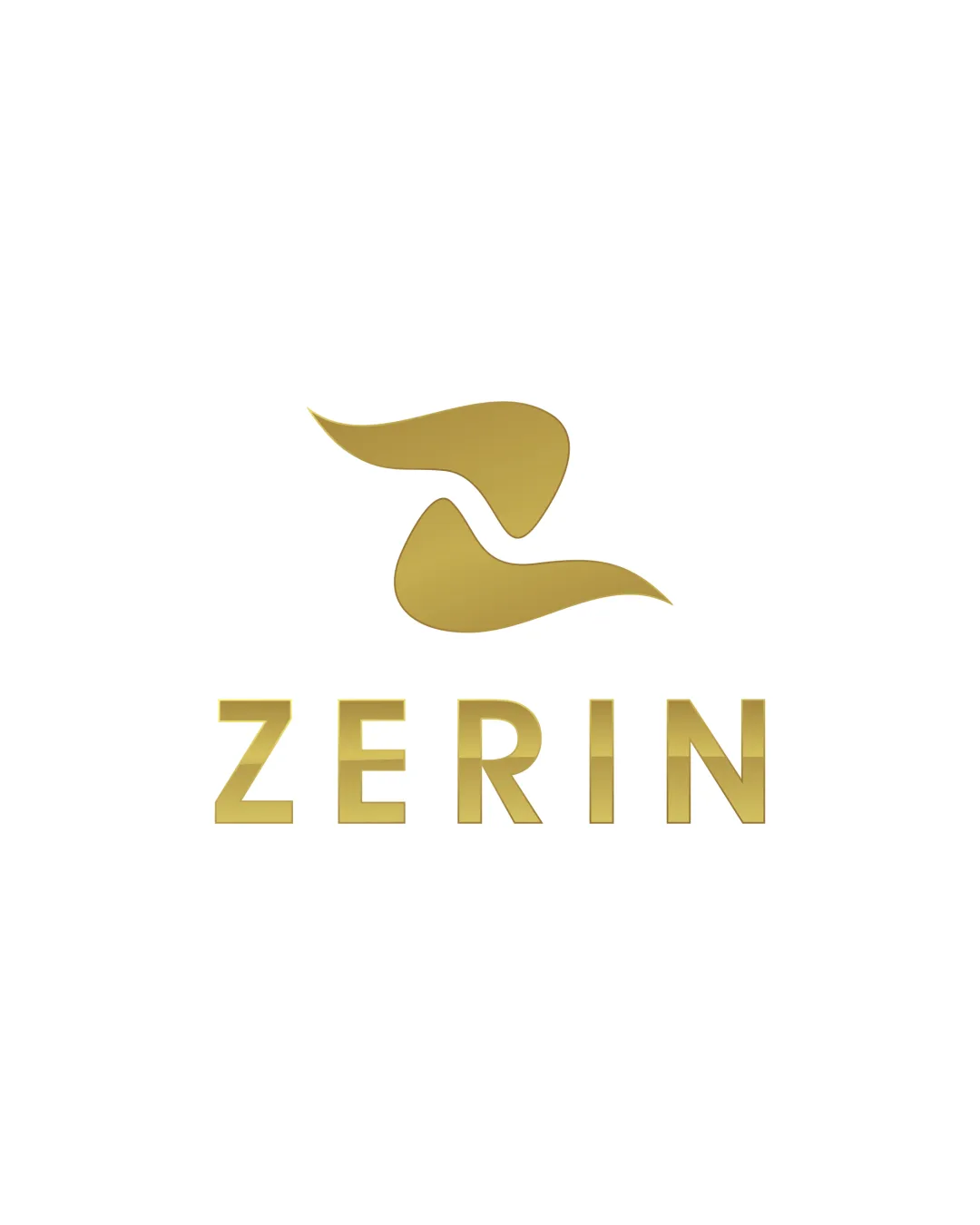
Try it Now!Logo review of ZERIN
 Logo analysis by AI
Logo type:
Style:
Detected symbol:
Detected text:
Business industry:
Review requested by Ulmsae
**If AI can recognize or misinterpret it, so can people.
Structured logo review
Legibility
![]() Well-defined, easily readable sans-serif letterforms.
Well-defined, easily readable sans-serif letterforms.![]() Consistent spacing and alignment aid quick recognition.
Consistent spacing and alignment aid quick recognition.
Scalability versatility
![]() Minimalistic motif and clear text allow good scalability on digital media and print.
Minimalistic motif and clear text allow good scalability on digital media and print.![]() Logo would be effective on signage, business cards, and luxury packaging.
Logo would be effective on signage, business cards, and luxury packaging.
![]() Gold gradient effect could present issues in monochrome or on small scales such as embroidery or favicon icons.
Gold gradient effect could present issues in monochrome or on small scales such as embroidery or favicon icons.
200x250 px
100×125 px
50×62 px
Balance alignment
![]() Excellent vertical arrangement and visual balance between symbol and wordmark.
Excellent vertical arrangement and visual balance between symbol and wordmark.![]() Both elements are sized and spaced harmoniously for aesthetic alignment.
Both elements are sized and spaced harmoniously for aesthetic alignment.

Originality
![]() Abstract interpretation of the letter 'Z' adds some uniqueness.
Abstract interpretation of the letter 'Z' adds some uniqueness.![]() Swoosh form suggests an upmarket, luxury vibe.
Swoosh form suggests an upmarket, luxury vibe.
![]() Abstract swoosh resembles many generic luxury brand motifs; lacks a distinctive twist that would stand out in crowded markets.
Abstract swoosh resembles many generic luxury brand motifs; lacks a distinctive twist that would stand out in crowded markets.
Logomark wordmark fit
![]() Metallic effect and style unify the mark and wordmark.
Metallic effect and style unify the mark and wordmark.![]() Clean modern aesthetic is consistent throughout.
Clean modern aesthetic is consistent throughout.
Aesthetic look
![]() Sophisticated, minimalistic appearance aligns with luxury sector conventions.
Sophisticated, minimalistic appearance aligns with luxury sector conventions.![]() Metallic gradient suggests exclusivity and quality.
Metallic gradient suggests exclusivity and quality.
![]() Aesthetic is somewhat conventional for upscale/luxury brands—could be more memorable with a unique element.
Aesthetic is somewhat conventional for upscale/luxury brands—could be more memorable with a unique element.
Dual meaning and misinterpretations
![]() Does not obviously resemble anything inappropriate or confusing.
Does not obviously resemble anything inappropriate or confusing.
Color harmony
![]() Strong gold-on-white contrast for a premium look.
Strong gold-on-white contrast for a premium look.![]() Color choice is harmonious and visually pleasing.
Color choice is harmonious and visually pleasing.
Teak
#B7996E
White
#FFFFFF


