Wondering how your logo performs? 🧐
Get professional logo reviews in seconds and catch design issues in time.
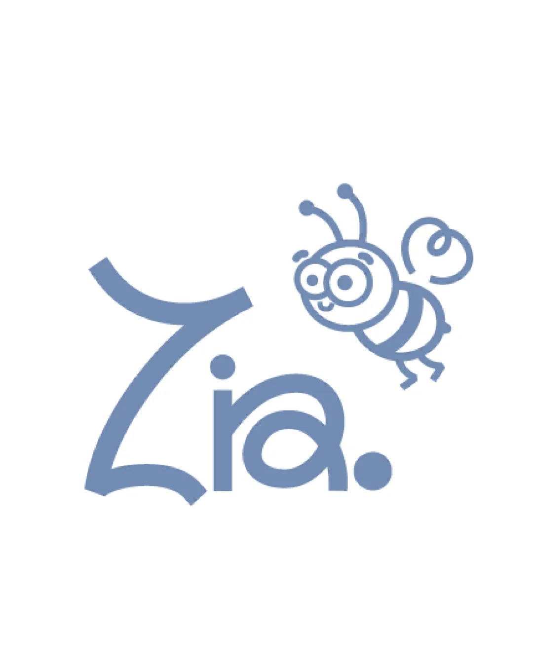
Try it Now!Logo review of Zia.
 Logo analysis by AI
Logo type:
Style:
Detected symbol:
Detected text:
Business industry:
Review requested by Zn.ana22
**If AI can recognize or misinterpret it, so can people.
Structured logo review
Legibility
![]() The ‘Zia.’ text is mostly clear and uses a whimsical, friendly typeface that matches the playful nature of the logo.
The ‘Zia.’ text is mostly clear and uses a whimsical, friendly typeface that matches the playful nature of the logo.![]() Good contrast between text and background for clear readability.
Good contrast between text and background for clear readability.
![]() The exaggerated curves and stroke weights on the 'Z' might make it difficult to read quickly or at a small size.
The exaggerated curves and stroke weights on the 'Z' might make it difficult to read quickly or at a small size.![]() The period could be mistaken for an intentional design element rather than punctuation.
The period could be mistaken for an intentional design element rather than punctuation.
Scalability versatility
![]() Simple color scheme eases scaling for different backgrounds.
Simple color scheme eases scaling for different backgrounds.![]() Logo could work on signage, labels, children's products, or educational materials.
Logo could work on signage, labels, children's products, or educational materials.
![]() Thin lines in the bee illustration may lose clarity when scaled down for business cards or small merchandise.
Thin lines in the bee illustration may lose clarity when scaled down for business cards or small merchandise.![]() Multiple detailed elements (the bee, complex 'Z') hinder usage as a favicon or app icon.
Multiple detailed elements (the bee, complex 'Z') hinder usage as a favicon or app icon.![]() The combination of thick and thin strokes could present issues in embroidery or low-res printing.
The combination of thick and thin strokes could present issues in embroidery or low-res printing.
200x250 px
100×125 px
50×62 px
Balance alignment
![]() Bee is playful and well-integrated with the text, reinforcing the energetic mood.
Bee is playful and well-integrated with the text, reinforcing the energetic mood.![]() Baseline alignment between 'ia.' is maintained.
Baseline alignment between 'ia.' is maintained.
![]() The oversized and stylistically different 'Z' draws too much attention, disturbing overall balance.
The oversized and stylistically different 'Z' draws too much attention, disturbing overall balance.![]() Bee illustration feels detached and 'floats' awkwardly above the text, leading to visual imbalance.
Bee illustration feels detached and 'floats' awkwardly above the text, leading to visual imbalance.

Originality
![]() Custom bee illustration adds a unique and personal touch.
Custom bee illustration adds a unique and personal touch.![]() Lettering and arrangement feel playful and less generic than typical children's brands.
Lettering and arrangement feel playful and less generic than typical children's brands.
![]() Bee character is a common symbol for children's brands and learning, risking some familiarity.
Bee character is a common symbol for children's brands and learning, risking some familiarity.![]() Typography style of 'ia.' is not especially distinctive.
Typography style of 'ia.' is not especially distinctive.
Logomark wordmark fit
![]() The friendly, rounded nature of the bee illustration pairs reasonably with the playful typeface.
The friendly, rounded nature of the bee illustration pairs reasonably with the playful typeface.![]() Both elements share a similar stroke weight and aesthetic mood.
Both elements share a similar stroke weight and aesthetic mood.
![]() The balance between logomark (bee) and the exaggerated 'Z' is not harmonious; they compete rather than complement.
The balance between logomark (bee) and the exaggerated 'Z' is not harmonious; they compete rather than complement.![]() Stylistic disconnect between highly playful bee and the more reserved 'ia.'
Stylistic disconnect between highly playful bee and the more reserved 'ia.'
Aesthetic look
![]() Color choice is cohesive and appealing for a children's brand.
Color choice is cohesive and appealing for a children's brand.![]() Bee illustration is charming and has personality.
Bee illustration is charming and has personality.
![]() Logo risks being slightly cluttered due to multiple visual focal points (bee vs large Z).
Logo risks being slightly cluttered due to multiple visual focal points (bee vs large Z).![]() Typography could further echo the illustration's whimsical quality for more unity.
Typography could further echo the illustration's whimsical quality for more unity.
Dual meaning and misinterpretations
![]() No unintended or inappropriate symbols detected.
No unintended or inappropriate symbols detected.![]() Positive, child-appropriate imagery throughout.
Positive, child-appropriate imagery throughout.
Color harmony
![]() Limited, harmonious palette suited for children’s markets.
Limited, harmonious palette suited for children’s markets.![]() Good contrast and visibility.
Good contrast and visibility.
Blue Gray
#909db2
White
#FFFFFF


