Recommended concept Recommended logo concept A
Concept A
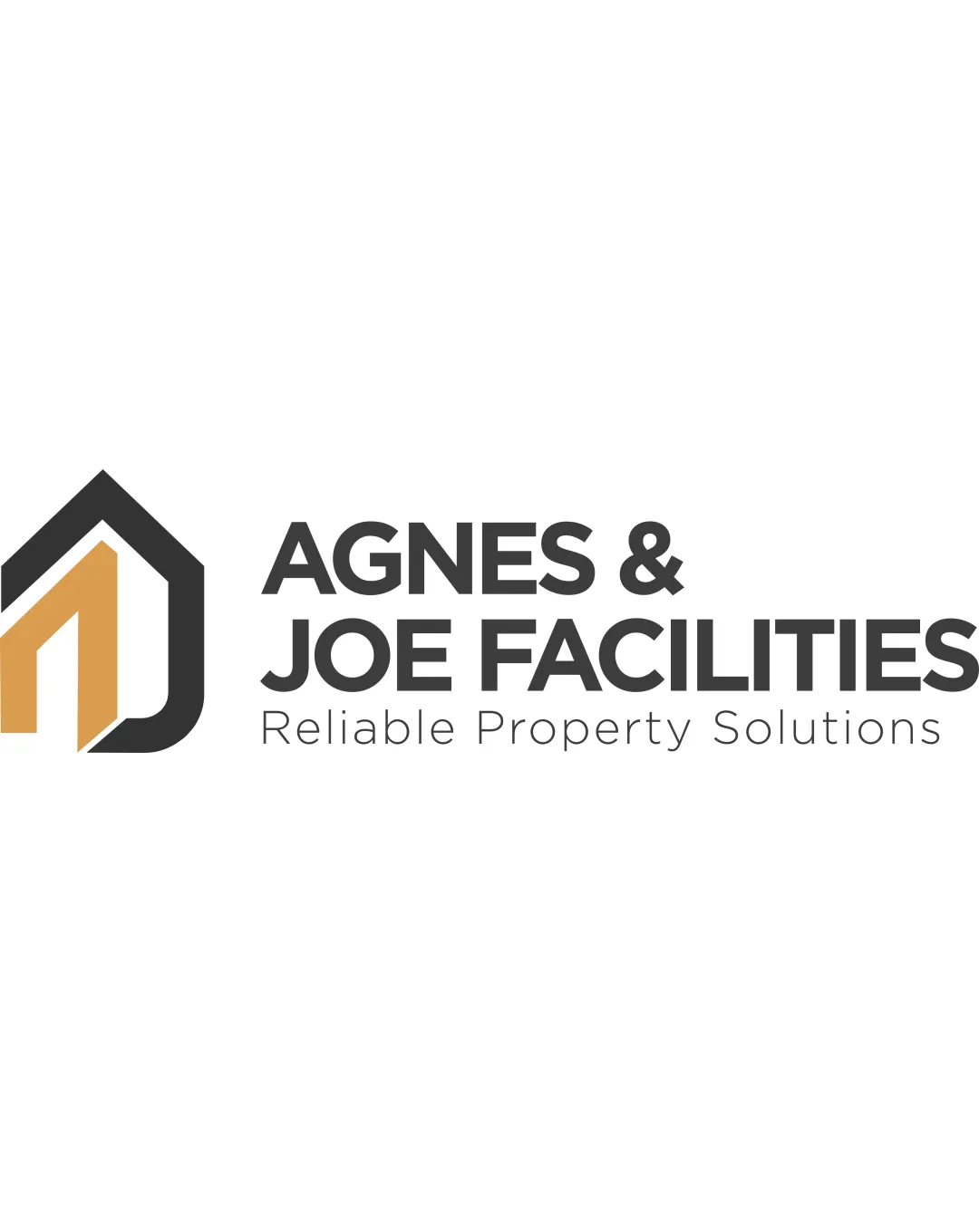
Logo concept A
5.0/5 Concept A
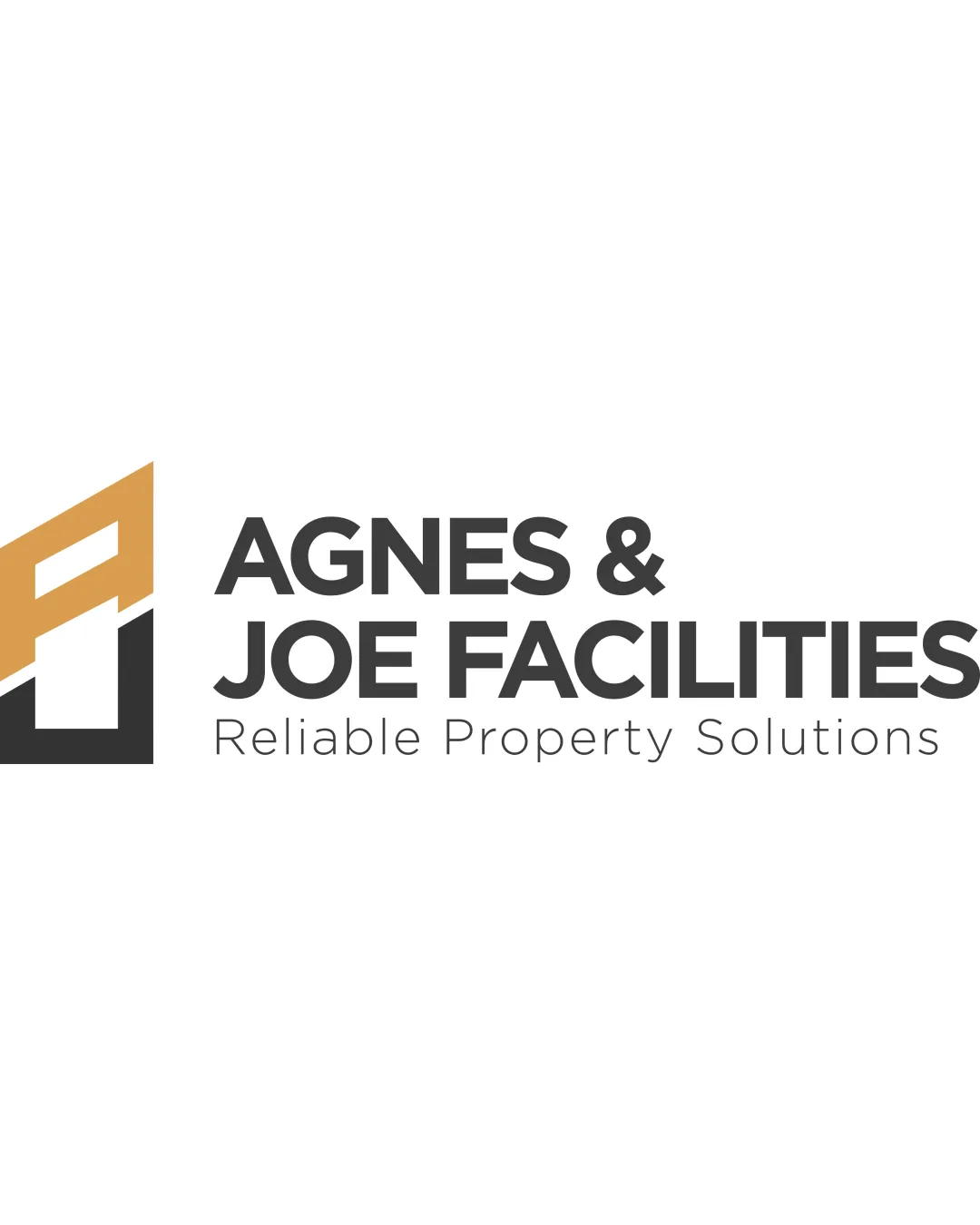
Logo concept B
3.0/5 Concept B
5.0/5
Winner score
Logo comparison

Agnes & Joe Facilities Logo Concept Comparison

Concept A is a strong, professional choice that clearly conveys the property and caretaking focus with excellent legibility and a memorable mark. Concept B has an abstracted form that risks some confusion and lacks the immediate clarity of A.

AI comparison. Your final decision.

High confidence
Winner concept details
Best for
Professional property service brands needing instant recognition.
Main strength
Clear, relevant symbol that communicates property and care; high legibility.
Main risk
Could be seen as generic if not further customized, but risk is low given current execution.
AI note
Highly recommended. Refine to further differentiate from general real estate logos.
Why concept A won

Concept A uses a house-like mark, instantly signaling property and care, which strongly aligns with the brand's values and mission. The mark integrates with the wordmark naturally and is scalable and recognizable. Concept B, though visually similar, is less immediately clear and its abstraction could cause hesitation or misinterpretation for a facilities support service.
Decision factors
  • Concept A's symbol immediately communicates property services and protection, supporting the brand's mission.
  • Legibility in Concept A is superior; all type is clear at various sizes.
  • Concept B's abstraction could be misread (non-obvious meaning or confusion with other sectors).
  • Both color palettes and typographic treatments are professional but A is more approachable and memorable.
Brief used

BRAND STORY: Agnes & Joe Facilities was founded in honour of our founder's parents, Agnes and Joe, whose foundational values of integrity, hard work, and excellence shape every service we provide. Looking after a property means looking after the people who invest in it, manage it, and live in it. We provide dependable cleaning and comprehensive property support services delivered with professionalism, meticulous attention to detail, and genuine care. We do not simply clean properties, we help our clients protect their investments and present every space at its absolute best. MISSION STATEMENT: To deliver reliable, professional, and high-quality property support and facilities services that make operations effortless for landlords, estate agents, short-let hosts, and property managers across London.

Next step Refine color palette and explore subtle variations of Concept A to enhance distinctiveness for the sector while testing at smaller scales.

Concept breakdown

Each uploaded direction is scored and explained so you can see why the winner stood out.

Logo concept A Recommended
5.0/5

Concept A

Best for
Professional property service brands needing instant recognition.
Main strength
Clear, relevant symbol that communicates property and care; high legibility.
Main risk
Could be seen as generic if not further customized, but risk is low given current execution.

Highly recommended. Refine to further differentiate from general real estate logos.

Logo concept B
3.0/5

Concept B

Best for
Brands willing to invest in building recognition for a more abstract mark.
Main strength
Modern, geometric structure; continuity with type.
Main risk
Lacks immediate sector clarity; risks misinterpretation.

Not recommended unless the brand wants a more abstract, less direct approach.