Recommended concept Recommended logo concept B
Concept B
Logo concept A
3/5
Concept A
Logo concept B
5/5
Concept B
5/5
Winner score
Logo comparison

Agtech Logo Concept Evaluation: ADAGREM

Concept B is the stronger option, offering clearer category fit, legibility, and a sustainable agritech visual language.

AI comparison. Your final decision.

High confidence
Winner concept details
Best for
Agtech branding focused on sustainability and smallholder farmer empowerment.
Main strength
Strong, universal iconography for agriculture/growth, clear and friendly wordmark.
Main risk
Potential for leaf motif to feel generic if not distinguished further.
AI note
Highly recommended; refine for uniqueness and memorable application.
Why concept B won

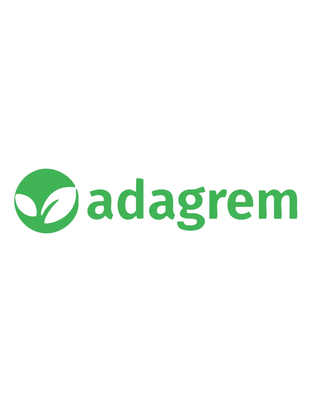
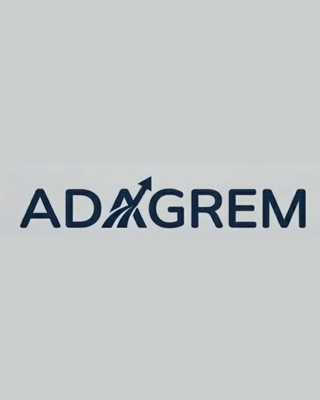
Concept B uses a distinctive and universally recognizable plant-leaf icon, directly communicating growth, agriculture, and sustainability. The green color aligns well with environmental technology. Its legibility and scalability are strong, crucial for digital tools targeting smallholder farmers. Concept A, while integrating a growth/arrow motif, suffers from less instant readability and a less unique aesthetic, pote

Decision factors
  • Concept B's icon signals agriculture and sustainability at a glance.
  • Bright green aligns with tech-forward, eco-friendly values.
  • Concept A's arrow/A integration is clever but weaker for instant recognition and font cohesion.
  • Concept B more clearly signals category and market intent.
Brief used

Agtech that provides digital tools for smallholder farmers for managing their farm. The promise: Reimagine your farm. Make it more productive, profitable and sustainable. Company logo

Next step Proceed with refinements of Concept B, focusing on finalizing icon/letter integration and testing scalability across digital and print applications.

Concept breakdown

Each uploaded direction is scored and explained so you can see why the winner stood out.

Logo concept A
3/5

Concept A

Best for
Contexts prioritizing business/growth, but less agricultural focus.
Main strength
Arrow motif subtly indicates ambition and growth.
Main risk
Letterform modification hurts legibility and instant category recognition.

Not recommended due to agricultural ambiguity and potential scalability issues.
Logo concept B Recommended
5/5

Concept B

Best for
Agtech branding focused on sustainability and smallholder farmer empowerment.
Main strength
Strong, universal iconography for agriculture/growth, clear and friendly wordmark.
Main risk
Potential for leaf motif to feel generic if not distinguished further.

Highly recommended; refine for uniqueness and memorable application.