Logo Concept Comparison: In Between
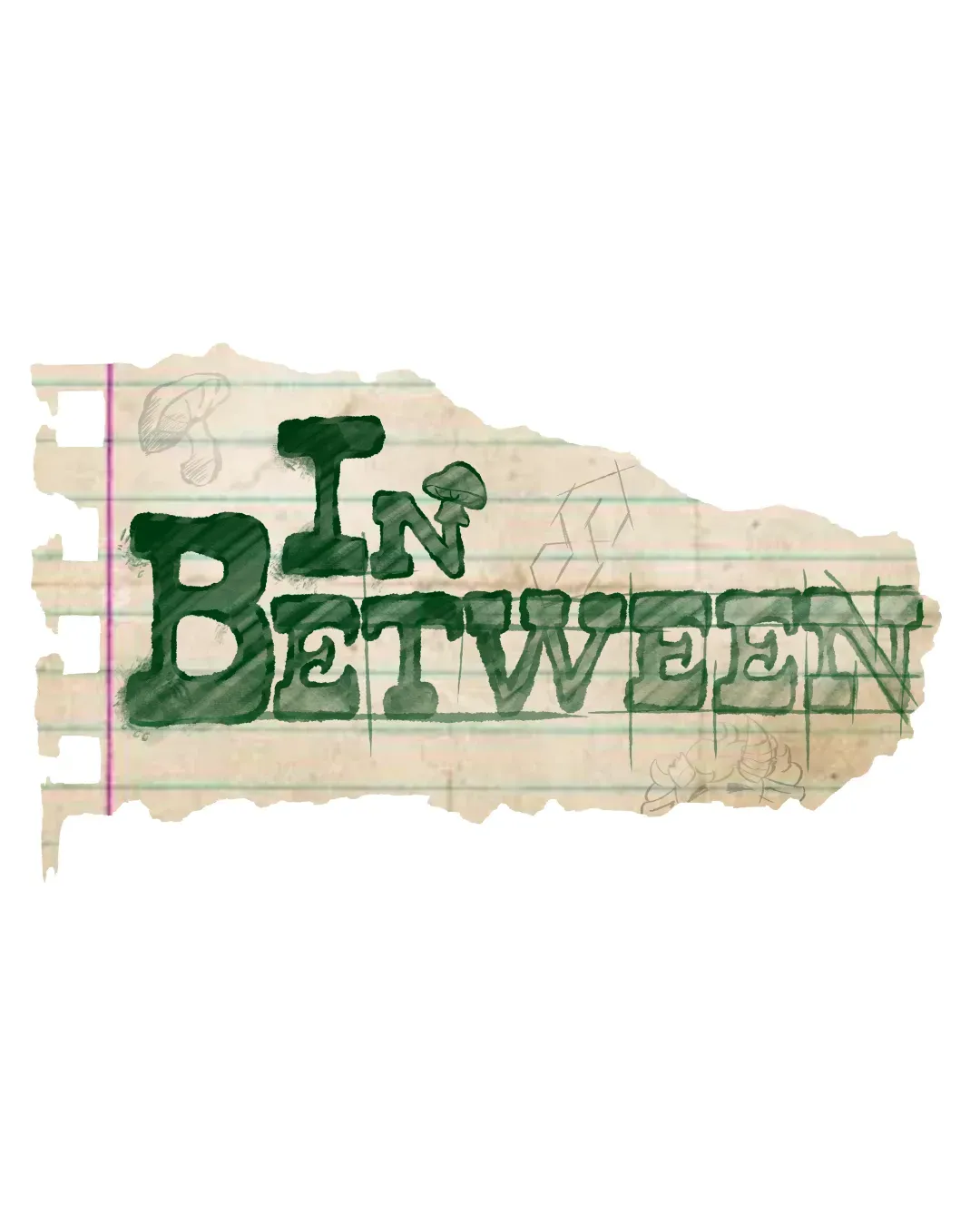
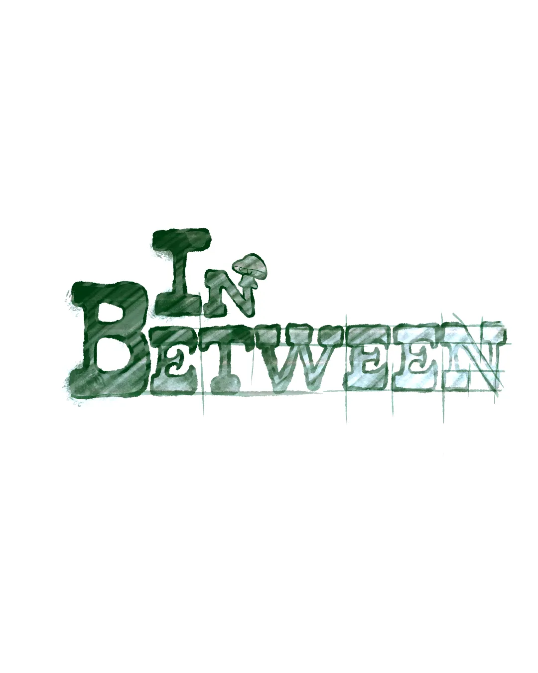
Concept B provides a cleaner, more scalable mark, while Concept A offers a unique hand-drawn vibe but is less versatile.
- Best for
- General audience brands prioritizing clarity and flexibility.
- Main strength
- Strong typographic presence and versatile for scaling.
- Main risk
- May benefit from a touch more personality to increase memorability.
- AI note
- Most appropriate as a primary logo. Minor refinement for brand personality recommended.
Concept B is less visually cluttered and omits the torn notebook paper background, making it more scalable across different formats. The removal of the extra paper elements improves clarity and legibility, while the strong typographic treatment remains memorable and distinct. Concept A, while memorable due to its unique treatment, is less practical and risks becoming illegible or overly busy at small scales.
- Concept B is simpler and more scalable for diverse applications.
- A's torn-paper effect is distinctive but harms legibility and flexibility.
- Both concepts are reasonably memorable, but A’s texture could become cluttered.
- B is more adaptable to various brand touchpoints (digital, print, merchandise).
No brief was added, so AI compared general clarity, memorability, scalability, visual risk, and presentation readiness.
Concept breakdown
Each uploaded direction is scored and explained so you can see why the winner stood out.
Concept A
- Best for
- Brands seeking a nostalgic or school-related aesthetic.
- Main strength
- Unique, hand-crafted look with personality.
- Main risk
- Background and texture hurt legibility and reduce versatility.
Better for niche or campaign use than as a primary logo.
Recommended
Concept B
- Best for
- General audience brands prioritizing clarity and flexibility.
- Main strength
- Strong typographic presence and versatile for scaling.
- Main risk
- May benefit from a touch more personality to increase memorability.
Most appropriate as a primary logo. Minor refinement for brand personality recommended.